The 24 Columns Grid
The foundation of the design system is the modified bootstrap frontend grid. this grid has 24 columns within the dashboard and 12 columns within the boardlets.
The dashboard is divided into two parts, header and content area. The 24 Columns Grid only applies within the content area.
The grid has no column space, all distances are solved via the margin.

Spacing of theÂ
web max.
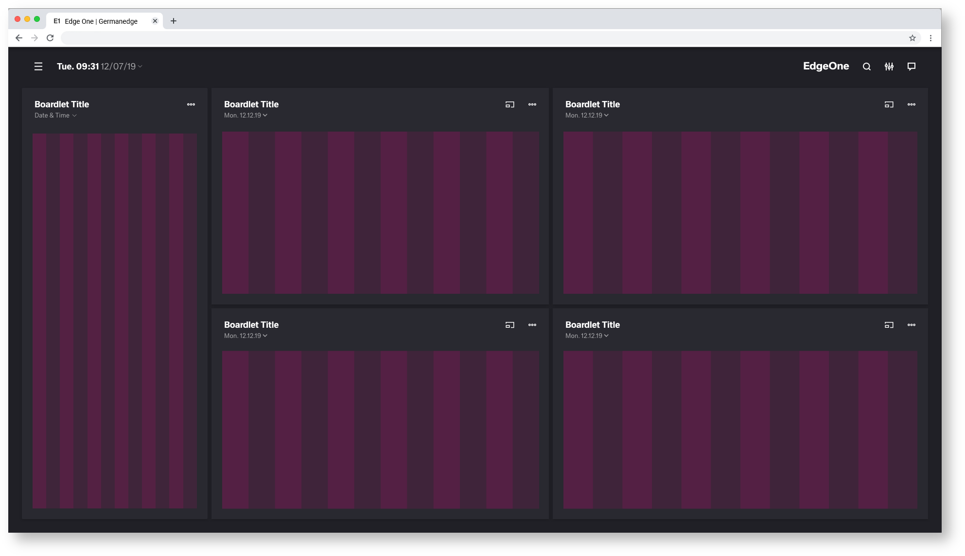
Here you can find all important values for building the web max grid. The grid is divided into two main containers. the header area and the content area.
| Base | px | rem |
|---|---|---|
| Breakpoint | 1584 | 99 |
| Width | 1920 | 120 |
| Height | 1080 | 67.5 |
| Margin | 24 | 1,5 |
| Content Area | ||
| Columns | 24 | - |
| Column Width | 78 | 4.875 |
| Gutter | 26 | 1.625 |
| Header Area | ||
| Header | 24 | 1,500 |
| Icon max | 24 | 1,500 |
| Icon min | 16 | 1 |
Space between | 22 | 1.375 |
The 24 Columns Gutter

EdgeOne Boardlet example.
This is how the division of the boardlets within this representation could look like. The Edge One/dSFM layout serves as an example.


EdgeOne Boardlet 12 Columns Grid.
In this example you can see how the 12 columns grid behaves within the different sized bordlets. Here you can also see why the grid has no columns space. It would mean that the distances within the different sized boardlets would be different. For this reason all components have a margin.
Best PracticeÂ
Dark and Light Theme.


X-Series Boardlet example.
This is how the division of the boardlets within this representation could look like. The X-Series/Objective layout serves as an example.
This is a work in progress. Not final!!!
Best PracticeÂ
Dark and Light Theme.
This is a work in progress. Not final!!!
comming soon, more infos needed