(this page was created automatically. In case of formatting issues, please visit the official Wiki Page)
Dialogs
A dialog is a interaction between the system and the user. It is prompted when the system urgently needs input or confirmation from the use.
Dialogs work best when used for singular, short tasks or to notify the user of task-relevant information. They keep the user anchored on the current page and allow for easy snap back once the purpose of the dialog is completed. However, dialogs are disruptive to the workflow they inhabit and thereby should be used sparingly. They should only be used for the most necessary interactions.
A dialog is triggered by an action of the user, appears above the main content of the page and remains until it is closed. The purpose of a dialog should be immediately apparent to the user, with a clear and obvious path to completion.
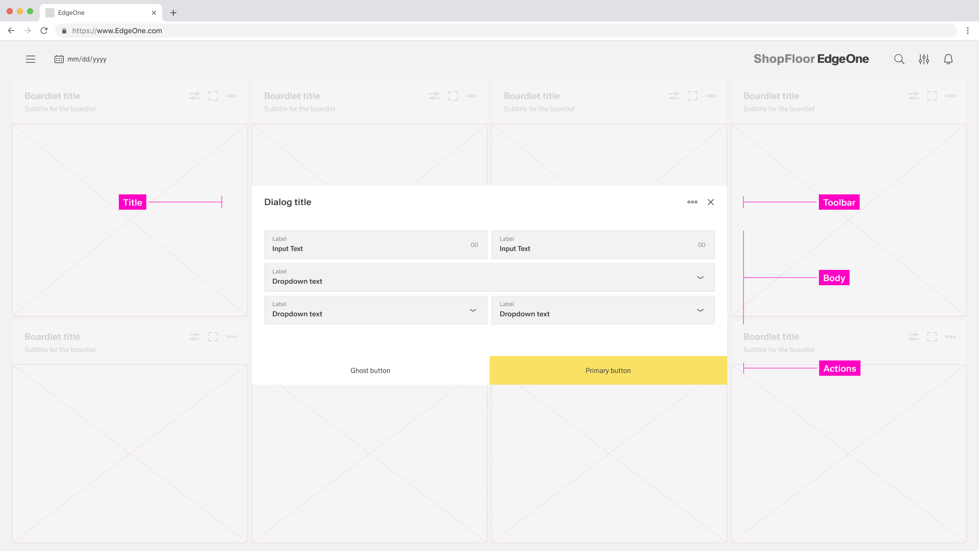
Anatomy
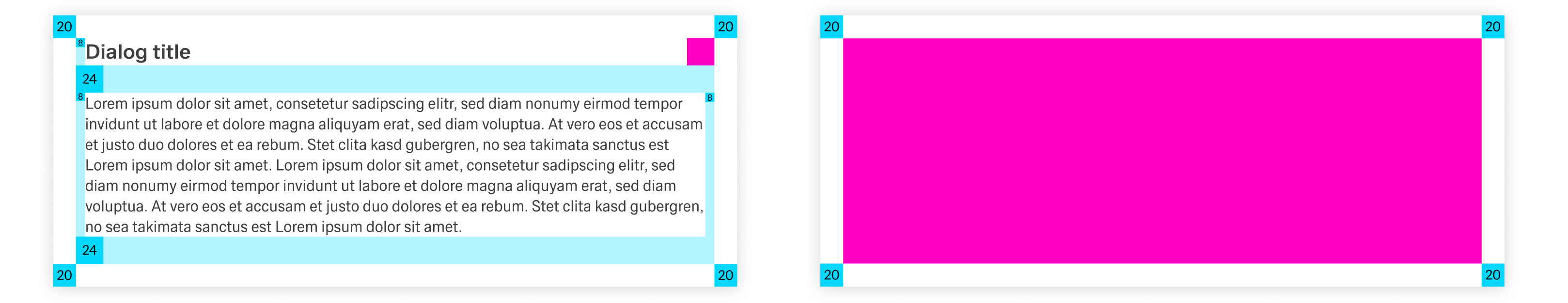
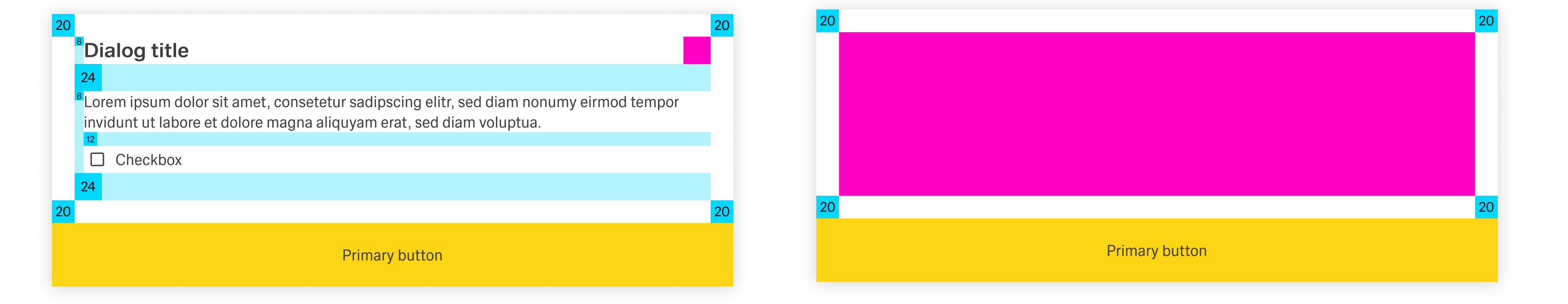
Title: The title should be brief and clearly describe the dialogues’s task or purpose. Use the optional label above the title set the context for the information in the dialogue. When using modals, the title is optional.
Toolbar: The toolbar contains all actions for the body as well as the modal or dialogue. More Infos you will find in the Action Placement. When using modals, the toolbar is optional.
Body: Contains the information and/or controls needed to complete the dialogue’s task. It can include message text and components.
Actions: The main actions needed to complete or cancel the dialogue task. Use descriptive words for the actions like Add, Delete, Save and avoid vague words like Done or OK.
A Dialog can vary in the height and width, with the dimensions depending on the context. The width of the modal is based on breakpoints within the window while the content.
Dialogs always have an overlay. The overlay has the same color as the BG of the dashboard, but only in 70% transparency. The entire background behind the dialog or modal is 15% blurred. The header of the dashboard is always excluded.
Rules on the maximum height of dialogs will follow soon.
Dialog
A Dialog is used when the system requires the user to enter data or perform tasks. The body of the dialogue is variable and can be freely edited. It is only important that the dialogue does not become too long. In such a case, please separate the interaction into partial interactions.
When a dialogue is active, the content of the underlying page is hidden and not accessible until the user completes the task or closes the modal dialogue.
The Inspire UI kit separates all its dialogues into two types: Basic and Process Dialog.
Basic Dialog
The basic dialogue consists only of a dialogue without a sidebar. This type of dialogue may be used for all conceivable simple interactions.
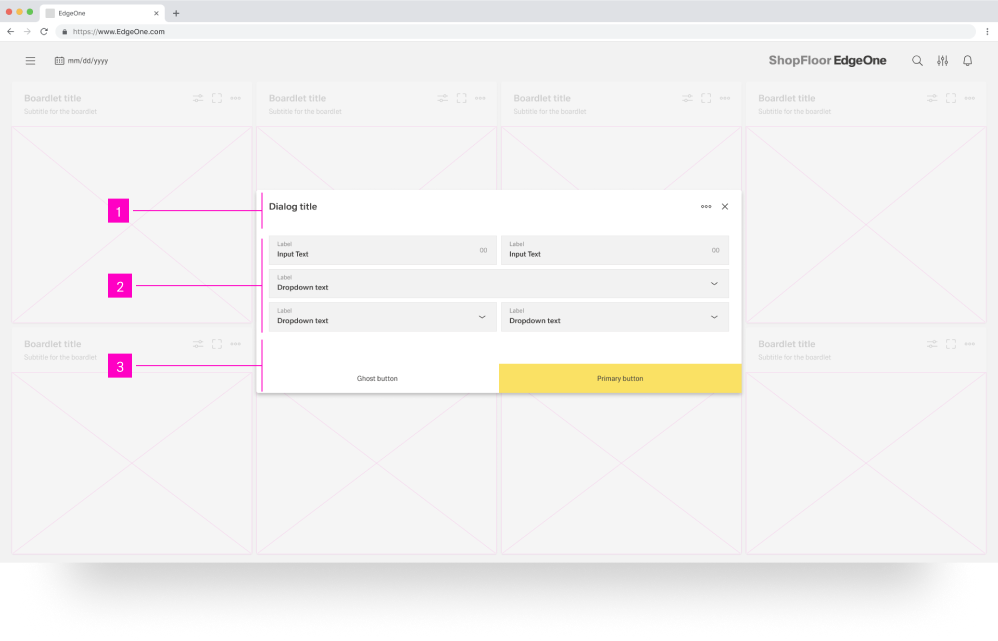
- 01 Dialog Title - The title must be present in each dialog. all assets are set.
- 02 Content Area - Here you can perform all the necessary content. In modal it is not allowed to position actions to another place.
- 03 Action Area Here you can perform all the necessary actions.
Process Dialog
The process dialogue may only be used for interactions that specify a sequence of different interaction sections. The different sections are shown in the sidebar, and the user can move backwards and forwards within the process sections.
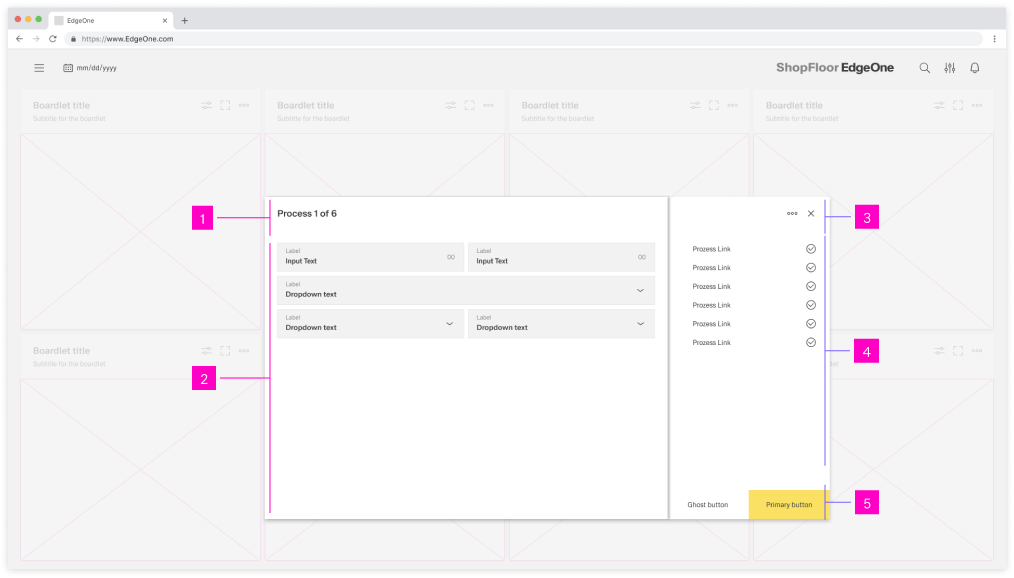
- 01 Dialog Title - The title must be present in each dialog. all assets are set.
- 02 Content Area - Here you can perform all the necessary content. In modal it is not allowed to position actions to another place.
- 03 Action Icons - In the process dialog the action icons are always located in the sidebar
- 04 Process Area - A process can be represented by different assets. these assets are always located in the process area.
- 05 Action Area - Here you can perform all the necessary actions.
Dismissing non-modal Dialogues
There are several possible ways to exit a non-modal dialog.
- x: Clicking the close x icon in the upper right will close the dialog without submitting any data.
- Cancel Button: If a cancel button is used then clicking it will close the dialog. Cancel undoes all applied changes.
- Esc: Pressing ESC on the keyboard will close the dialog and undo all applied changes.
Modals
A modal dialogue triggers a state that focuses the user's attention exclusively on a task or relevant information. Modals interrupt a user's workflow by design. When active, a user is blocked from the one-page content and cannot return to their previous workflow until the modal task is completed or the user dismisses the modal. While effective when used correctly, modals should be used sparingly to limit disruption to the user.

- 01 Content Area - Here you can place all your content.
- 02 Action Area - Here you can perform all the necessary actions. In modal it is not allowed to position actions to another place.
Dismissing a Modal
How a modal is dismissed and the effects thereof depend on the content of the modal. For more information, read "Use Cases for Modals".
Best Practices
Usage
Use a dialog when the system must briefly interrupt the current workflow. The user has to decide, confirm, or enter something before they can continue. Typical cases are destructive actions, small edits, or acknowledging an important consequence.
If the information is not critical, choose a lighter pattern. Status updates, hints, and non-urgent messages belong in inline or toast notifications. When users need to work with larger data sets or several views, use a dedicated page, dashboard, or boardlet instead. Content in a dialog must always relate directly to the action that triggered it. Do not turn dialogs into sub-applications or complex configuration screens that users visit repeatedly.
Choosing dialog and modal behavior
A non-modal dialog allows interaction with the underlying page. It works well for supportive and reversible tasks. It is useful when the user should still see and sometimes use the background, for example filter panels or optional settings. Avoid non-modal dialogs when ignoring them could lead to unclear states or data loss.
A modal dialog blocks interaction with the rest of the interface. Use it when the user must finish or cancel the task before continuing. Typical examples are confirmations or short forms in a one-time flow. If users need to switch often between the dialog and the page, reconsider the design. In that case move the task to a full page or simplify it.
Avoid nested dialogs. When an interaction contains several dependent subtasks, use a process dialog or a dedicated process page instead.
Basic dialogs and process dialogs
A basic dialog is suitable for self-contained tasks that fit into a single view. It needs a concise title, only the necessary fields, and a clear primary action. If the content grows into many sections or needs long scrolling, the pattern is no longer a good fit.
A process dialog breaks a larger interaction into clear steps. Use it when the user must follow a defined sequence such as “Details → Options → Summary”. The sidebar or process area provides orientation. It shows which steps are completed, which one is active, and which ones follow. Users should be able to move backwards and forwards without losing their input. If the steps or options make the dialog feel like a small application, move the flow to a full page.
Types of Modals
| Type | When to use | Key characteristics |
|---|---|---|
| Passive modal | To present urgent, workflow-related information without requiring input. | Does not collect input. Closes once the user has read the message and returns to the task. |
| Active dialog | When the user must confirm or reject an action, such as delete or apply. | Contains a clearly labeled primary action and an option to cancel. |
| Acknowledgement dialog/modal | When the system needs explicit confirmation that information was seen and accepted, e.g. legal or irreversible changes. | Usually contains a single action such as “OK”. Should be used sparingly. |
| Focus modal | For very important decisions that need full attention. | Text is short and centred on one question. Actions are limited and clearly described. Avoid side tasks or long explanations. |
| Progress dialog | For multi-step tasks and guided processes. | Guides the user through several steps. Shows where the user is, gives feedback after each step, and avoids too many choices at once. For longer-running work, use clear progress indication and, if possible, an option to cancel. |
Whenever a modal starts behaving like a notification or a full page, change the pattern and use the more suitable option instead of keeping both.
Behaviour and interaction
Dialogs are always triggered by a visible user action such as a button, icon, or link. The label of the trigger should prepare the user. Examples are “Delete”, “Configure”, or “Edit settings”. Avoid dialogs that appear without a clear cause.
When a dialog opens, set the input focus to the first meaningful element. This is usually the primary field or the dialog container. Keep the focus inside the dialog while it is open so that users can complete the interaction with the keyboard alone. After closing, return focus to the original trigger.
Keep dialog content short and easy to scan. The title describes the goal from the user’s perspective. Place important hints close to the inputs they affect. If the dialog requires extensive scrolling, consider a process dialog or a page instead.
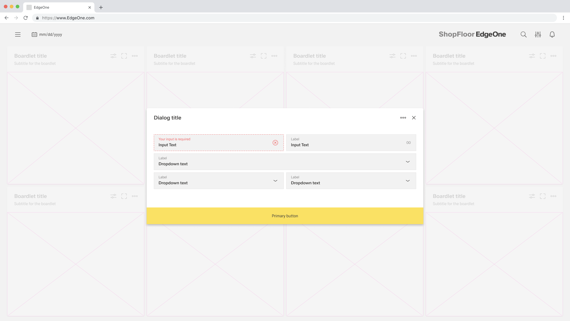
Validate user input before closing. When there are errors, leave the dialog open and highlight the affected fields. Show concise, helpful messages that explain what went wrong and how to fix it. For simple dialogs, it is acceptable to allow dismissal via close icon, cancel action, Escape key, or clicking outside the dialog. For critical or destructive actions, require an explicit button press. Consider disabling outside clicks to prevent accidental loss of data.
Button Placement
For more information, look in footerbar actions.
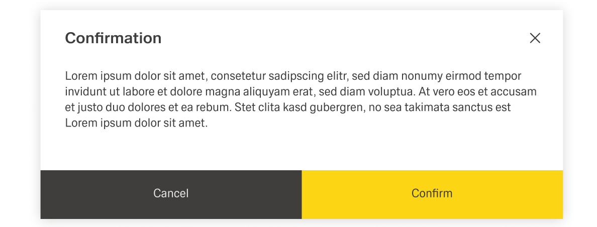
When placing buttons, Cancel is always the outmost left button option and the primary action is always the outmost right button. There should only ever be one primary action per dialog. Dialog buttons are always full bleed and attached to the bottom of a dialog.
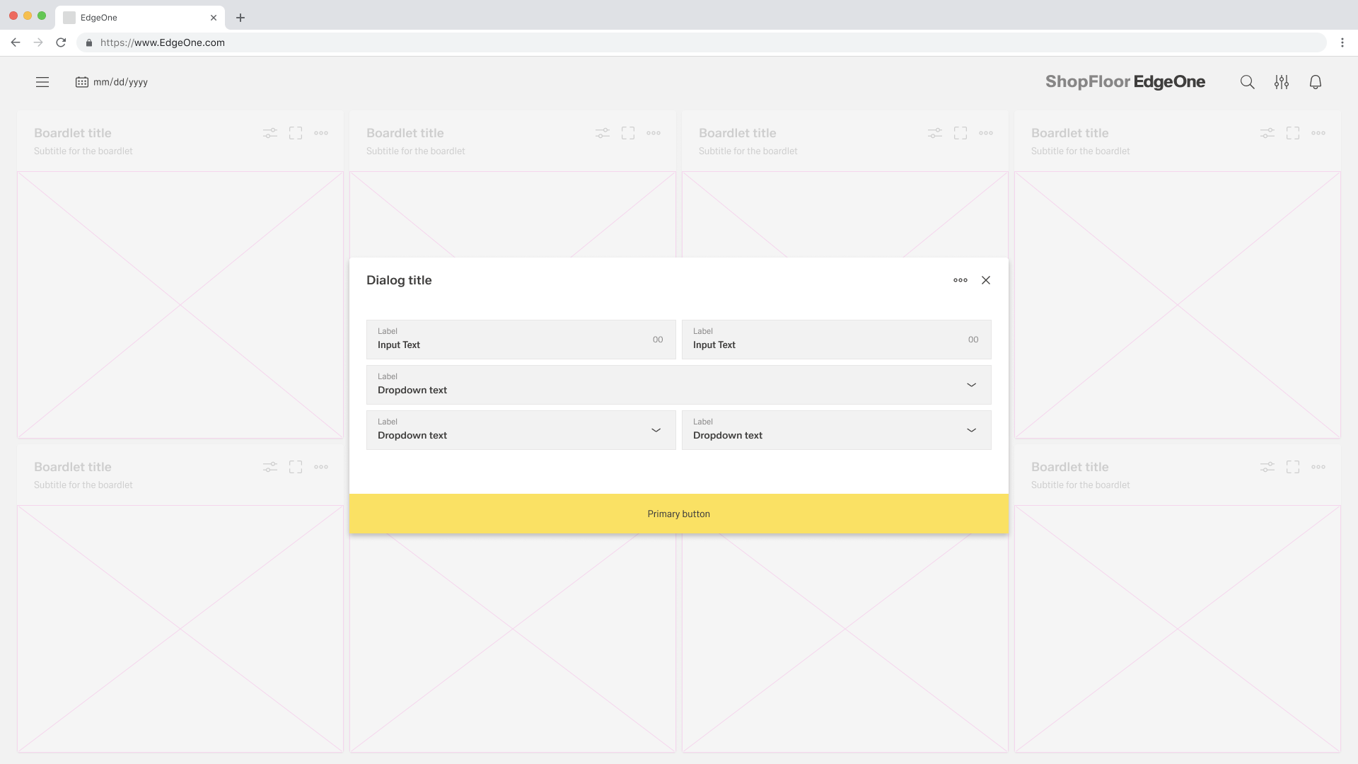
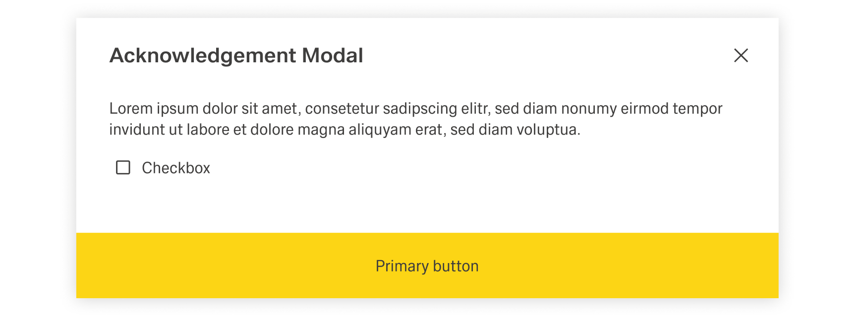
Single buttons are placed across the entire page. The single button format is most commonly used for confirmation dialogues. In most scenarios, a primary button is used when only one button is needed.
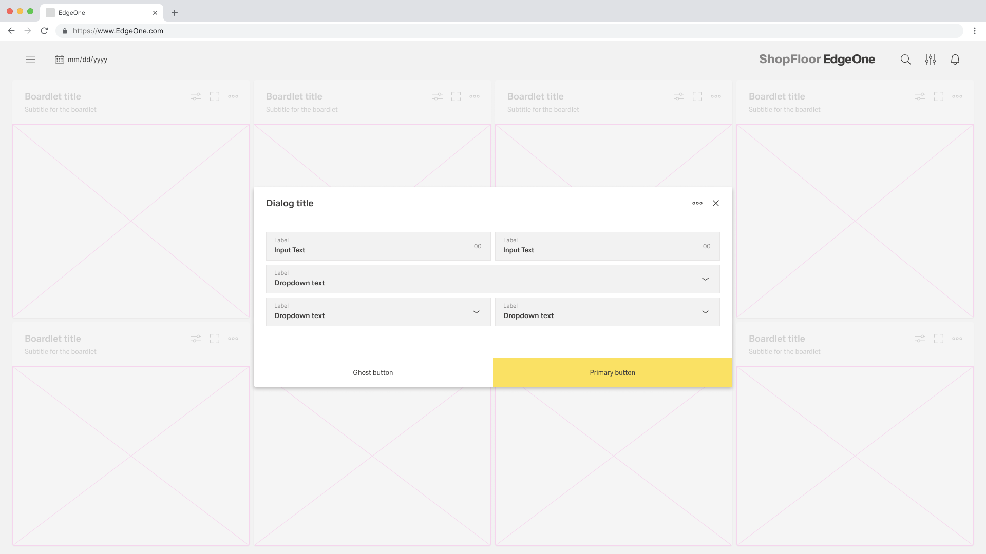
When using two buttons, the secondary or ghost button is on the left and the primary button is placed on the right. Each button spans 50% of the dialog and are full bleed to the edge.
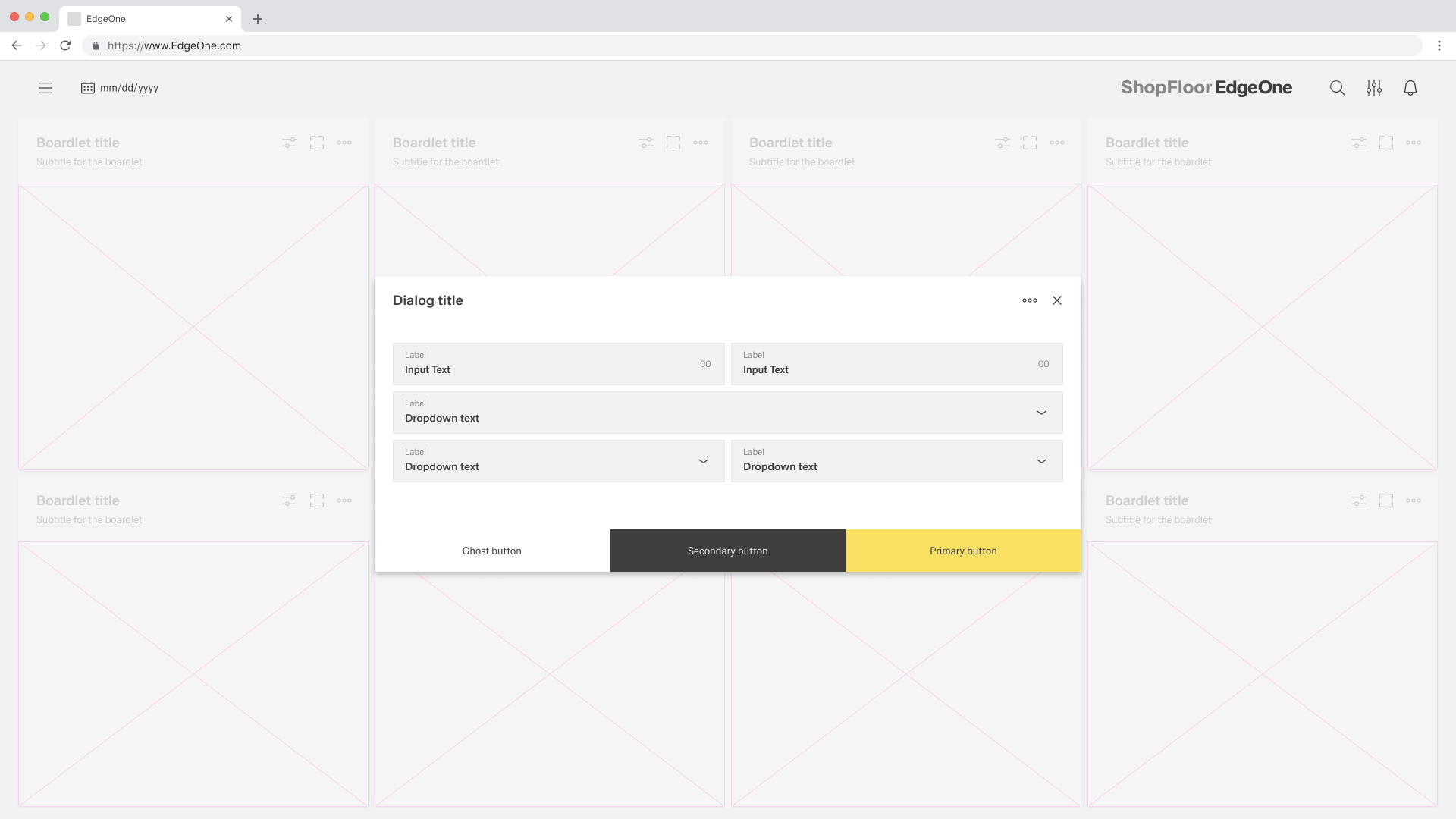
If three buttons are required, each takes up 33.33 % of the dialogue width. Only the rightmost button may be a primary button, the other two are secondary buttons. If all three actions have the same weight, all three should be secondary buttons.
Use Cases for Modals
Passiv
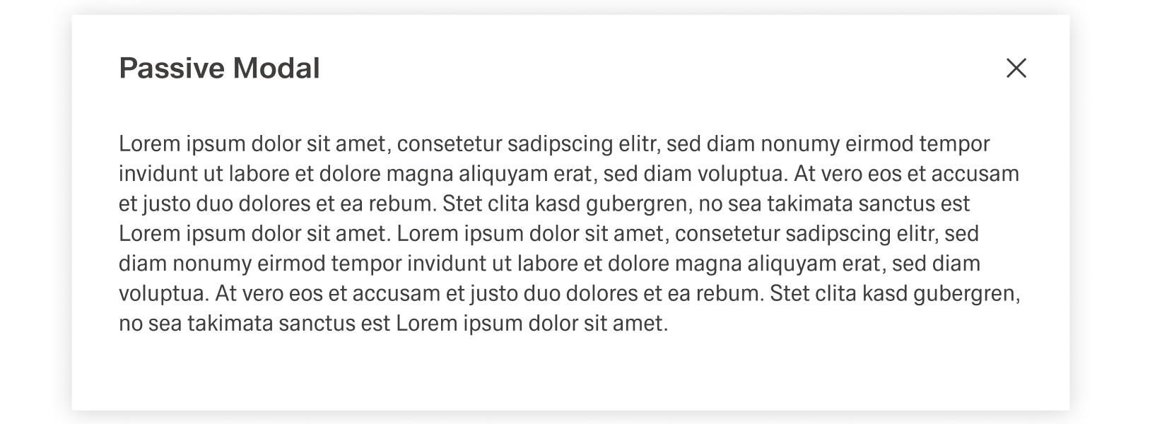
Passive modals present information the user needs to be aware of concerning their current workflow. It contains no actions for the user to take and should not include any data that needs to be submitted. They should serve as a type of notification alerting the user to urgent information such as reporting system errors or conveying a consequence of a user's action. [Link to Notifications]
Dismissing a Passive Modal
- X: Clicking the close c icon in the upper right will close the modal without submitting any data and return the user to their previous context.
- Click Elsewhere: Clicking outside the passive modal will Automatically close the modal.
- Esc: Pressing ESC on the keyboard will close the modal and send user to the previous context.
Active
Active modals are used to validate user decisions it to gain secondary conformation from the user. Active modals require an action to be taken in order for the modal to be completed and closed. It contains a cancel and primary action button.

Dismissing an Active Modal
- X: Clicking the close x icon in the upper right corner will close the modal and return the user to their previous context.
- Cancel Button: Clicking the cancel button will close the modal and return the user to their previous context. Cancel undoes all applied changes.
- Esc: Pressing ESC on the keyboard will close the modal and send user to the previous context.
Acknowledgement
Acknowledgement modals are used to validate user decisions or to gain secondary confirmation form the user. Transactional modals require an action to be taken in order for the modal to be completed and closed. It contains a cancel and primary action button.
Dismissing a Acknowledgement Modal
- X: clicking the close x icon in the upper right will close the modal without submitting any data and return the user to their previous context.
- Task Complete: clicking the primary action will complete the task and automatically close the modal.
- Esc: Pressing ESC on the keyboard will close the modal and send user to the previous context.
Focus
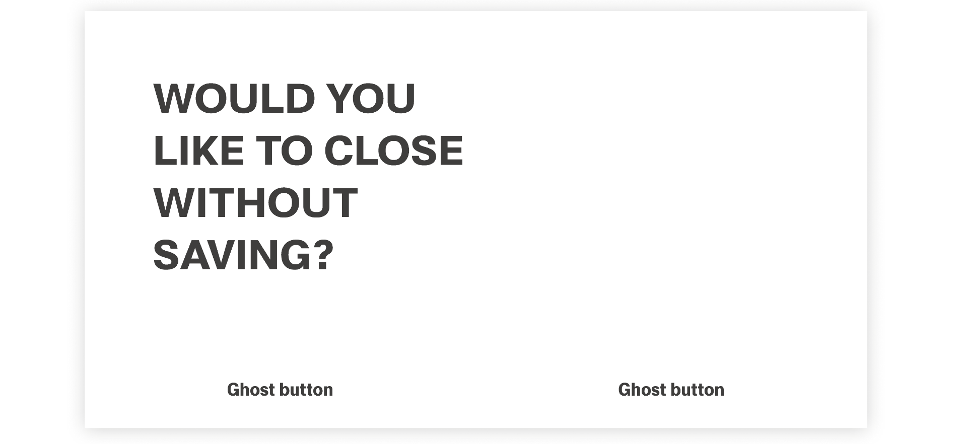
Focus modals are used to contain very important user decisions. The focus here is the focused headline. The focused modals have only ghost buttons. After confirming, the user will be informed about their conformation via inline notification.

Dismissing a focus modal
- Task Completion: clicking the primary action will complete the task and automatically close the modal.
- Cancel Button: clicking the cancel button will close the modal and return the user to their previous context. Cancel undoes all applied changes.