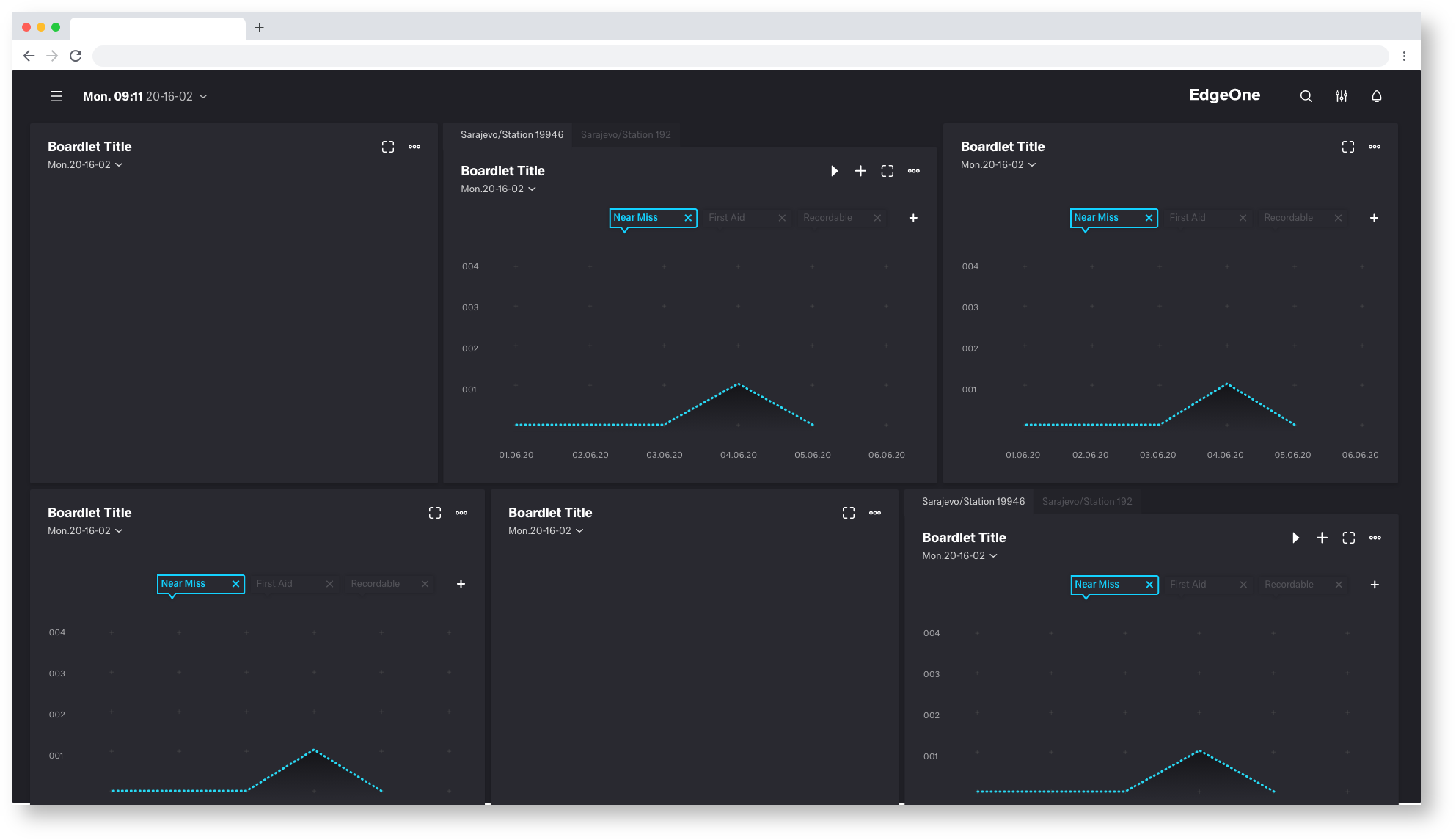
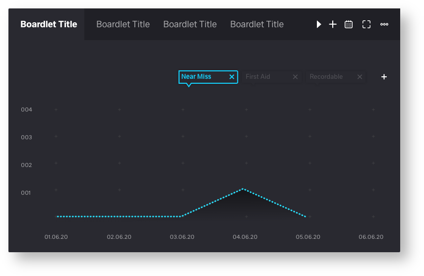
Within the boardlets a decision is necessary. Currently there is no uniform decision how the tabs inside the boardlets should look and work. On this page you can see different suggestions of tabs with advantages and disadvantages.
Layout 1 (UI/UX 1.Favorit)
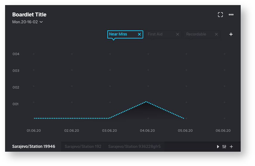
Tabs at the bottom of the boardlet.
| advantages | disadvantages |
|---|---|
• generally good overview and clarity | • Tabs can be overlooked. user may need to get used to them |
| • clean bordlet title, all components are easily recognizable. no confusion | • tabs could slip out of the visible area |
| • function icons placed on the respective components (toolbar, tab function icons) | |
| • time setting always in the same place |
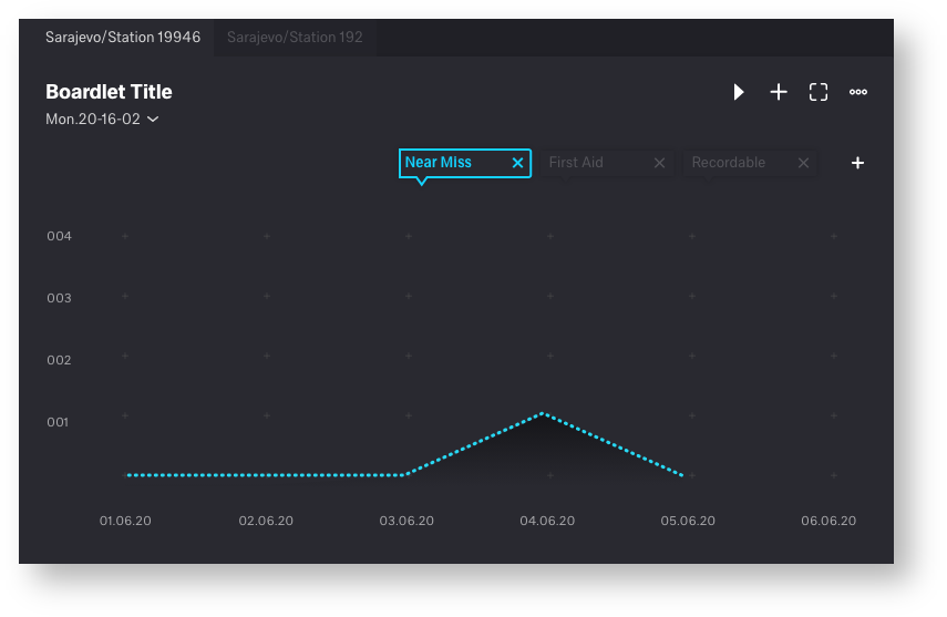
Layout 2
Tabs at the top of the boardlet.
| advantages | disadvantages |
|---|---|
• look and function learned from the web | • tab icons and toolbaricons (content function) mix together |
| • time setting always in the same place | • not the best visual solution, title could be confusing |
| • tabs always in the visible area | • strong misalignment of the title and therefore a dirty looking title (picture 1) |
Picture 1
Layout 3 (UI/UX 2.Favorit)
Tabs placed under a drop down

| advantages | disadvantages |
|---|---|
• generally good overview and clarity | • tab icons and toolbaricons (content function) mix together |
| • time setting always in the same place | • Tabs only become visible when you click on the drop-down |
| • clean bordlet title, all components are easily recognizable. no confusion | • strong misalignment of the title and therefore a dirty looking title (picture 1) |
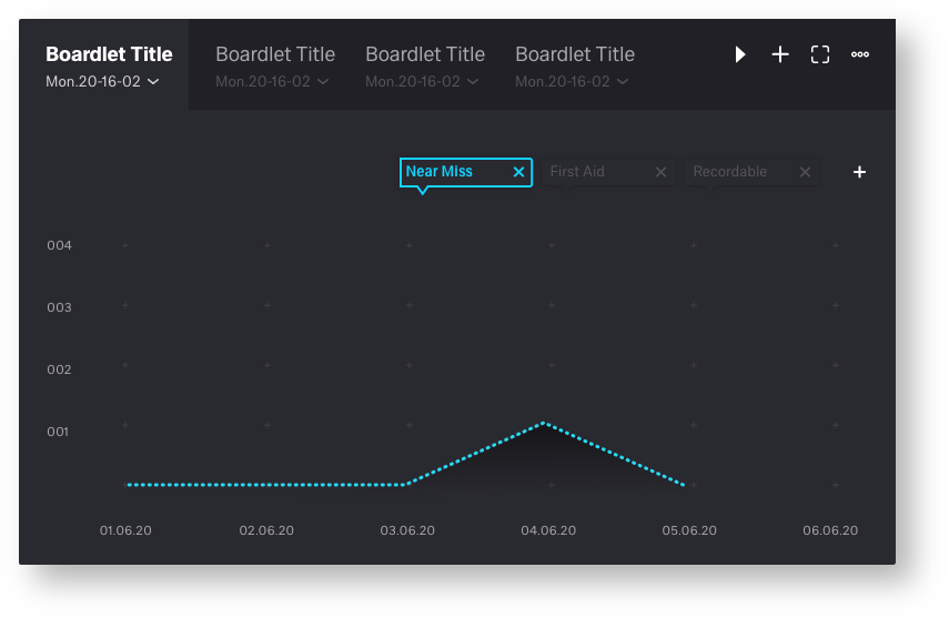
Layout 4
Bordlet title with timesetting as tabulator
| advantages | disadvantages |
|---|---|
• look and function learned from the web | • tab icons and toolbaricons (content function) mix together |
| • clean bordlet title | • each tab needs its own time setting dropdown |
| • Title requires too much space | |
| • Number of tabs is very limited |
Layout 5
Timesetting as icon in the toolbar
| advantages | disadvantages |
|---|---|
• clean bordlet title | • tab icons and toolbar icons (content function) mix together |
| • look and function learned from the web | • To mutch Toolbar icons |
| • not each tab needs its own time setting dropdown | • number of tabs is very limited |
19 Comments
Frank Fuchs[X]
Mar 09, 2020Ron Oemus I like option 1, but I agree, it's easy to miss the tabs on your first view of the boardlet. Maybe there is a "good" way to make the existence of tabs (at the bottom) a bit more prominent (a coloured frame around?, a better colour contrast?, ...). I am sure you will have some great ideas for that ...
Erwin Vervondel
Mar 09, 2020General functional decision to consider
In general:
Ron Oemus
Mar 09, 2020Thanks for feedback!
Erwin Vervondel agree, and for this we need a meeting. The Time must work for edgeOne and X-series.
if we don't need local (on the tab) time for the x-series we can decide that. but unfortunately i can't judge that. for that we need all products on one table.
for the dSFM we need lokal Time Setting.
Maybee we must go back to the Timesetting Icon in the Toolbar. That make the Job more Easy
Frank Fuchs[X] after we have decided that I can also perfect contrasts
Wannes Dhooge
Mar 09, 2020Hi Ron,
table 3 is not good, too confusing.
1 is the best, but feels unlogical, can we mix boardlet title + time in header and tabs underneath it? Those tabs are always part of the boardlet title no?
Shouldn't that be the most logical one?
or time selector besides the boarlet title?
Open for any suggestion
nice propositions by the way!
Christian von Stengel
Mar 09, 2020a few notes from my side:
Ron Oemus
Mar 09, 2020Christian von Stengeltotal agree! we need user tests for this i think
Wannes Dhooge can you send me a sketch. sounds for me more confusing. we fixed the problem in dSFM before. please letz have a meeting to find a solution.
Wannes Dhooge
Mar 09, 2020Hey Ron,
what I meant:
i just did a cut and paste off proposition 1:
In this case it would be that you have only one time selector which will work over all tabs
But it all depends on how you see a tab in the boardlet:
1) is it a variation of the same date to make it easy to switch (E.g. other machines but same data in this date-time range= quality graph per machine)
2) is it a variation of the same machine to make it easy to switch (E.g. same machine but different data in this date-time range= quality and production graph of same machine)
it could be that for both examples above the boardlet representation must/can be different to make it understandable. Thanks for your feedback
Ron Oemus
Mar 09, 2020hey wannes thanks for your feedback. I'm afraid your proposal has more disadvantages than advantages.
but this i think is a good point: "In this case it would be that you have only one time selector which will work over all tabs"
I will think about it. but it would mean putting the time setting in the icon bar.
1. the icons on the right side are too close together. this causes confusion
2. your points work well in objective but are not in all cases transferable from dSFM.
we can not fix the Problem in a chat! we need a meeting!!!!!!!!!
Wannes Dhooge
Mar 10, 2020Hey Ron, no problem at all, we arrange a meeting for this It is just sharing thoughts in these comments
thanks for the effort!
Sascha Ziegler
Apr 02, 2020I find the concepts presented here all very exciting. Currently, we have only built a tab container into eSFM, in which several boardlets can be packed. Place and time cannot be set individually. A variant of this container is the slider, where different boardlets rotate through.
These containers are required by the customer, this functionality must be fulfilled.
I talked to the consultants about this, the comparison between different time periods or locations can be interesting and would be used (For example to compare different shifts).
So in regards to an MVP I would prefer variant 5 at first and only in a later iteration I would see variant 1 as an extension of variant 5.
Wannes Dhooge
Apr 02, 2020Hey Sascha,
thanks for your reaction, you describe what my feeling is:
1) when having no need for a datarangepicker in a boardlet (because all the boardlets use one and the same datarangepicker in the header) the tabs on top are more natural
2) when one or more boardlets need a datarangepicker the tabs below are more natural.
so we realy should have a discussion about this and perhaps we just have to make 2 different ways of handling tabs?
Something for our next UI/UX-meeting?
This is important for DSFM, some x-series and especially the UPW where we could mix easily boardlets with and without daterangepickers.
to be discussed
Jutta Schenck
Apr 09, 2020I had to look at the content of boardlets again. Boardlets and QDA modules will fit together. When changing a QDA modules, time settings and other data are taken over as filter suggestion.
QDA expample

Time and data filter

I wondering what the boardlet time is: 1) local time in my Chinese plant or 2) data filter (start or end time?)
Wannes Dhooge
Apr 14, 2020Hi Jutta,
Thanks for your feedback! It seems to be that we can define two different sub-questions we have to answer with this tabs discussion: How do we handle:
1) Tabs when having also a specific data-range picker at the boardlet (and/or specific filter attributes)
2) Tabs when having a general data-range picker in the header (and/or general filter attributes)
→ I added the Filter attributes because we sometimes will have the need to add one or more filter criteria at a boardlet
Can everybody agree on this?
So we should find a way to cover multiple scenario's in an alligned design or try to make different designs and let them feel as natural as possible?
Let's discuss this upcoming Thursday
Frank Fuchs[X]
Apr 14, 2020Hi Jutta,
I hope you had a nice Easter, too.
Unfortunately, the boardlet requirements are not well documented. They were developed along the requirements for dSFM.
If you or the UX/UI guild have such questions, please directly contact Michael Matejko (Silevis) - he is fine with that.
Christian von Stengel
Apr 20, 2020Ron Oemus
where are we on the decision for "Tab"?
I have somehow lost track. Sorry.
fyi: Erwin Vervondel/ Olaf Lummer
Ron Oemus
Apr 20, 2020Frank Fuchs[X]
Apr 20, 2020Hi Ron,
I like it.
But I am not sure if we need to make it more prominent (more easily visible) that there are tabs available.
Wannes Dhooge
Apr 20, 2020Christian von Stengel
Decisions has been made in the last meeting of the UI/UX guild to agree on "Tabs at the bottom of the boardlet"
After that decisions Ron was about to tweek his last proposal a little bit which results to mp4 above.
regards, Wannes
Oliver Prudlik
Apr 20, 2020Nice work!
We also talked about highlighting the tabs a bit more.