1. Toolbars actions
Toolbar actions are an important part of the action placement. These actionbars within the boardlets control functions of the content as well as the boardlet itself. Toolbars can also be used in rows of tables, here they always control functions of the entire row.
Actions are always represented by action icons within the toolbar. Actions can also be grouped, e.g. if the actions exceed the maximum number of allowed action icons within the toolbar. In this case a group icon is placed in the toolbar and all actions are listed in an overflow menu.
Toolbars are found in different organisms and have partly different rules,
depending on the field of application of the respective organism.
| Category | Organismen |
|---|---|
| 1.1 | Header toolbar |
| 1.2 | Boardlet toolbar |
| 1.3 | Ghost Boardlet toolbar |
| 1.4 | Card toolbar |
| 1.5 | Dialog toolbar |
1.1. ID2 Header toolbar:
Contains actions that affect all applications or the entire user environment. The number of actions in the header toolbar may vary within the applications. A distinction is made between primary and secondary actions. Primary actions must always be available in the header. Inside the header/right toolbar you will find the name of the application the user is currently in.
| Primary | Secondary |
|---|---|
| Burger | Datepicker |
| Setting | Search |
| EdgeOne Wordmark | Notification |
| Application name | Breadcrumb |
| Home |
x
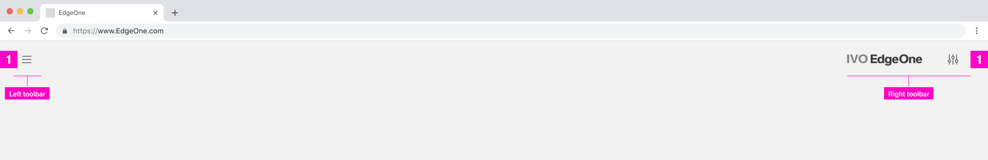
1.1 Header Toolbar with primary actions
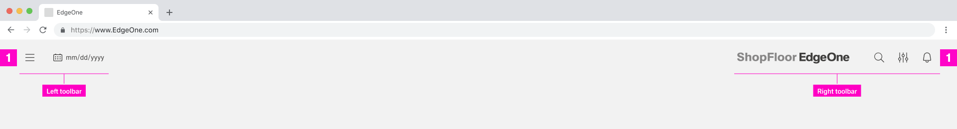
1.1 Header Toolbar with primary and secondary actions
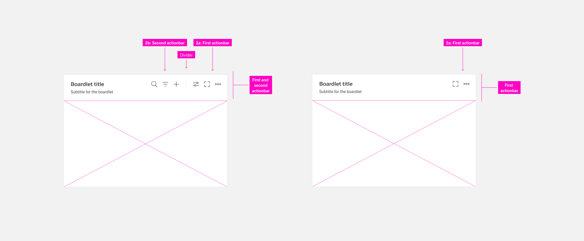
1.2 ID3 Boardlet toolbars:
Every boardlet has a toolbar/actionbar. This toolbars are always located on the right side of the boardlet. They contain actions that affect the entire boardlet within the content.
Page-level toolbars remain constant and do not depend on selections or interactions on the page. Page-level toolbars are optional.
The toolbar can exist in two variations:
1.2a: First actionbar contain actions that affect to the boardlet
1.2b: Second actionbar contain actions that affect to the content
 1.2 Boardlet Toolbar
1.2a. First Actionbar
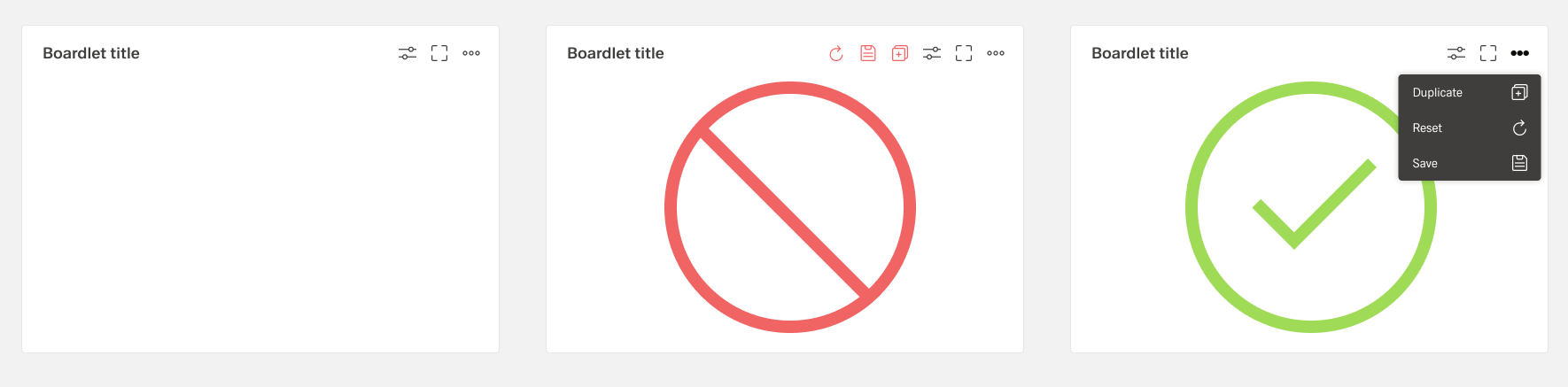
Never place more than three actions per toolbar. If it is necessary to place more than three actions in the boardlet, they are grouped and can be found under the "more" icon. Grouping is always done with the help of an overflow menu.
 1.2a First actionbar / maximum icons
The actions of the toolbar are divided into primary and secondary. A boardlet must always have the "more" action. The number of secondary actions is not limited. But it is recommended not to place more than 8 actions, because otherwise the overflow menu becomes too long. this can disturb the clarity. But this is not expressly forbidden.
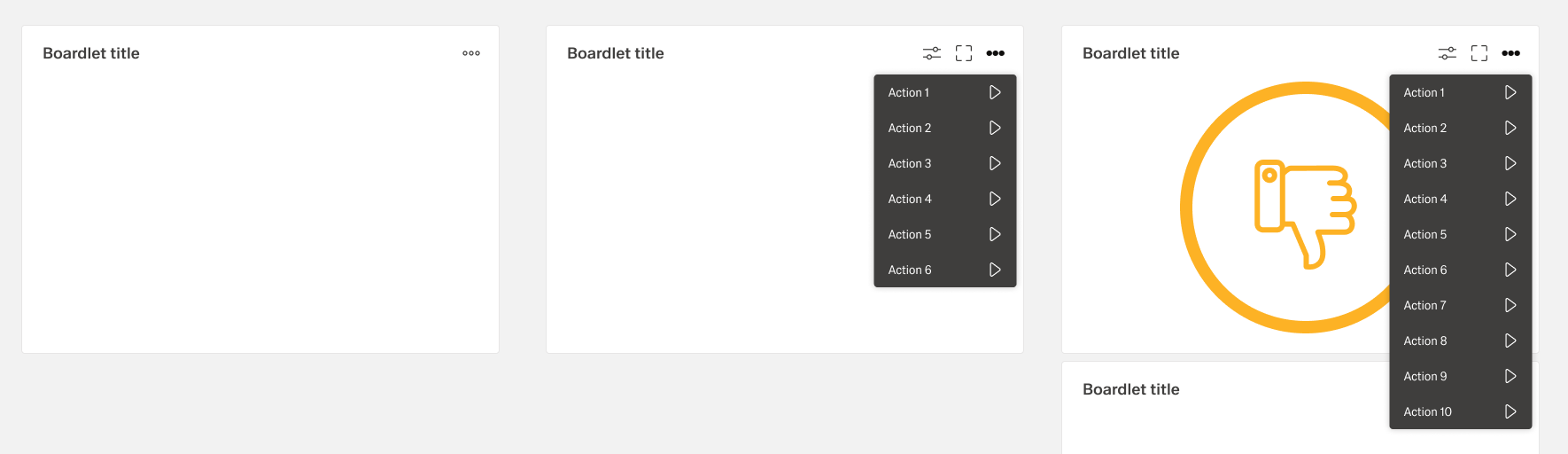
1.2a First actionbar / overflow icons
1.2b. Second Actionbar
The second actionbar is always separated from the first actionbar by a dividing line. The second actionbar contains only actions that can be performed on the content of the boardlet. E.g. filtering and sorting the content, search, adding etc. The second actionbar never be used without the first action bar. This also breaks the rule of A boardlet must always have the "more" action.
1.2a First with second actionbar
1.3 Ghost boardlet toolbar
The Ghost boardlet toolbar follows as a child the boardlet in its rules. The only difference is that the first actionbar has only one More icon.
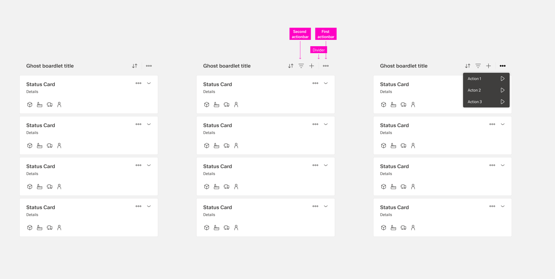
1.3 Ghost boardlet toolbar
1.4 Card toolbar
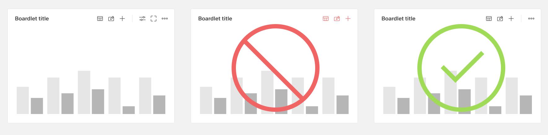
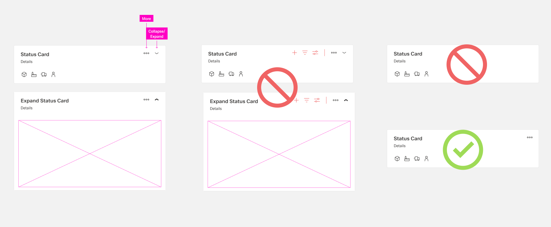
Cards do not have a first and second toolbar. Since this is not necessary from the current point of view. Within all cards only two actions are allowed, more and expand/collapse, if the card has this function. A card must always have a more icon.
1.4 Card toolbar
1.5 Dialog toolbar
The Dialog Toolbar, as a child of the Boardlet Toolbar, follows its rules. However, the viatiante Dialog with Sidebar is an exception. In case a dialog has a sidebar, the first actionbar must be placed in the outer right area of the sidebar. his ensures that the user notices the difference between dialog functions and content functions.
1.5a Toolbar at the single dialog
1.5b Toolbar at the dialog with sidebar
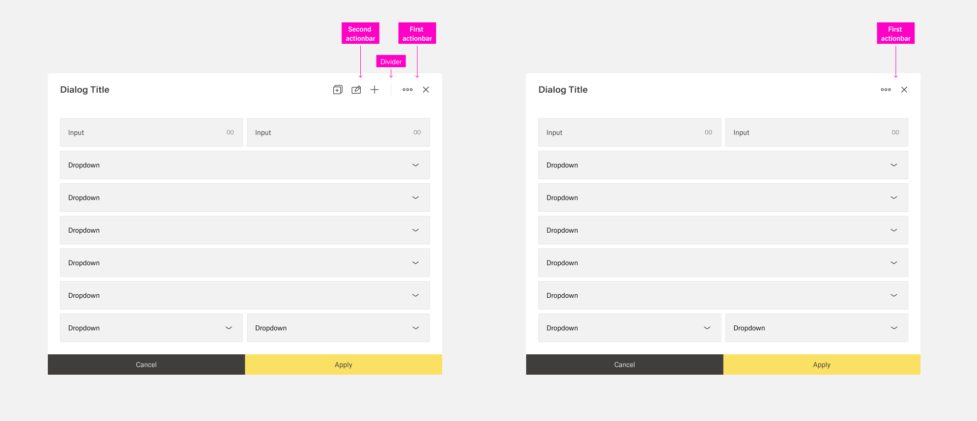
1.5a Toolbar at the single dialog
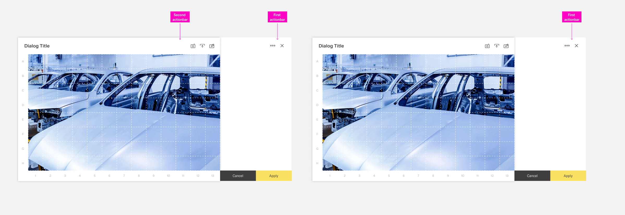
1.5b Toolbar at the dialog with sidebar
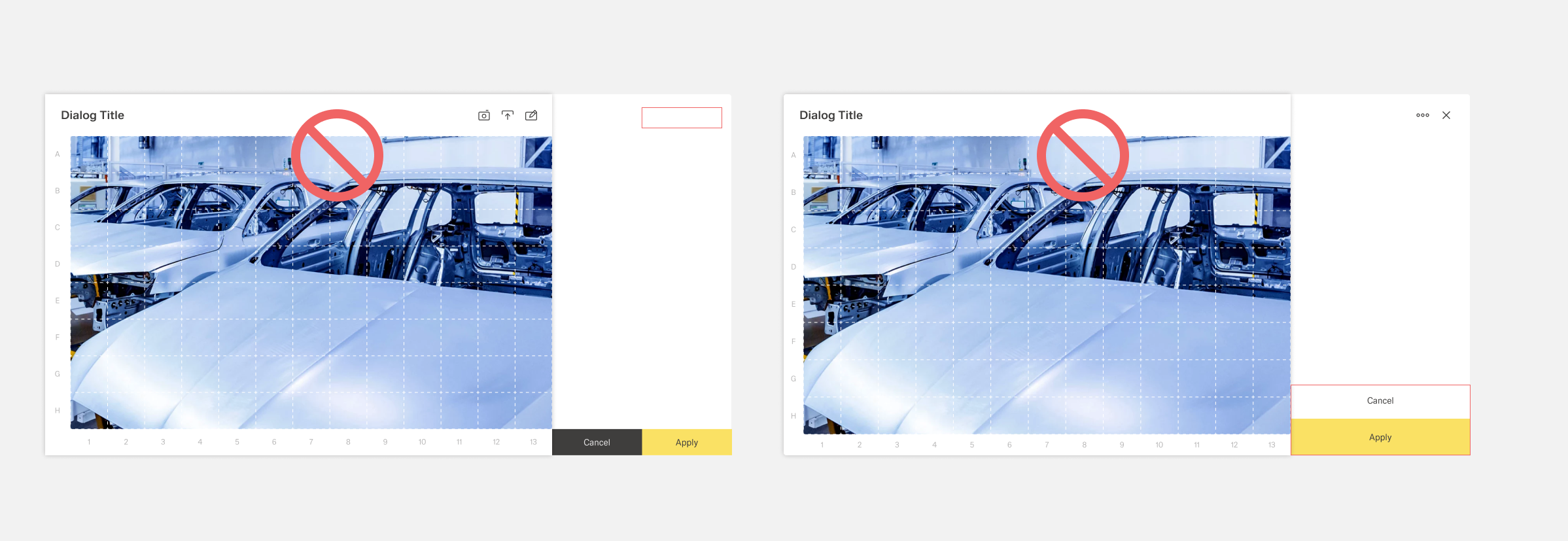
Dialog toolbar dont's
2. Footerbar
The footer bar always controls the workflow of the organism it is placed in. Within the footerbar, tabs, buttons as well as actionbars can be placed, depending on the use case of the organisms. The actions related to the workflow are always located at the bottom right of the boardlet. the hirachie moves from the bottom right to the bottom left.
The footerbar may be used within the organisms only in the following combination. The footerbar has a fixed height and may never be multiline.
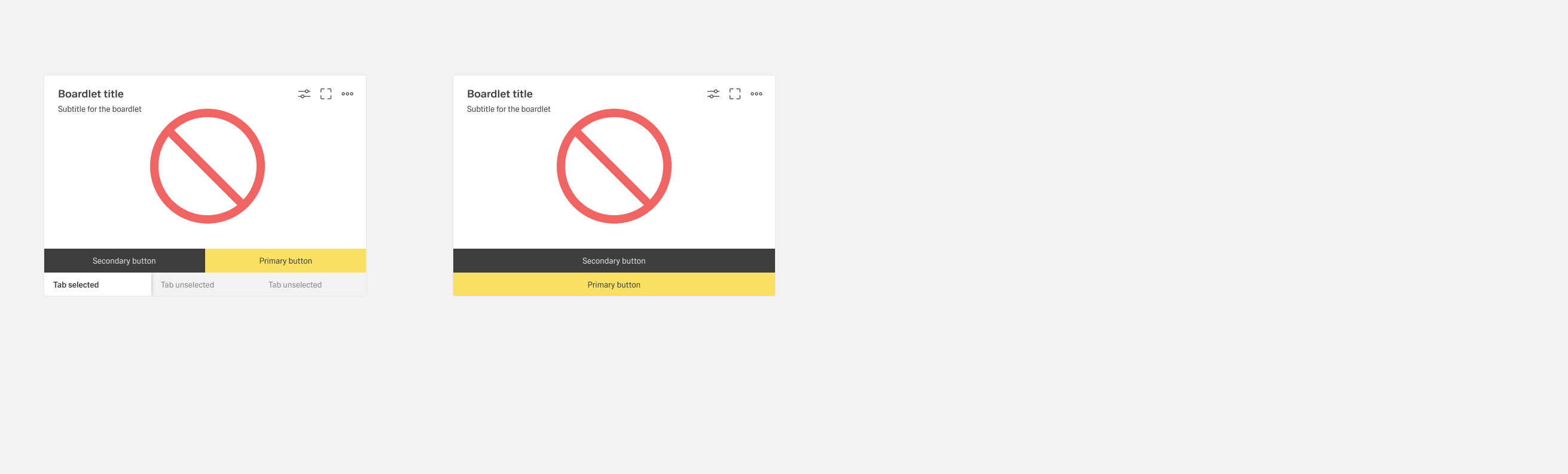
2.a. Tabs only
Boardlets with tabs are one of the primary display options. the tabs are arranged side by side, there is no default number of tabs within the boardlet.
2.b. Tabs with buttons
Boardlets with tabs and buttons are one of the primary display options. this display is used as soon as the boardlet has multilayer content as well as a contentaction. in case the action is only available in one tab, it will be displayed disabled in all other tabs. this is necessary to avoid unpleasant jumping back and forth of the molecules within the organism.The number of possible actions is limited to a maximum of 2 buttons.
2.c. Buttons only
Boardlets with buttons only are one of the primary display options. This representation can be used in case an action is required in the boardlet. The number of possible actions is limited to a maximum of 2 buttons.
2.d. Tabs with actionbar
Boardlets with tabs and a actionbar are one of the secondary display options. This combination can be used in the kiosk mode and enables the control of the tabs.
E.g. the rotation of the tabs as well as time control of the rotation.
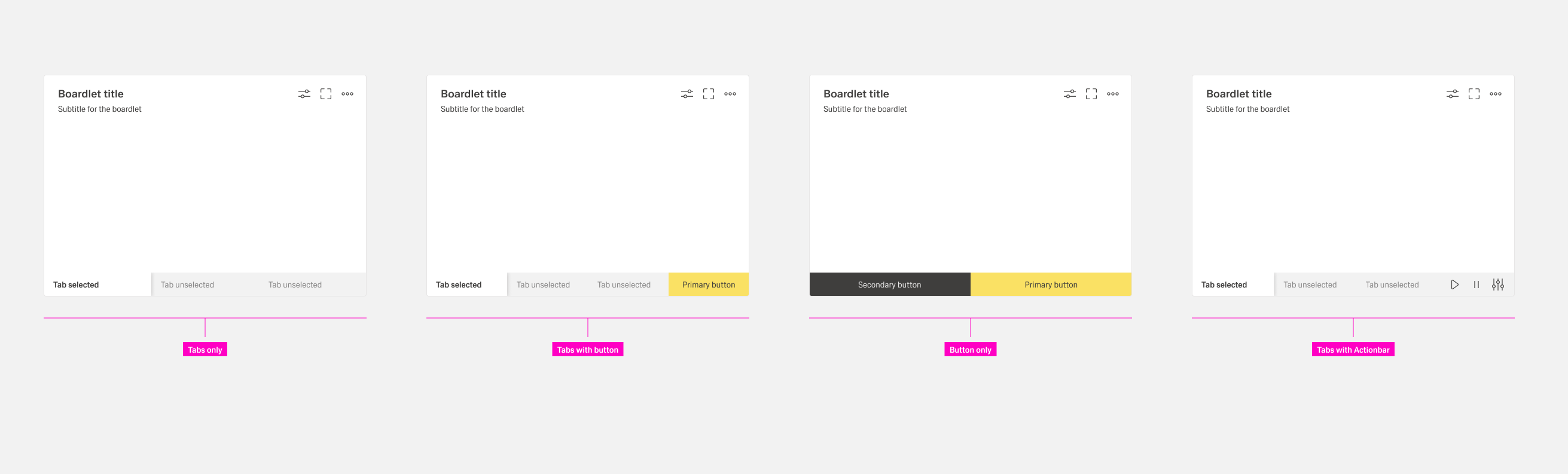
Footerbar cominations
Footerbar dont's
Footerbars are found in different organisms and have partly different rules,
depending on the field of application of the respective organism.
| Category | Assets |
|---|---|
| 2.1 | Dashboard footerbar |
| 2.2 | Boardlet footerbar |
| 2.3 | Dialog footerbar |
| 2.4 | Modal footerbar |
| 2.5 | Tooltip footerbar |
2.1. Dashboard toolbar:
Must be created in the next interation.
Function, rule as well as whether it will be used within Inspire is not yet finally decided
For dashboard or application actions please consider 4.a Dashboard Controls.
2.2 ID3 Boardlet footerbar:
Each boardlet has the possibility to use a footer bar. All 4 different combinations are allowed. The combination d. (tabs with actionbar)can be used in the kiosk mode and enables the control of the tabs. E.g. the rotation of the tabs as well as time control of the rotation.
2.2 Boardlet footerbar
2.3 Dialog footerbar:
Dialog Footerbars may only be used in the combinations 2a., 2b. , 2c. can be used. In case the dialog has a sidebar, the footerbar goes over the whole width. the buttons must not be wider than the footerbar. this also applies to combinations with 2 buttons.
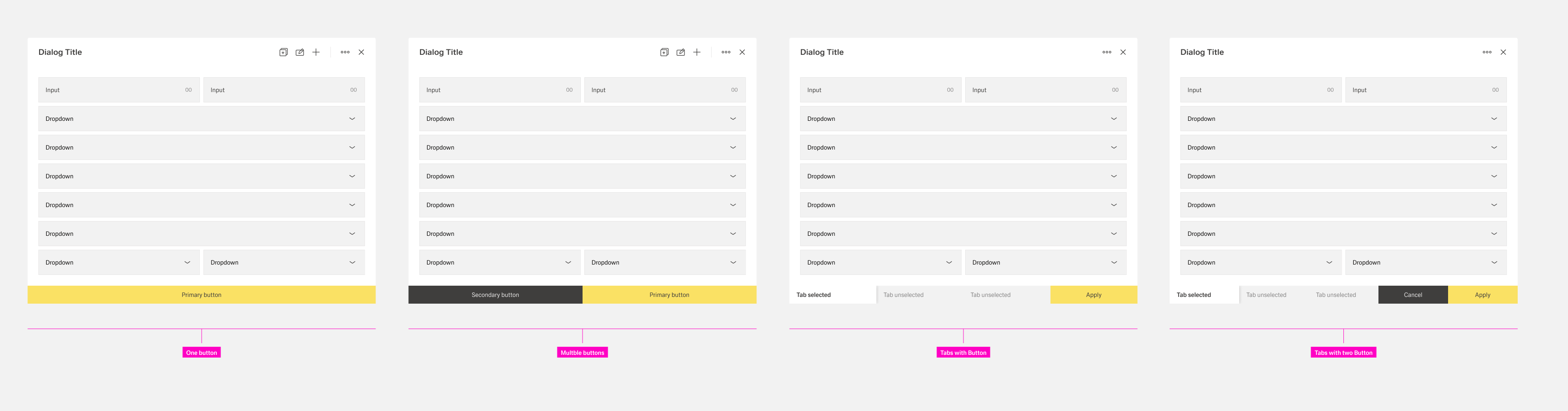
2.3 Dialog footerbar
2.3 Dialog with sidebar footerbar
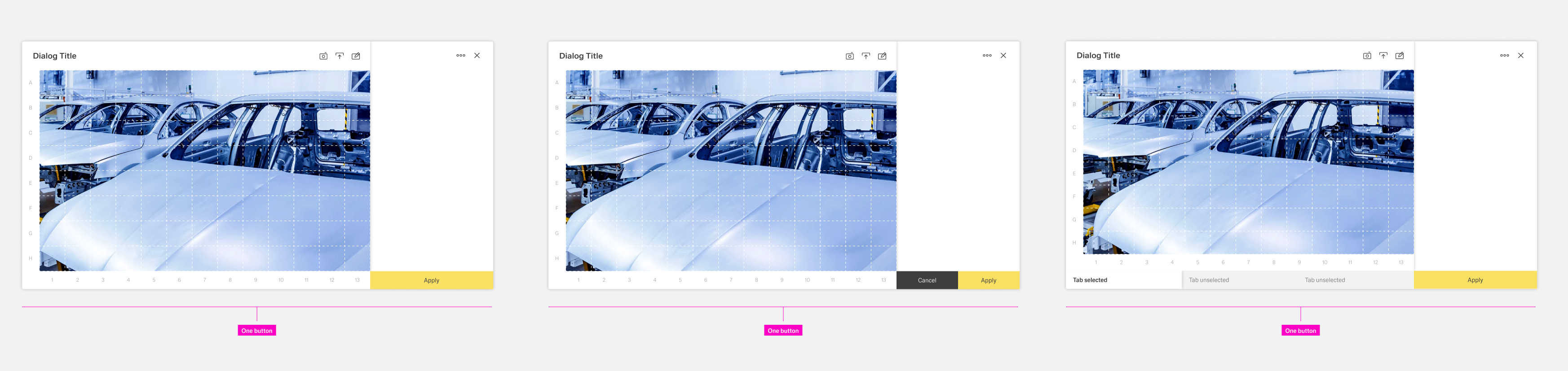
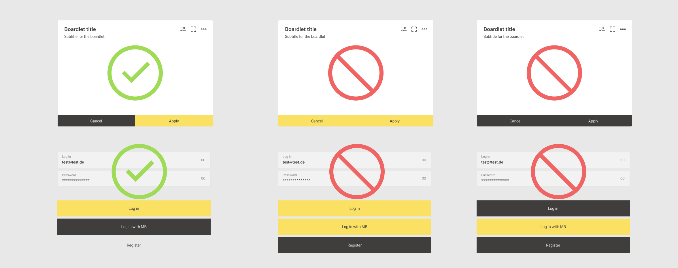
2.4 Modal footerbar:
The modal allows only one footerbar combination, only buttons. But it is up to the designer which combination of the different buttons he chooses. important is only the height of the buttons, primary buttons are always on the right.
Lowest hirachie | Medium hirachie | Highest hirachie
 2.4 Modal footerbar
2.5 Tooltip footerbar:
...
3. Content actions
Within Inspire, we use the term content actions to refer to all actions that are located in freely selectable content, e.g. in the content area of a boardlet, dialog or modal organism or free standing content. We categorize the content actions into 3 groups:
3.a. Inline Actions
These are actions that consist of one or more actions and other molecules. The action molecule/organism is not enclosed by a body.
All molecules or organisms follow a basic rule: the action is always on the left inside of the molecule/organism.
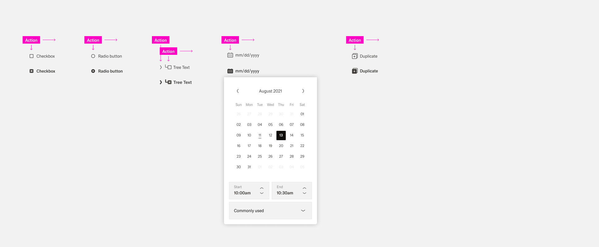
3.a Content action/ inline action
3.b. Actions
These are actions that consist of one or more actions and other molecules. The action molecule/organism is not enclosed by a body.
All molecules or organisms follow a basic rule: the action is always on the left inside of the molecule/organism.
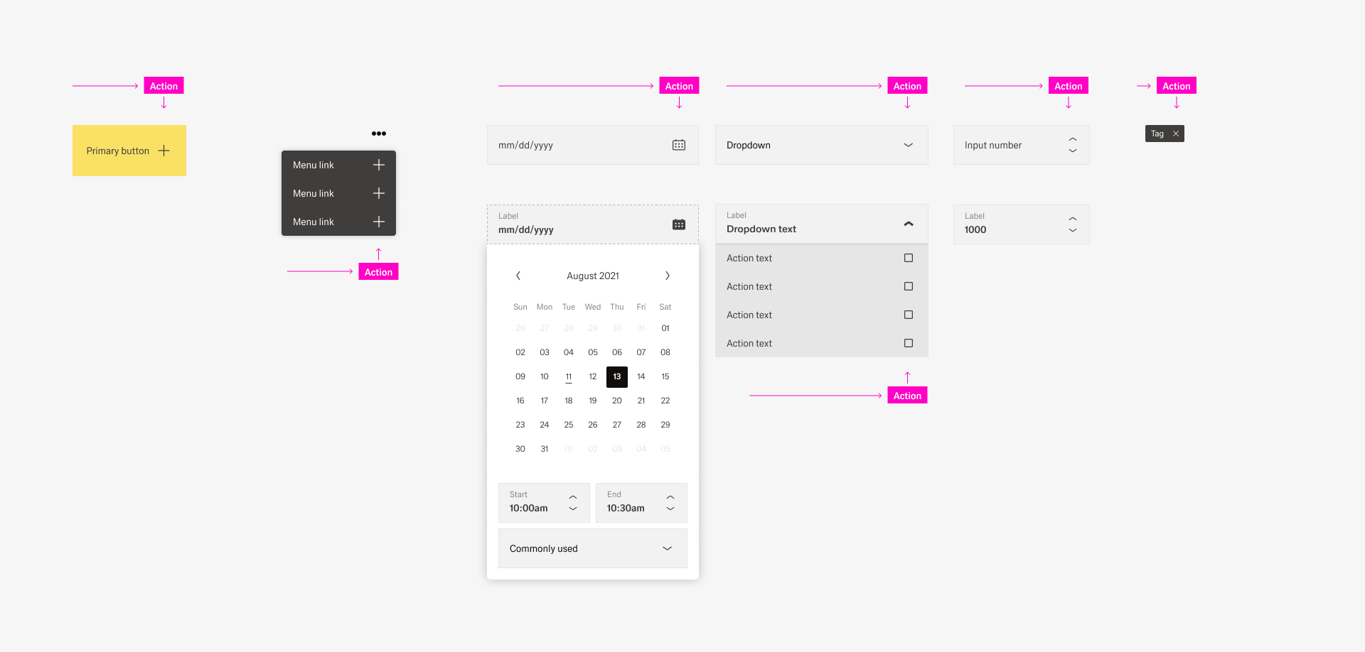 3.b Content action/ actionS
3.c. Table Actions
Michal Kulesza can you please paste your rules here
4. Common actions
Common actions frequently appear across different components and workflows. For platform consistency, these actions should only be applied in the ways described below.
4.a Dashboard Controls
A dashboard control could controls the possition of the user within a dashboard, the user can move forward and backward in a process. Furthermore, additional functions can be activated, paused or stopped for the process. It is important that these processes affect the entire dashboard.
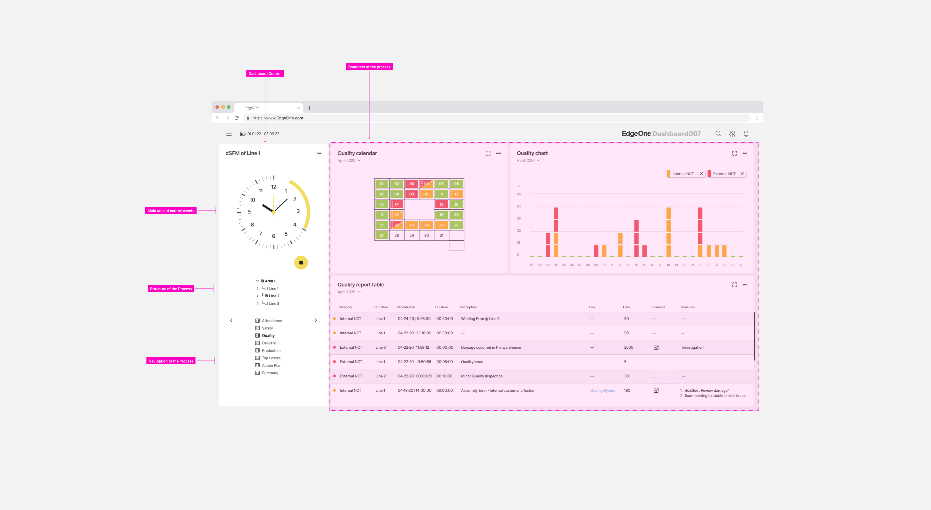 4.a. dSFM Cockpit
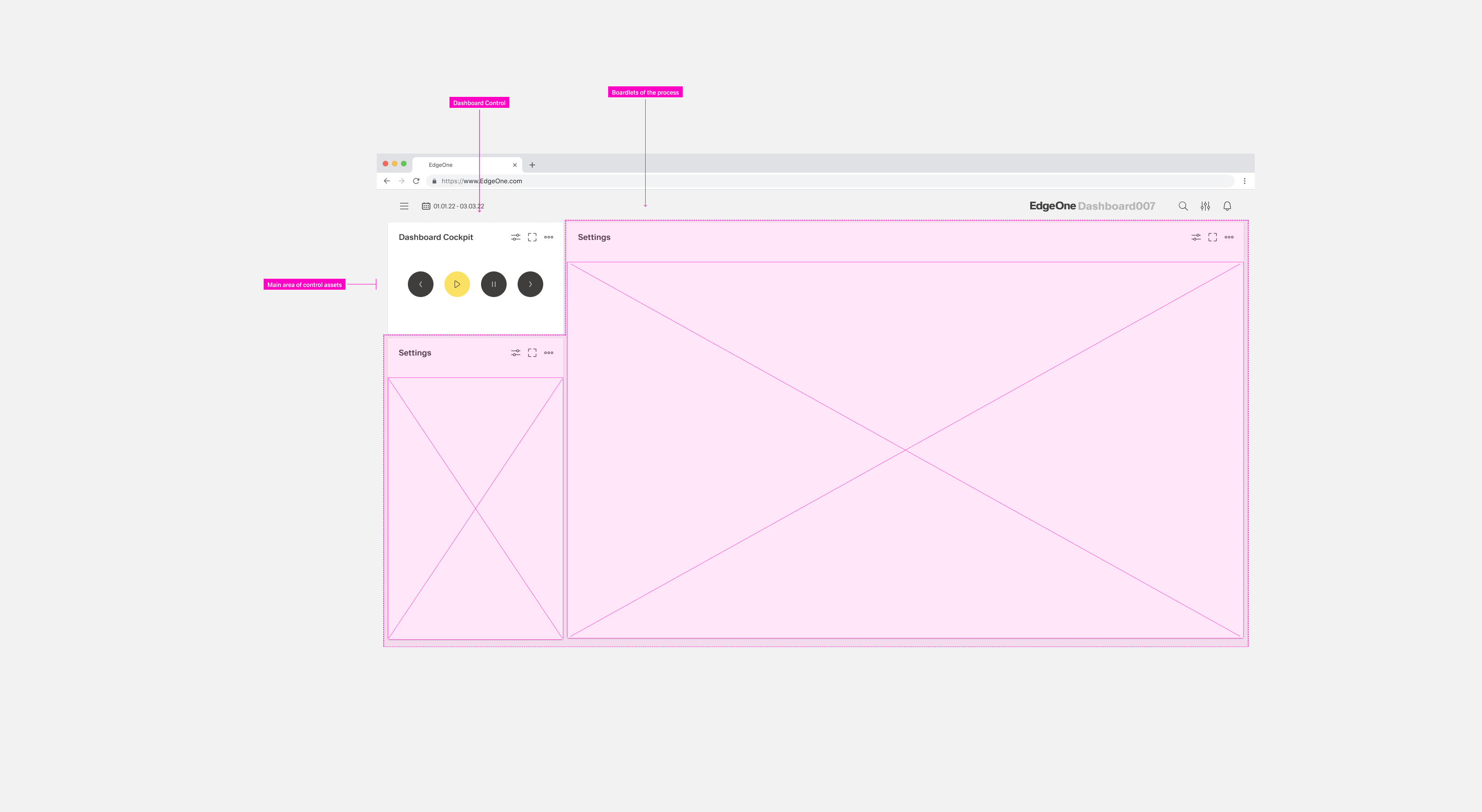
4.a. Common Control
4.b
Comming soon
https://www.carbondesignsystem.com/patterns/common-actions/
5. Hirachy and alignment of actions
The buttons follow a hierarchical order. It is important that you create a visual hierarchy between the buttons in your user interface. The hirachie moves linearly from right to left.
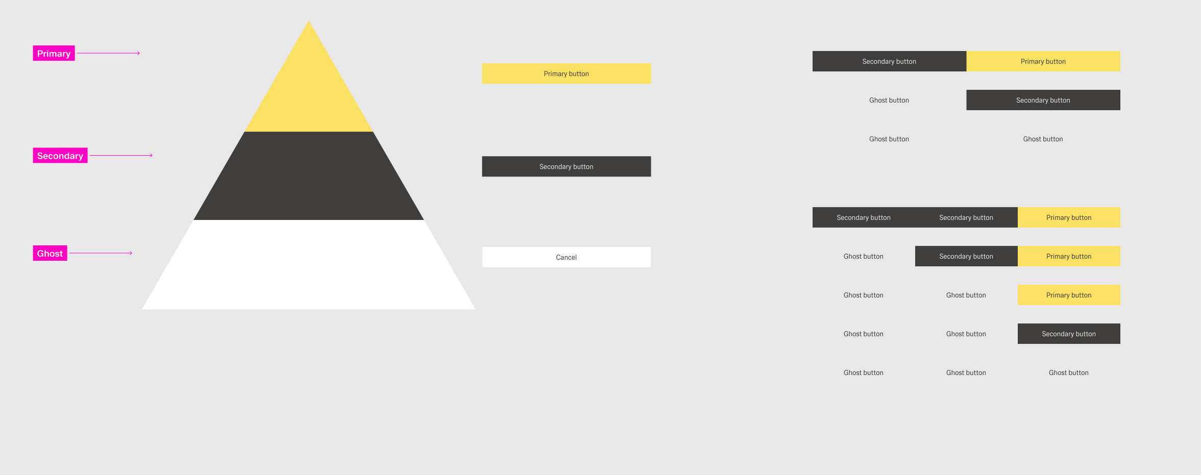
| Type | What you need to know | Examples | Style |
|---|---|---|---|
Primary |
| Edit |
|
Danger |
| Delete |
|
Secondary |
| Copy Cancel |
|
Negative Path |
| Close (for modal dialogs) |
|


Top Tips
General
- Place actions as close as possible to the content they affect – usually in a toolbar or, if needed, directly in a form or table row.
- In toolbars, always right-align.
Action Order in Header Toolbar
Use the following order:
- Business actions (such as Edit, Delete)
- Manage content (such as Filter)
- Manage layout (such as viewing a panel in full screen mode)
- Generic (such as Share)
Recommended: Always place the action that is most important for your business context on the very left, even if the action belongs to a group further to the right.
Action Order in Footer Toolbar
Use the following order:
- Primary workflow/finalizing action leftmost (such as Post)
- Secondary actions (such as Return)
- Negative path actions (such as Cancel)
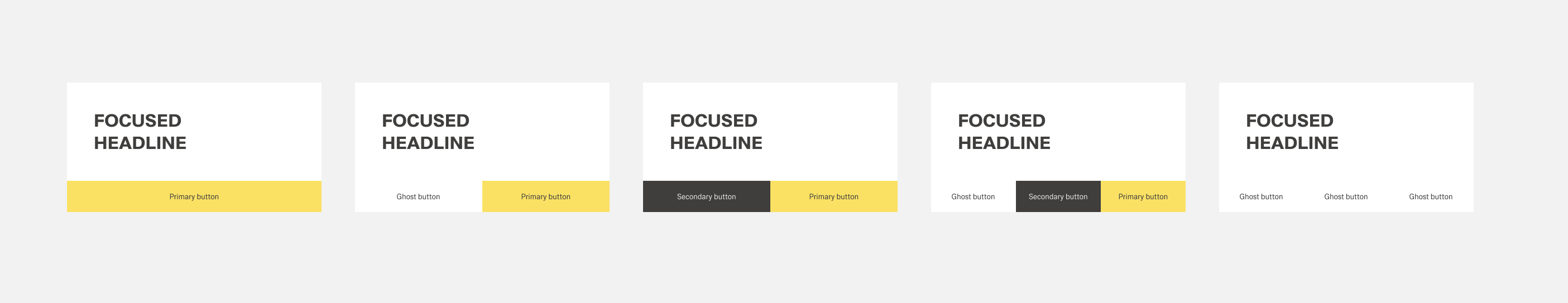
Primary Action (Emphasized)
- Use only one primary action per page.
- Show a primary action or a semantic action, but never both.
Style
- To help the user quickly identify primary, secondary, and negative path actions, apply the correct visual styles.
For more information, see Action Types.
Related Links
Enable / disable / hide actions: UI Element States
Buttons:
- When to use text buttons or icon buttons: Button – Components
- Guidelines for text and icon buttons: Button – Guidelines
- Standard action labels: Terminology for Common Actions
Toolbars:
- Toolbar Overview
- Footer Toolbar
- Table Toolbar
- Chart Toolbar
- Header Toolbar