A dialogue is a interaction between the system and the user. It is prompted when the system needs input from the user or to give the user urgent information concerning their current workflow. There are two types of dialogues, modal and dialogue.
Overview
dialogueues work best when used for short tasks or to direct the user to task-relevant information. dialogues are useful in many scenarios; they are less confusing than navigating a user to a new page for simple tasks or to gather knowledge. However, dialogues are annoying and can distract the user. Use them only for the most necessary interactions.
A dialogue is triggered by an action of the user, appears above the main content of the page and remains until it is closed. The purpose of a dialogue should be immediately apparent to the user, with a clear and obvious path to completion.
Dialogues or modules always have an overlay. The overlay has the same colour as the BG of the dashboard, but only in 70% transparency. The entire background behind the dialogue or modal is 15% blurred. The header of the dashboard is always excluded.
Anatomy
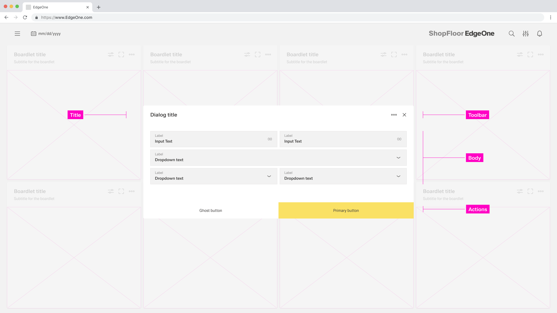
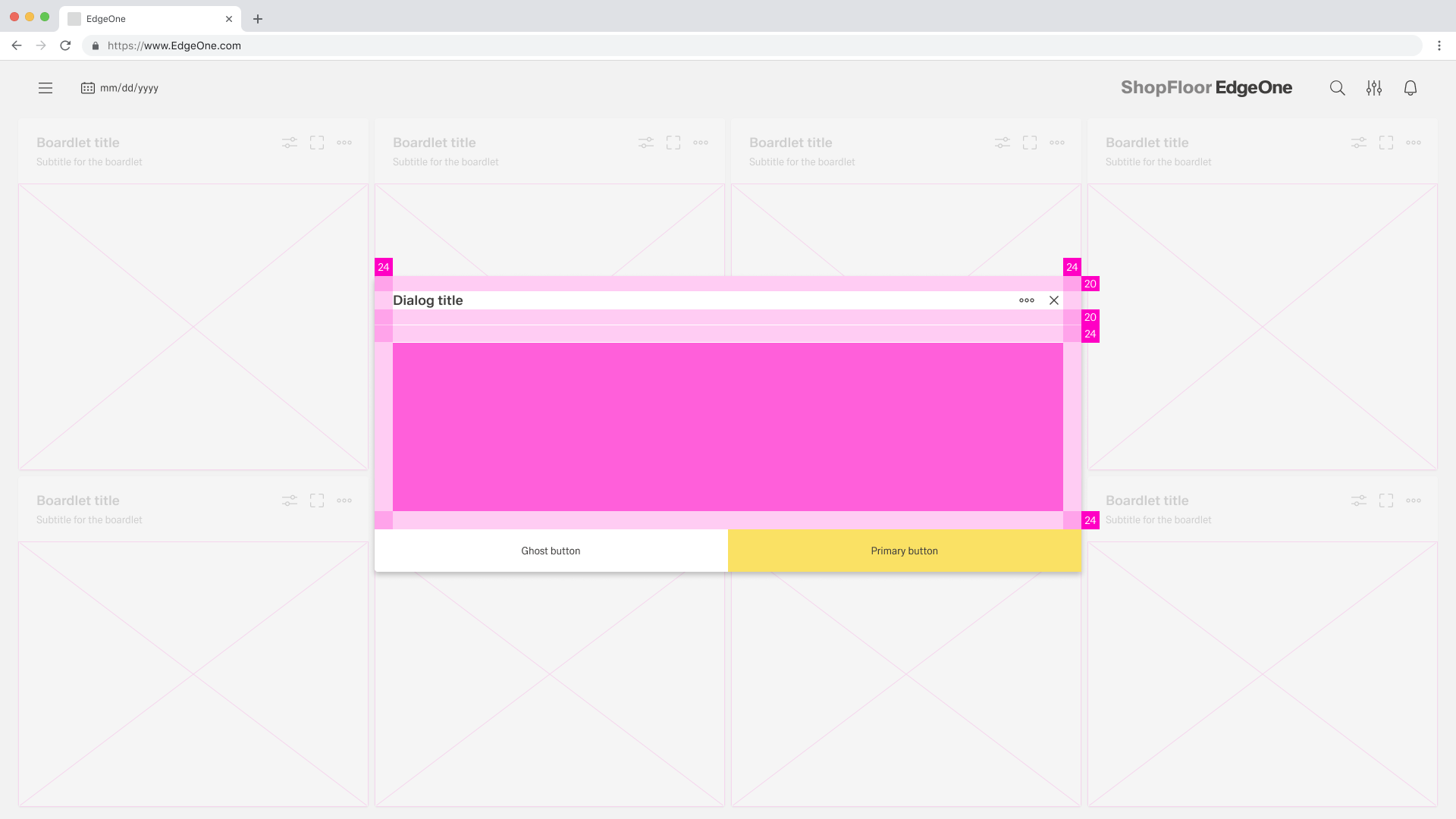
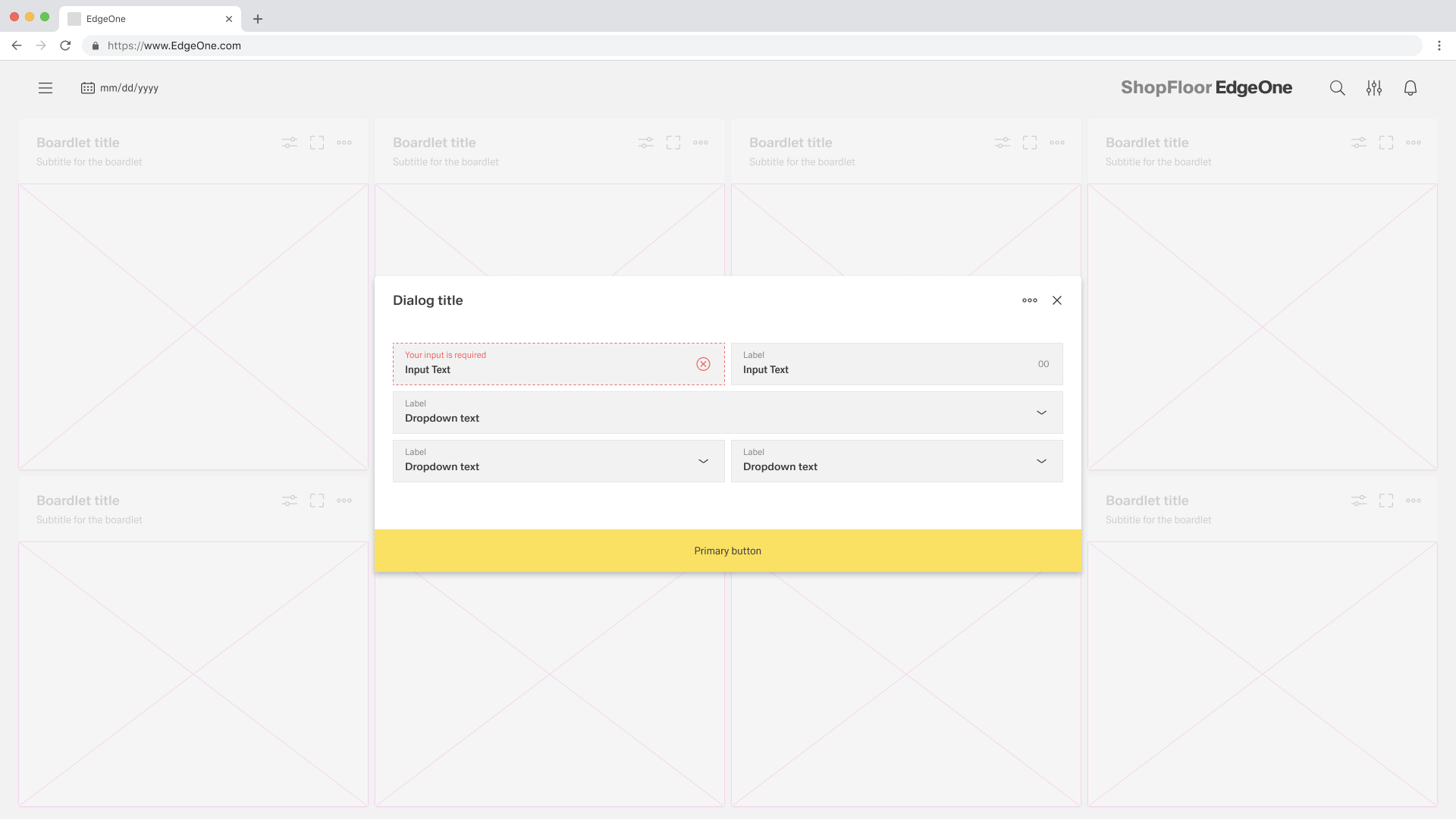
Title: The title should be brief and clearly describe the dialogues’s task or purpose. Use the optional label above the title set the context for the information in the dialogue. When using modals, the title is optional.
Toolbar: The toolbar contains all actions for the body as well as the modal or dialogue. More Infos you will find in the Action Placement. When using modals, the toolbar is optional.
Body: Contains the information and/or controls needed to complete the dialogue’s task. It can include message text and components.
Actions: The main actions needed to complete or cancel the dialogue task. Use descriptive words for the actions like Add, Delete, Save and avoid vague words like Done or OK.
When to use a dialogue
When not to use a dialogue
- Use it to focus the user's attention.
- For completing non-simple to complex tasks.
- To collect input from the user.
- To display relevant information.
- Do not use if the content is unrelated to the current workflow.
- Do not use for displaying complex or large amounts of data.
- Do not display a sub-application or other dashboard in a dialogue box.
- Do not use if the user has not triggered the dialogue.
Type of dialogues
Modal
A modal dialogue triggers a state that focuses the user's attention exclusively on a task or relevant information. When a modal dialogue is active, the content of the underlying page is hidden and inaccessible until the user completes the task or closes the modal dialogue.
Dialogues
Dialogues are commonly used to present non-critical information or optional user tasks. When a dialogue is active, the content of the underlying page is hidden and not accessible until the user completes the task or closes the modal dialogue.

Alignment
Modal
Dialogues
Dialogue
A dialogue is used when the system requires the user to enter data or perform tasks. the body of the dialogue is variable and can be freely selected by the admin/UI designer. It is only important that the dialogue does not become too long. in such a case, please separate the interaction into partial interactions.
The Inspire UI kit separates all its dialogues into two types:
| Name | Discription |
|---|---|
| Basic | The basic dialogue consists only of a dialogue without a sidebar. This type of dialogue may be used for all conceivable simple interactions. |
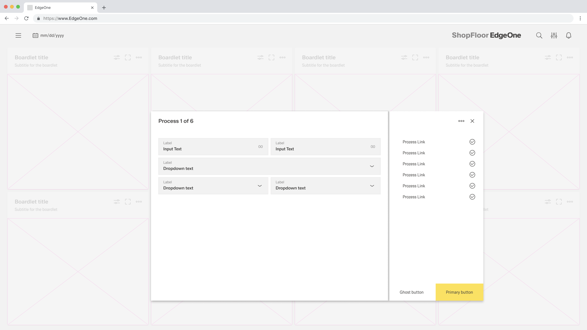
| Process | The process dialogue may only be used for interactions that specify a sequence of different interaction sections. the different sections are shown in the sidebar, and the user can move backwards and forwards within the process sections. |
Basic dialogue
Process dialogue
Dismissing non-modal dialogues
There are several possible ways to exit a non-modal dialog.
- x: Clicking the close
xicon in the upper right will close the modal without submitting any data. - Cancel button: If a cancel button is used then clicking it will close the modal. Cancel undoes all applied changes.
- Esc: Press
ESCon the keyboard
Button groups
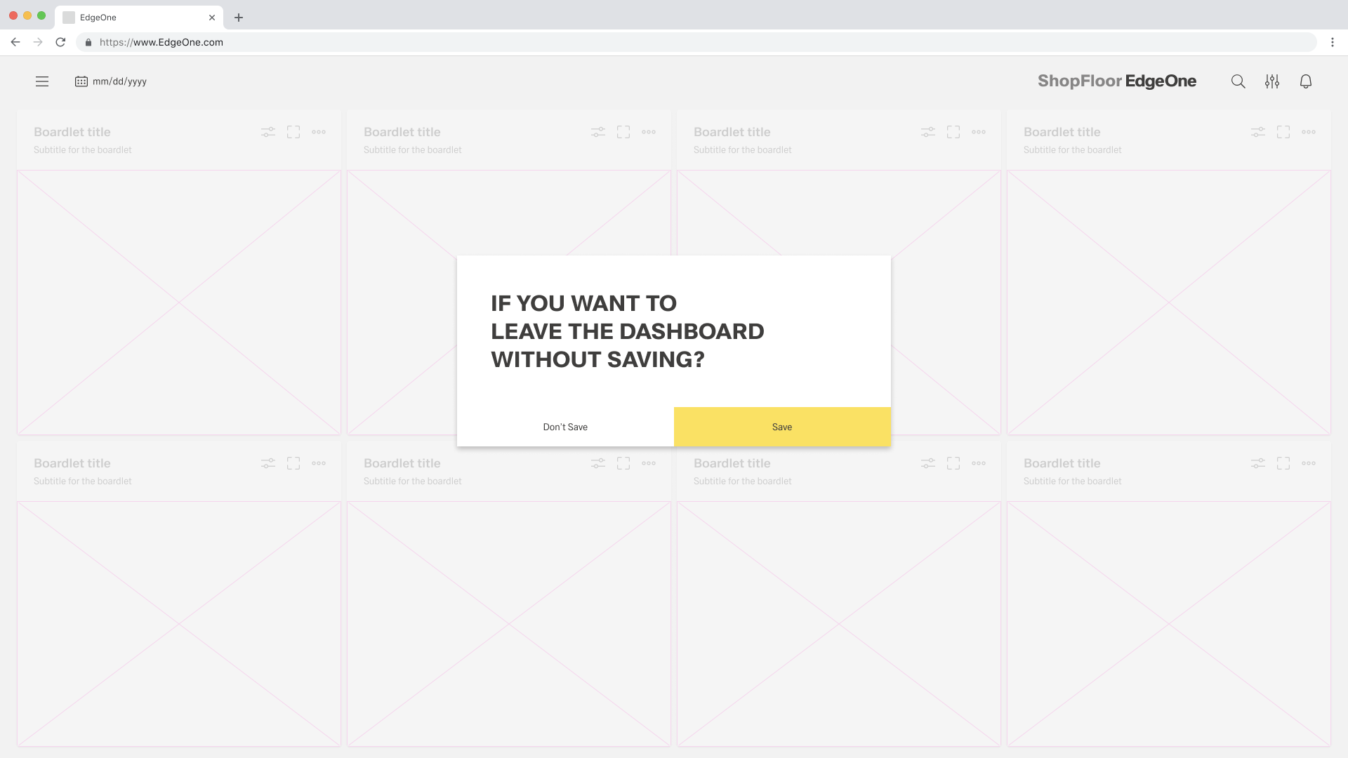
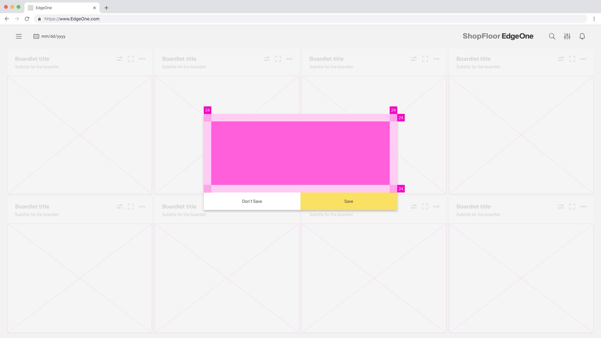
When placing buttons, Cancel is always the outmost left button option and the primary action is always the outmost right button. There should only ever be one primary action per dialog. Dialog buttons are always full bleed and attached to the bottom of a dialog.
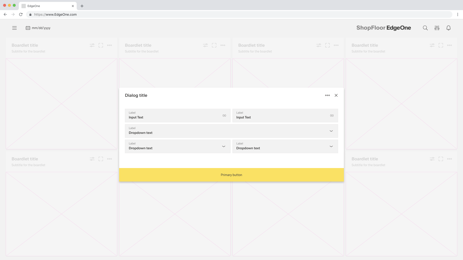
Single buttons are placed across the entire page. The single button format is most commonly used for confirmation dialogues. In most scenarios, a primary button is used when only one button is needed.
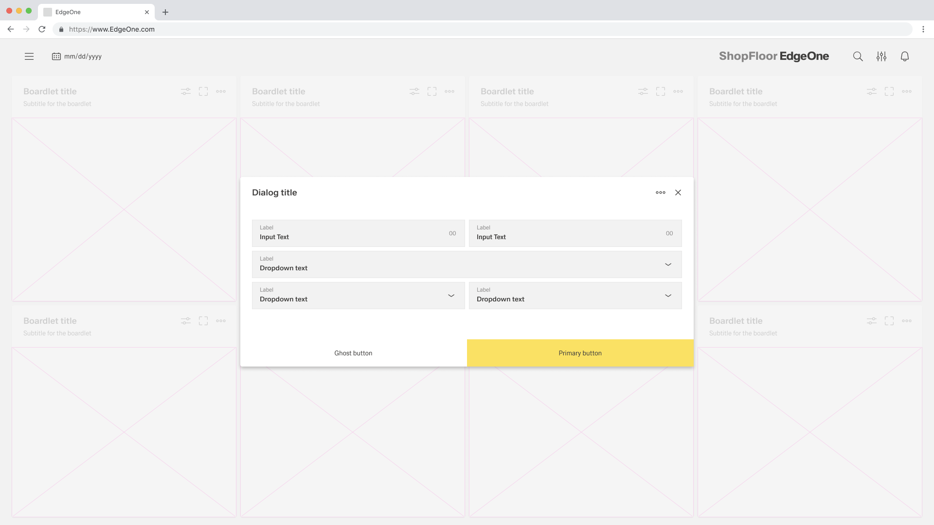
When using two buttons, the secondary button is on the left and the primary button is placed on the right. Each button spans 50% of the dialog and are full bleed to the edge.
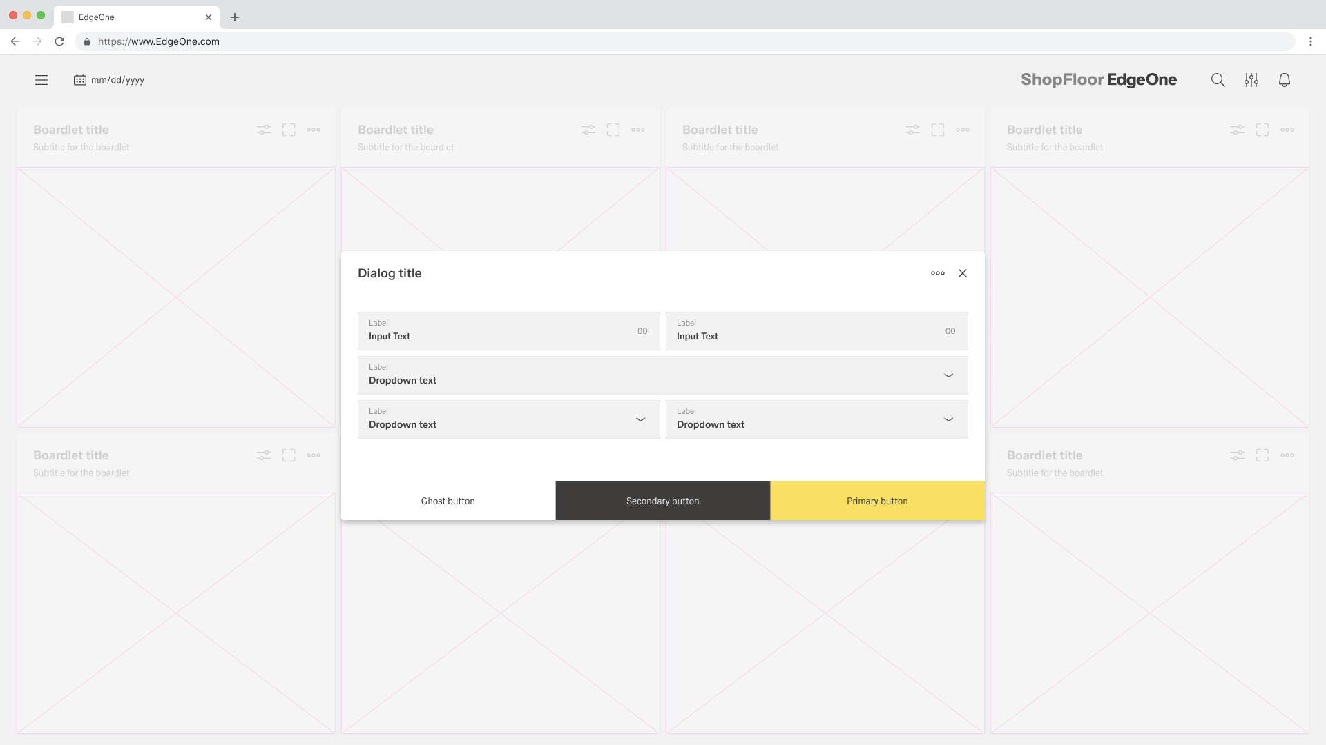
If three buttons are required, each takes up 33.33 % of the dialogue width. Only the rightmost button may be a primary button, the other two are secondary buttons. If all three actions have the same weight, all three should be secondary buttons.
Behaviors
Trigger
Dialogues are triggered by a user's action and not generated by the system. Common components that can trigger a dialogue include buttons, links or icons.
Focus
Once the dialogue box is open, set the initial focus to the first location that allows user input. The focus should then remain in the dialogue until it is closed.
Process
The modal component has a fixed maximum height. If the content of the dialogue is longer than the height of the dialogue, the main part should be divided into so that the user can scroll through the process. for this case, only the process dialogue may be used.
Validation
Validate a user's input before closing the dialogue. If an input is invalid, the dialogue should remain open with the input marked with an error status and an inline error message. The message should inform the user what has happened and give advice on next steps or possible solutions. An effective and immediate error message can help the user understand and resolve the problem.
Modal
has to be placed here. Oliver Prudlik ticket is nessesary.