Page History
...
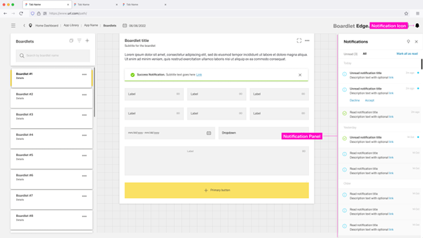
- The Notification Icon inside the header.
- The Notification Panel that opens on the right side of the dashboard.
- Global Notification that exist in the form of Toast Notifications and Inline Notifications.
- Local Notifications in the form of Inline Notifications that are part of boardlets.
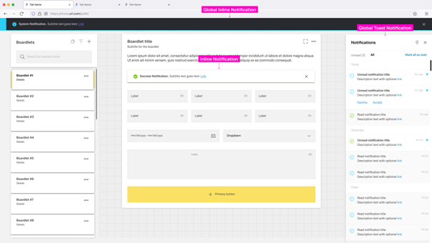
Global Notifications are independant of any dashboard and appear across the entrire application. The Notification Icon, Notification Panel and Global Notifications build a global notification flow that activates when a user receives a global notification.
...
- Error Notification – Colored red, signals critical errors.
- Warning Notification – Colored orange, announces problems that may result in errors.
- Success Notification – Colored green, signals a successful process.
- System Notification – Colored blue, reports system information.
- Progress Notification – Colored blue with a progress bar, updates the user on an ongoing process.

Notification Icon
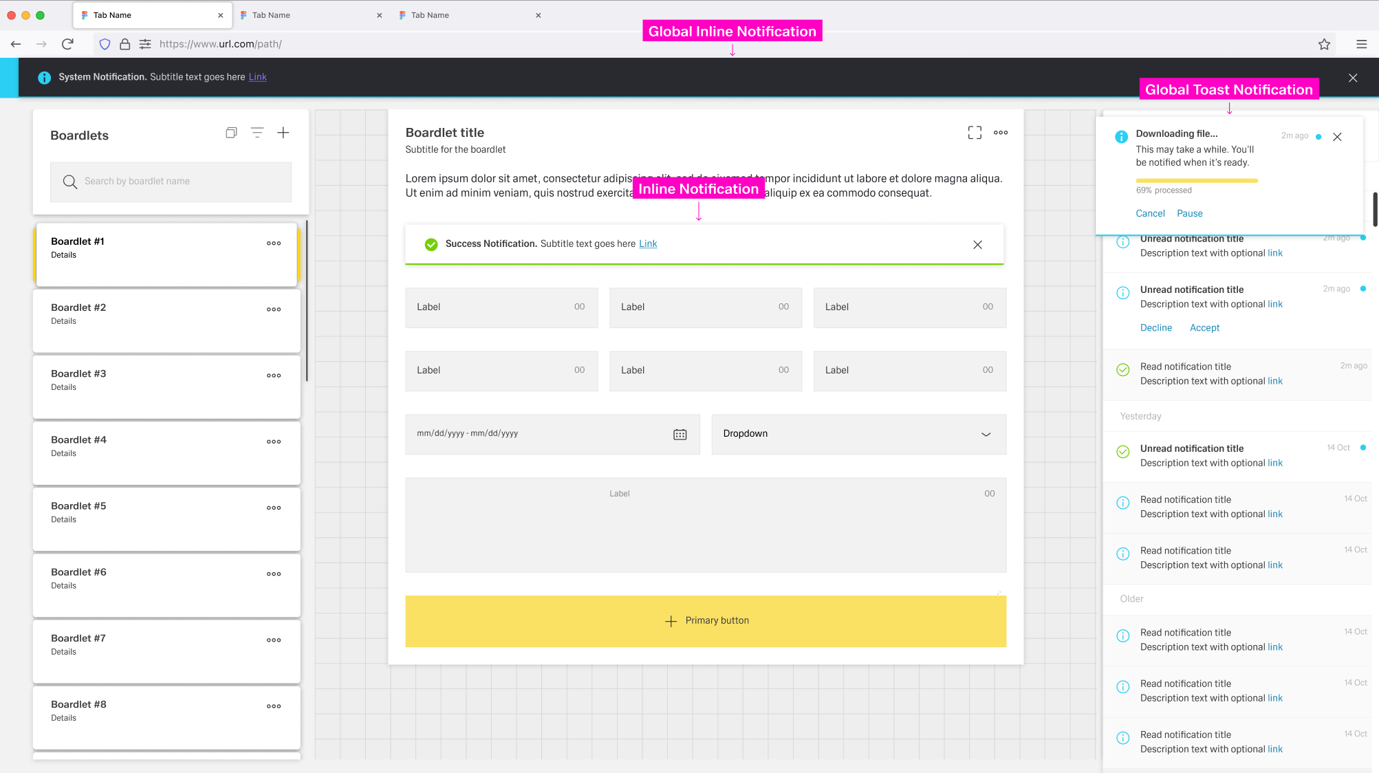
The Notification Icon is part of the header toolbar at the right side of the dashboard header. It is always present independent of the current dashboard and situated . The icon is located at the far right, only left to the overflow menu, if one is present.
When a new and unread notification appears, the notification icon gains a small blue indicator at the top-right. The indicator disappears when the user has no unread notifications or opens the notification panel.
[IMAGE PLACEHOLDER: Notification Icon]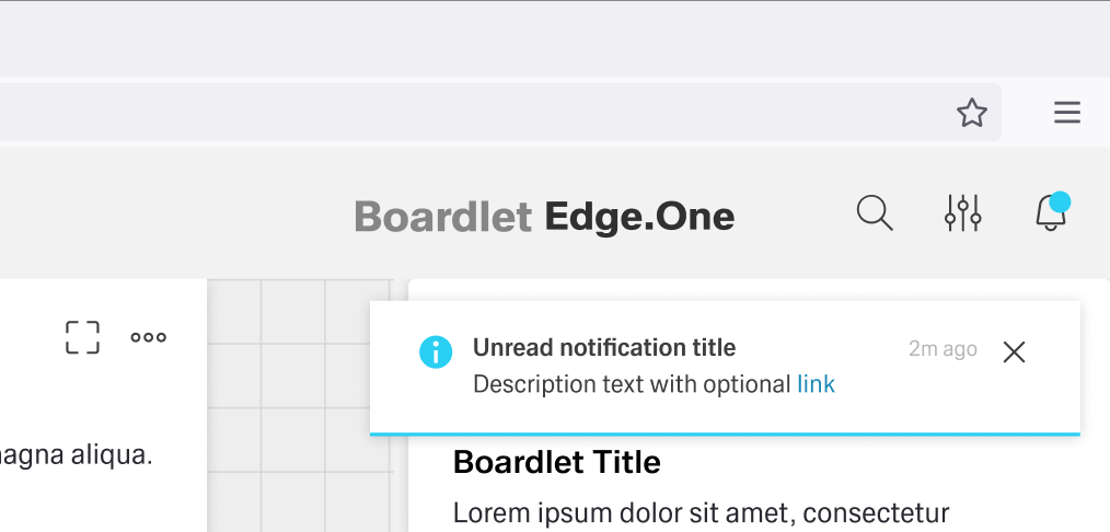
If the notification is an error, warning or success notification, a special secondary icon appears to the left of the notification icon inside the header. This icon matches the type of notification in appearance and vanishes when the user interacts with the notification.
[IMAGE PLACEHOLDER: Additional Icon]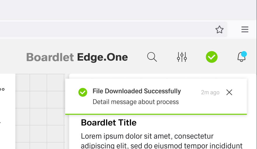
A progress notification adds a progress indicator to the left of the notification icon. It is circular and actively shows the progress instead of being a static icon.
[IMAGE PLACEHOLDER: Progress Notification]
Toast Notification
The Toast Notification appears in the top-right corner to signal information critical to a process currently in progress. It does not align with the grid and visually floats above the dashboard.
Only one toast notification can be visible at a time.
The color of the toast notification depends on the type of notification it contains. The general layout stays the same between notifications, with the progress notification as the only exception. Progress notifications include a progress bar under the description.
[IMAGE PLACEHOLDER: Labeled anatomy notification without progress]
- 01 Notification Icon – Signals the type of notification and matches the icon in the header, with the exception of the progress notification.
- 02 Title
- 03 Time Stamp – Shows when the notification popped up.
- 04 Close Action – Allows the user to close the toast notification.
- 05 Description – A short text explaining the notification.
- 06 Actions – Influence the process in progress.
[IMAGE PLACEHOLDER: Labeled anatomy notification with progress]
- 01 Notification Icon – Signals the type of notification and matches the icon in the header, with the exception of the progress notification.
- 02 Title
- 03 Time Stamp – Shows when the notification popped up.
- 04 Close Action – Allows the user to close the toast notification.
- 05 Description – A short text explaining the notification.
- 06 Actions – Influence the process in progress.
- 07 Progress Bar – Actively shows updates on the progress.

Notification Notification Panel
Users can open the Notification Panel by clicking the notification icon in the header or on a toast global notification. It opens on the right side of the dashboard and has a fixed width.
...
Unread notifications have a small blue status indicator at the top-right and a bold title. By clicking the status indicator, users can set a notification as redread. Read notifications are greyed out and have a non-bold title. Both tabs have an action to set all notifications as read in their "read" to the left of the content switch.
Notifications are ordered and grouped by their date of appearance, regardless of the active tab. .
Toast Notification
The Toast Notification appears in the top-right corner and visually floats above the dashboard.
Only one toast notification can be visible at a time.
The color of the toast notification depends on the type of notification it contains. The general layout stays the same between notifications, with the progress notification as the only exception. Progress notifications include a progress bar under the descriptionSelecting a notification opens a detail panel to the left with basic information about the notification. Users can edit this information by clicking the edit action inside the toolbar. This panel can be open without the notification panel being open.
[IMAGE PLACEHOLDER: Detail PanelLabeled anatomy notification without progress]Users can open the Notification Panel by clicking the notification
- 01 Notification Icon – Signals the type of notification and matches the icon in the header
...
- , with the exception of the progress notification.
- 02 Title
- 03 Time Stamp – Shows when the notification popped up.
- 04 Close Action – Allows the user to close the toast notification.
- 05 Description – A short text explaining the notification.
- 06 Actions – Influence the process in progress
Users can close the notification panel by clicking the close action in the toolbar or by clicking outside the panel. They can anchor the panel, similar to the navigation panel. An anchored panel can only be closed by clicking the close action.
The notification panel has two tabs: Unread and All.
- Unread – Displays all notifications the user has not interacted with. This is the default tab.
- All – Shows all information the user has received so far.
[IMAGE PLACEHOLDER: Notification Panel]
Unread notifications have a small blue status indicator at the top-right and a bold title.
By clicking the status indicator, users can set a notification as read.
Read notifications are greyed out and have a non-bold title.
Both tabs have an action in their content switch to set all notifications as read. Notifications are ordered and grouped by their date of appearance, regardless of the active tab.
Selecting a notification opens a detail panel to the left with basic information about the notification. Users can edit this information by clicking the edit action inside the toolbar. This panel can be open without the notification panel being open.
...
Labeled anatomy notification with progress]
- 01 Notification Icon – Signals the type of notification and matches the icon in the header, with the exception of the progress notification.
- 02 Title
- 03 Time Stamp – Shows when the notification popped up.
- 04 Close Action – Allows the user to close the toast notification.
- 05 Description – A short text explaining the notification.
- 06 Actions – Influence the process in progress.
- 07 Progress Bar – Actively shows updates on the progress.
Inline Notifications
tba
Best Practices
...