Page History
...
Common actions frequently appear across different components and workflows. For platform consistency, these actions should only be applied in the ways described below.
Add
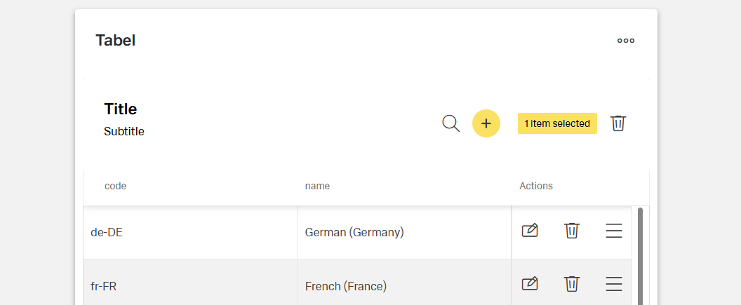
Add adds an existing This actions adds a new object to a list, set, or system. The most common accurance for this actions are tables and card collections.
Adding a record to a table. Depending on the importance of the add action on the page, the emphasis can be high, medium, or low. For example, In case of a high emphasis action should use a single primary button with all others being secondary.
Use only the add icon or an overflow menu
...
importance, the add action presents as an icon-only button in the toolbar of the component. If the add action has lower priority, it may be placed in an overflow menu.
Cancel/ Reset
Cancel stops the current action and closes the component or item. Warn the user of any negative consequences if the process doesn't progress, such as data corruption or data loss.
The cancel action is usually placed inside the footerbar. Use a secondary button or a link for cancel actions.
When not in form of a button, avoid using only an action icon for this action. One exception to that rule is the table component. When editing the table, the user can cancel the changes with an action icon.
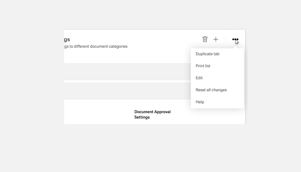
More
The more action contains secondary functions for the content displayed within the asset. The more action It can also be used as a grouping object of primary and secondary functions in case of a lack of space. One example for this would be the ghost boardlet toolbar.
The more action can only be used as a secondary action within InspireWhile the more actions act as a primary action, it only ever contains secondary actions. It only exists in the form of an action icon with the form of three dots. The functions or objects bundled in the more action must always be listed in an overflow menu.
Clear
Clear The clear action removes data from a field or removes selections. Clear can also delete the contents of a document, such as a log. For controls that have a default selection or value, such as radio buttons, the default selection or value is reset.
Use only the as a clear icon or placed in an overflow menu.
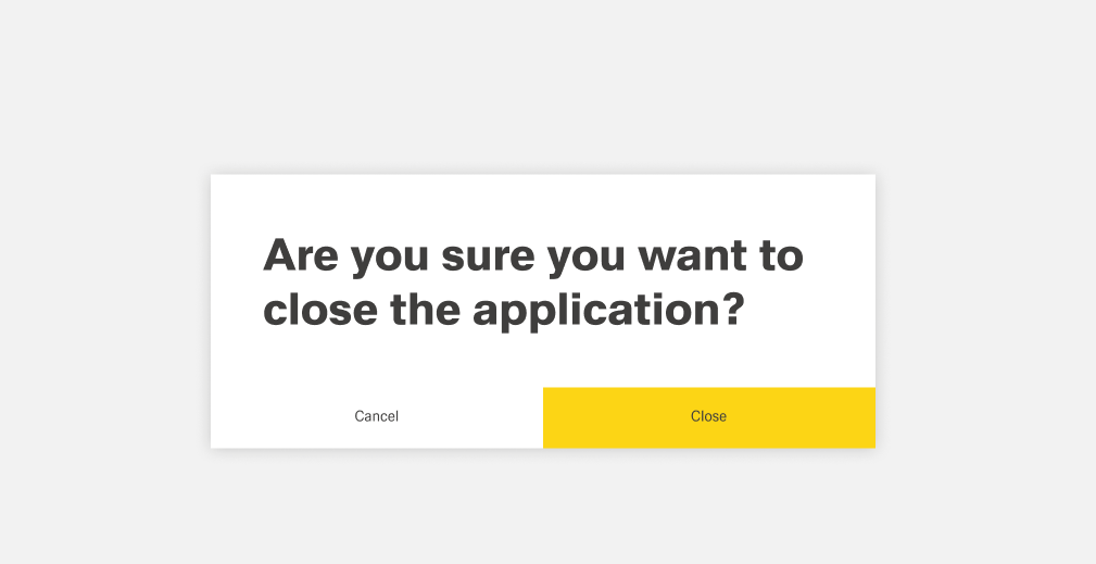
Close
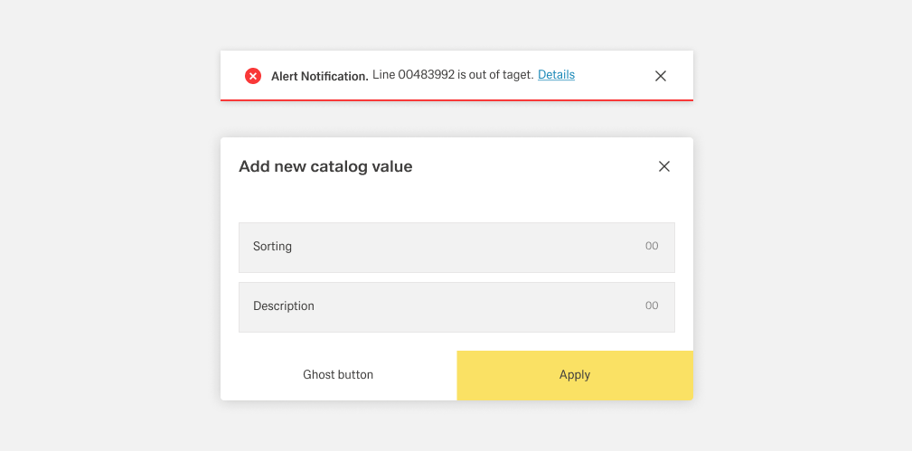
Close terminates the current page, window, or menu. Close It is also used to dismiss information, such as notifications.
Use the close icon, which is typically placed on the upper right side of the element. Do not use close in a button.
Delete
Deletion destroys an object. Deletions cannot be easily undone and are usually permanent. Warn the user about the negative consequences of destroying an object, such as data loss.
Use either a primary delete button or the trash can icon. A hazard modal is used when a warning is required to confirm an action. Example of deletion in a modal and overflow menu
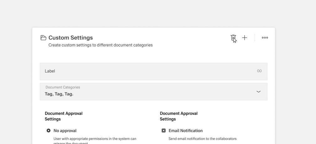
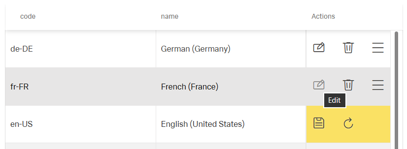
Edit
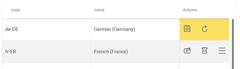
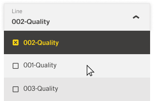
With Edit, data or values can be changed. In the current MVP version 1, editing only takes place in the tables. Editing is activated for an entire record. After editing, the active edit icon must be deactivated again to close the function. Editing usually triggers a change of state of the object or input element concerned.
Use only the edit icon or an overflow menu
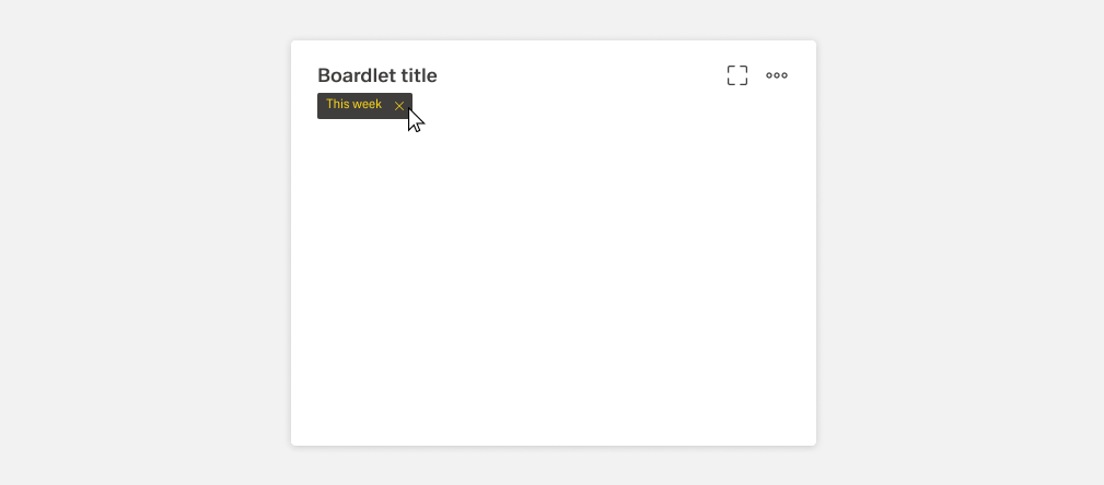
Fullscreen
Due to the presentation of koplex content within the boardlets, the fullscreen function is a default setting in every boardlet. This function is very helpful in charts or matrixes. However, the user can exchange the function with a more important function at any time.
Reset
This action reset the view of an object, list, or record when the displayed view is out of sync with the source.
In the current version, this action is exclusive to the table component. Editing is activated for an entire record/table. After editing, the user must save or cancel the changes.
Use only in the form of the edit icon or inside an overflow menu.
 Use only the reset icon or an overflow menu
Remove
This action removes an object from a list or item. Remove is distinct from delete, as a removed item is not destroyed. Multiple objects can be removed at once. It is important that you always inform the user is always informed about the removal of the object within the list. Some situations also require the use of a danger modal.
Use only the This action is only used with a remove icon or inside an overflow menu.
Save
The save action confirms an input or change of a process inside the application. This can lead to a change in data. There might also be requirements that the new or changed input needs to adhere to, like a required input field. Warn the user if critical information will be changed with this action.
Save is a primary action and usually part of footerbar actions. It can also appear in the form of the save icon.