Page History
...
Local Navigation helps users move within a specific product area or workflow. It complements Global Navigation by enabling navigation that is being context-specific, task-oriented, and adaptive to the current dashboard or process step. While Global Navigation connects users to system-level destinations and cross-product areas, Local Navigation supports the “work inside the page”—helping users understand where they are in a flow, jump It supports orientation in flows, navigation between related sections, and move forward or backward /back movement without losing context.
Local Navigation is intentionally dynamic and flexible. It does not and doesn’t need to exist everywhere in Edge.One. Simple applications might may not require it at all. Local Navigation is introduced as soon as dashboards develop dependencies between each other—such as . It becomes relevant when dashboards have dependencies (for example, favorites, nodes, and or multi-dashboard processes). Because it is limited to the current dashboard context, Local Navigation it can vary between dashboards and should reflect match the local structure and needs of that area rather than forcing a one-size-fits-all approachthe area.
Anatomy
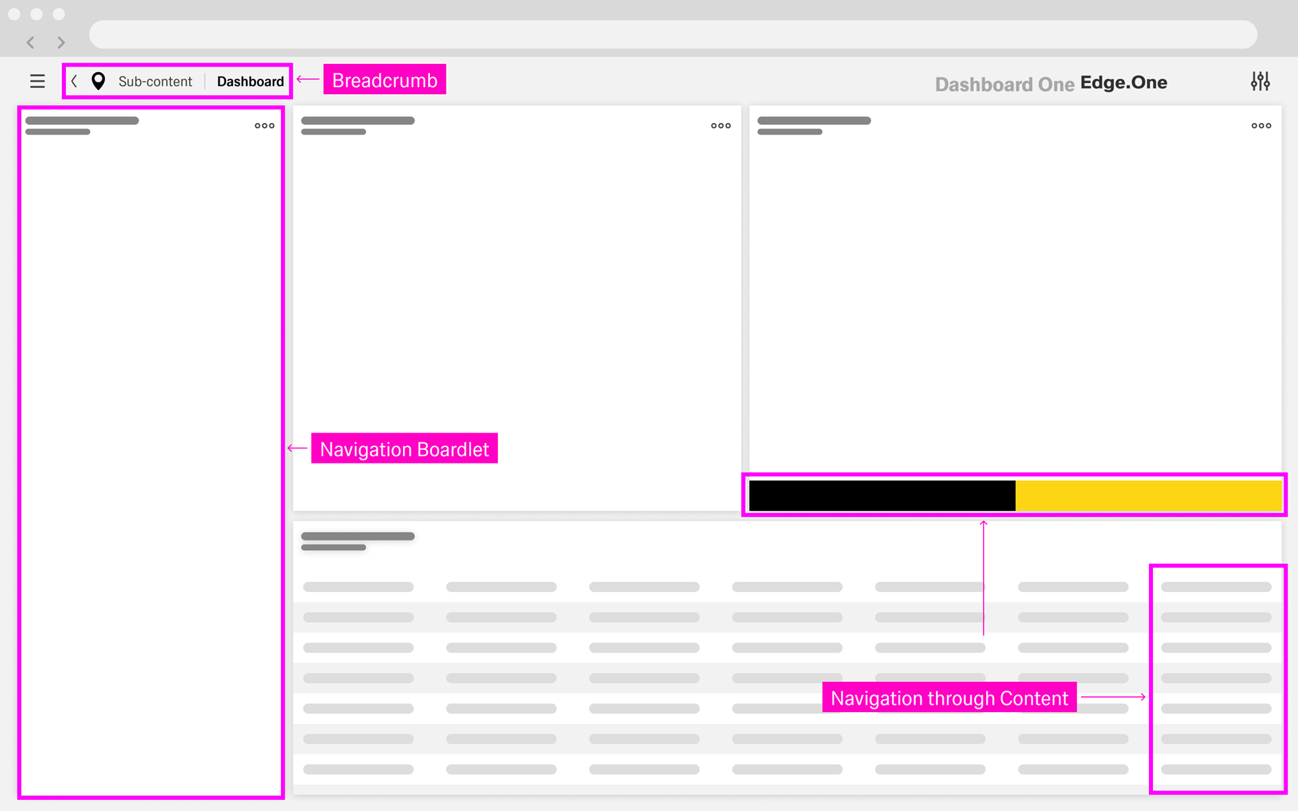
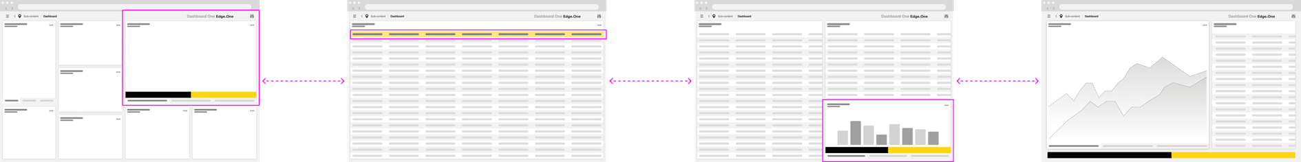
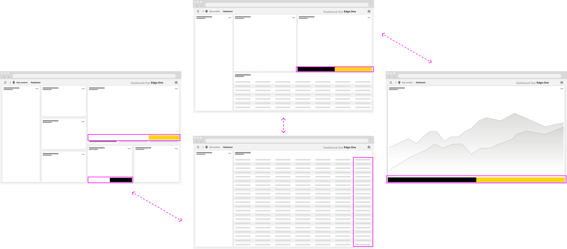
Local Navigation is composed of a set of reusable navigation surfaces that appear within a dashboard to help users move through related content and workflows. These elements are chosen based . The set of surfaces depends on the complexity of the application area: some dashboards only need lightweight navigation (for example, breadcrumbs or in-content links), while others benefit from a persistent structure such as a Navigation Boardlet. The following sections describe the key components and how they work together to Together, these surfaces should support both vertical navigation (drilldowns) and horizontal , navigation (step-based flows).
Navigation Boardlet
...
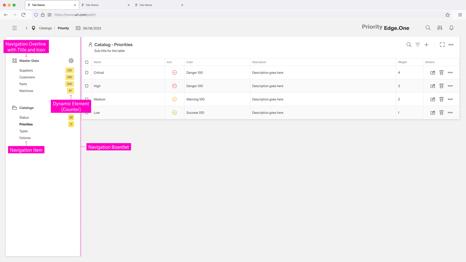
The Navigation Boardlet is an expandable and collapsible navigation element placed . It sits on the far left of the dashboard , spanning and spans from top to bottom of the page. It provides a collection of tools and links to different aspects of the current application area, usually links and tools for navigating within the current product area, typically presented as a list or a tree list.
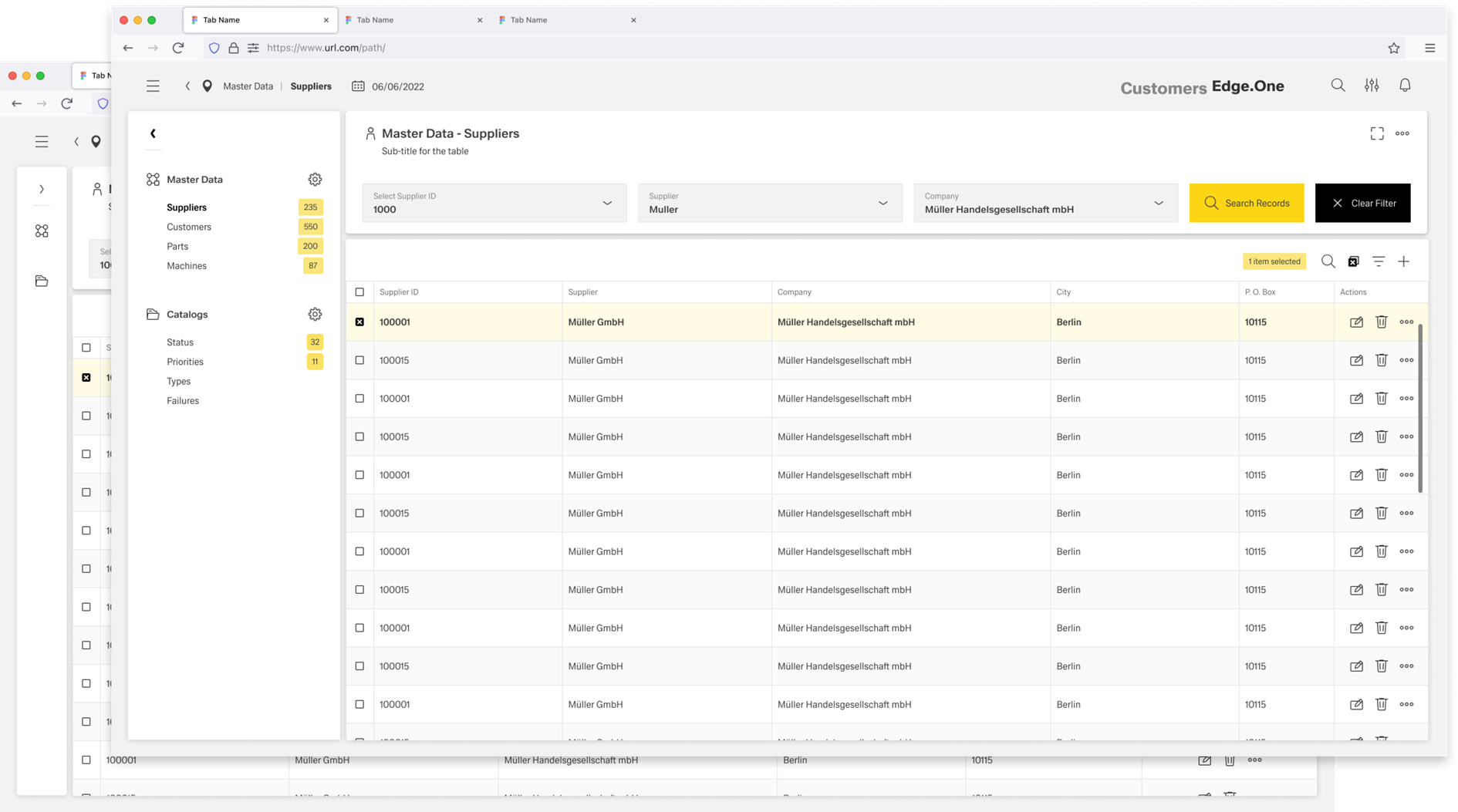
Navigation items are commonly organized into groups usually grouped to improve scanning and to align with reflect the information architecture. Each group should have a clear heading and a distinct icon so users can quickly understand what belongs together.
The boardlet can include dynamic elements that update to reflect the current stage of the application or the user’s context based on context. For example, counters to the right of links can indicate the number of items in a library behind that link. When a boardlet contains many items, it should support independent scrolling so the dashboard content remains usable.
By combining hierarchical structures with direct links, the Navigation Boardlet supports both horizontal navigation (moving between peer areas or steps) and vertical navigation (drilling down into deeper levels of detail).
...
Breadcrumbs show users their current location relative to the information architecture. They enable users to quickly move up to a parent level or return to a previous step.
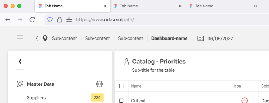
Breadcrumbs are always located in the left part of the header. Breadcrumbs support vertical navigation inside drilldowns and adjust based on the user’s current position in the structure. All page items in the breadcrumb component are interactive and link to the corresponding pages. The go-back icon moves back one step at a time within the page structure.
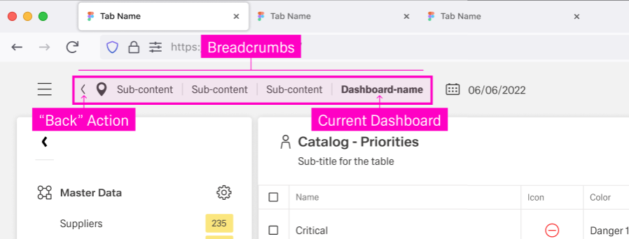
They support vertical navigation inside drilldowns and adjust based on the user’s current position in the structure.
Navigation Actions inside the Content
Navigation actions are navigation elements placed inside the dashboard content. They enable allow users to move through workflows and drilldowns continue a task directly from where they are working, rather than instead of relying only on side navigation structures.
Common placements include:
- Buttons in toolbars
- Links and buttons within dashboard content
- Actions inside tables
- Actions from dialogs
These actions are most useful when navigation is a consequence of an interaction, such as opening details, progressing through steps, or confirming a decision.
For more information on how to use these action, refere to Creating a User Flow.
Tables
Table navigation is commonly provided as part of row actions, usually placed in the last column. It typically routes users to a drilldown page (for example, a details view), representing . This represents vertical navigation to the next layer in the breadcrumb structure.
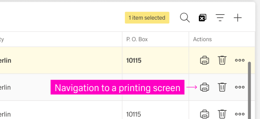
The destination screen should provide a clear “back” “Back” option. Users should be able to return to the prior contexttable with minimal loss of context (for example, preserving filters or selection where feasible).
Buttons and Links
Navigation can happen through buttons or links placed within Buttons and links inside the dashboard content , often to support process flows. They are commonly used for horizontal navigation through a sequence of steps. Typical examples include , such as “Next” and “Back.” They can also allow vertical navigation, like "View Table" and "Edit Data".
These actions usually appear in toolbars, footer bars, or at the bottom of the content and should be used . Use them sparingly to avoid clutter and conflicting navigation paths.
For more information, please go to the Wizard pattern
Dialogs
Dialog navigation is usually implemented through footer bar actions. It typically includes two directions:
- An option to return to the current page (“Back” or cancel/close).
- An option to move forward by initiating a process or confirming an action (for example, accept, submit, or continue), which often leads to a new page.
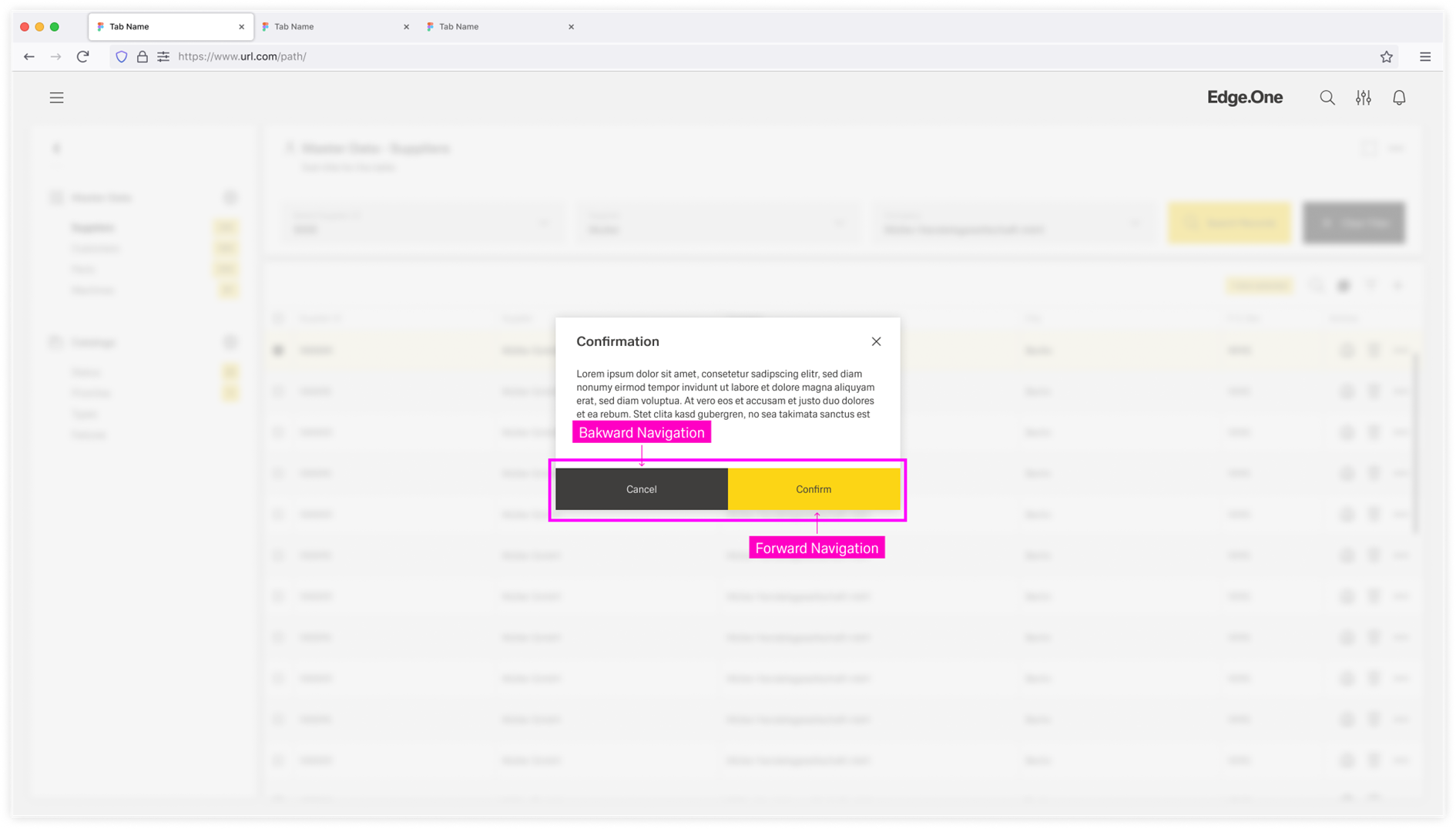
Depending on the action performed, dialog -based navigation can represent vertical navigation (to a deeper level) or horizontal navigation (to the next step in a flow).
Best Practices
Balance flexibility with predictability
Local Navigation should reflect the user’s current dashboard, task, and information architecture. Keep options relevant to what users can do from this area, and avoid exposing unrelated destinations.
Variation is expected across dashboards. Within the same application area, however, behavior should stay predictable. Use consistent placement, interaction models, and naming so users can build reliable habits.
Keep structures easy to scan
Prefer clear groupings over long flat lists. Avoid deep trees, especially when they require repeated expand/collapse to reach common destinations. If navigation becomes hard to scan, reduce nesting, shorten labels, and consider adding shortcuts or search.
Choose the right surface
Use a Navigation Boardlet when users need persistent navigation across sections of an area. Use breadcrumbs primarily for orientation and moving up a hierarchy. Use in-content navigation actions for step-based flows and drilldowns where users need to act and then move forward.
Navigation inside a process
Local Navigation should not route users into the middle of a process or conditional content. Link to a process entry point or overview instead, and let step-to-step movement happen inside the process UI (for example, Next/Back).
Drilldown destinations should include a clear path back. Breadcrumbs, a visible “Back” action, or both can work, as long as the behavior is consistent.
Always communicate “where I am” and “what will happen next.” Highlight the current destination in the boardlet. If a group is collapsible, its expanded/collapsed state should be clearly visible.
Language and labeling
Use user-facing language. Keep labels concise and aligned with page titles, and avoid internal jargon. Similar destinations must have distinguishable names.
If local navigation can link to external destinations, label them clearly so users understand they are leaving the current context.