Page History
| Info | ||||
|---|---|---|---|---|
| ||||
here you will find the handover and the Styleguide of this componente: |
| Info | ||||
|---|---|---|---|---|
| ||||
coming soon |
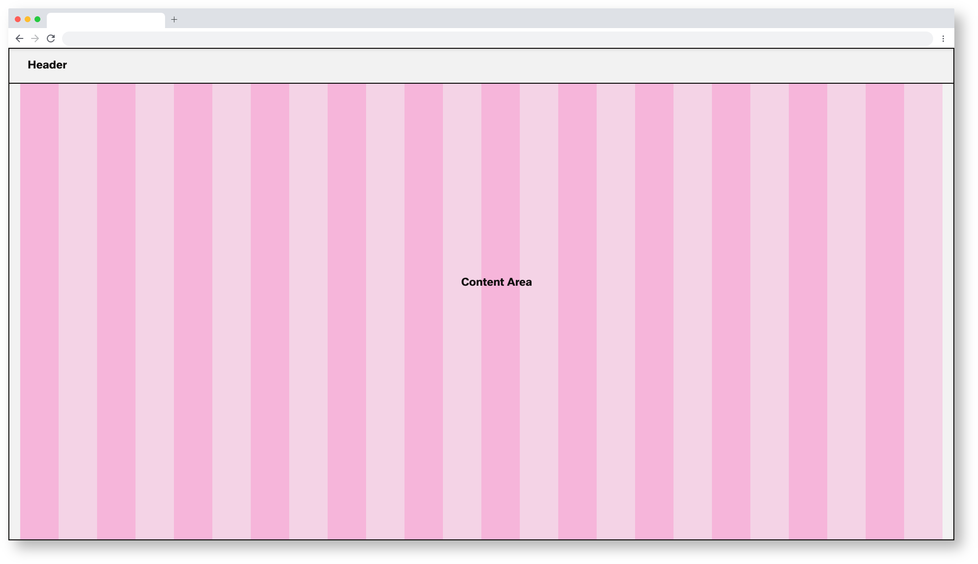
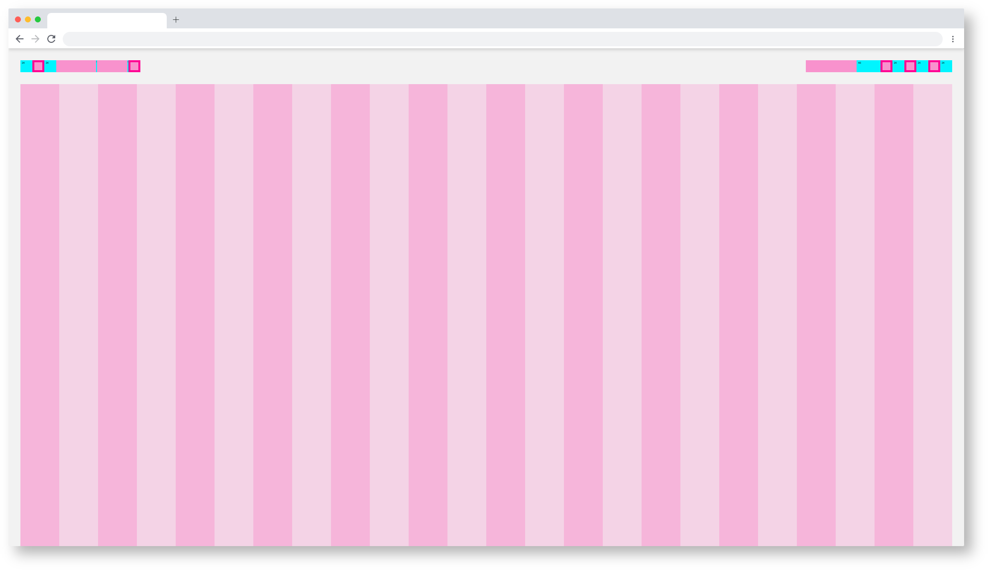
Basic Components of the Dashboard
All different breakpoints have a 24 column-grid.
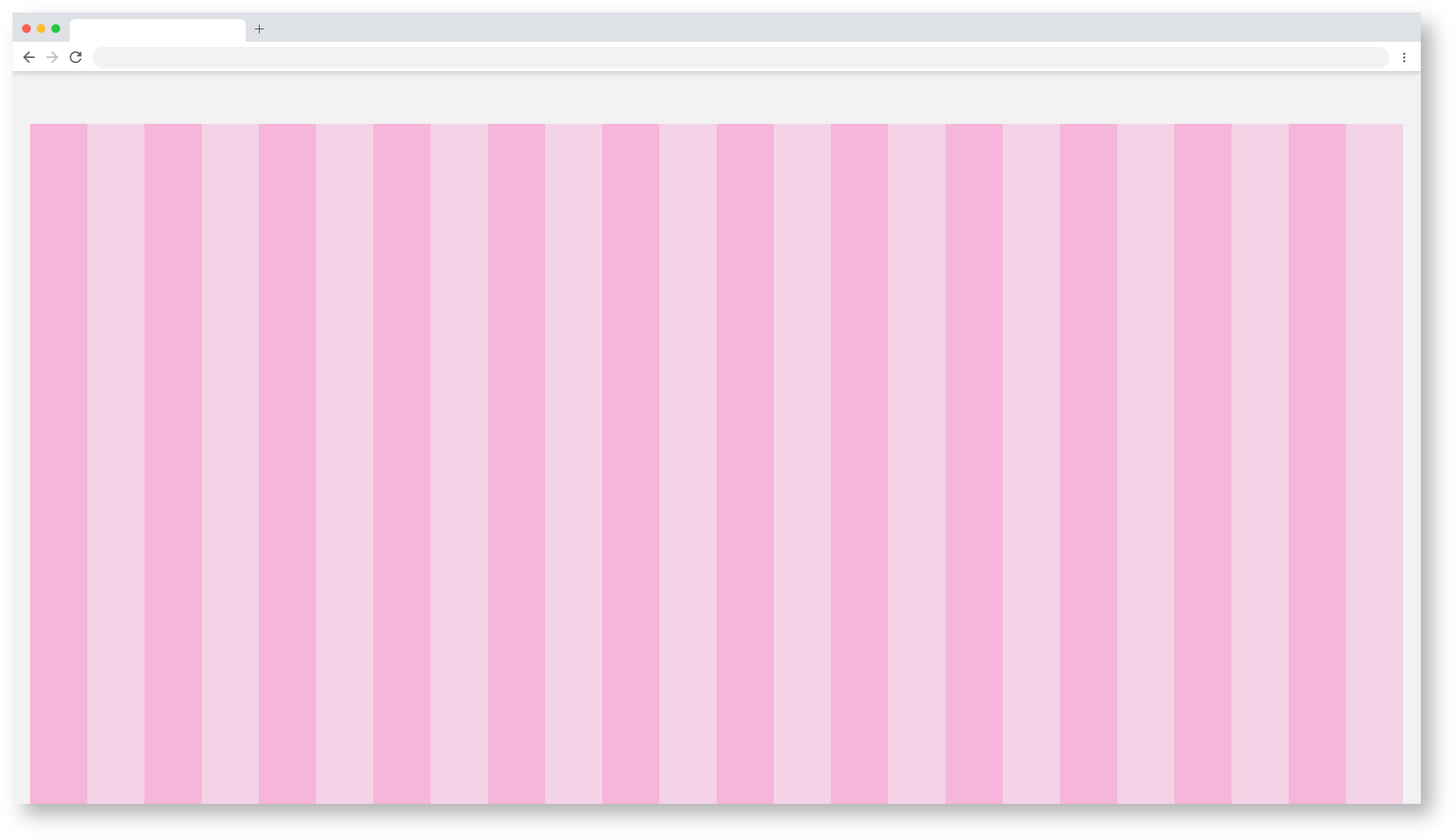
24 Column-grid of the Dashboard
The dashboard spacing

Basic Components of the Dashboard
| Base | web_max | web_max (rem) | web_min | web_min (rem) | tablet_landscape | tablet_landscape | tablet_portrait | tablet_portrait | mobile_portrait (px) | mobile_portrait | kiosk (px) | kiosk (rem) |
|---|---|---|---|---|---|---|---|---|---|---|---|---|
| Breakpoint | ≥1800px | - | ≥1200px | - | ≥960px | - | ≥576px | - | <576px | - | WiP | WiP |
| Width | 1920 | 120 | 1280 | 80 | 1024 | 64 | 768 | 48 | 375* | 23,438* | WiP | WiP |
| Height | - | - | - | - | - | - | 1024 | 64 | - | - | WiP | WiP |
| Content Area | ||||||||||||
| Column Width | 78 | 4.875 | 52 | 3.25 | 42 | 2.625 | 31 | 1.938 | 15* | 0,938* | WiP | WiP |
| Gutter | 26 | 1.625 | 16 | 1 | 8 | 0,5 | 8 | 0.5 | - | - | WiP | WiP |
| Content-Area Margin | 24 | 1,5 | 16 | 1 | 8 | 0,5 | 8 | 0.5 | 6 | 0,375 | WiP | WiP |
| Header Area | ||||||||||||
| Header-Area | 24 | 1,5 | 24 | 1,500 | 48 | 3 | 48 | 3 | 48 | 3 | WiP | WiP |
| Icon max | 24 | 1,5 | 24 | 1,500 | 48 | 3 | 48 | 3 | 48 | 3 | WiP | WiP |
| Icon min | 18 | 1,125 | 18 | 1,125 | 48 | 3 | 48 | 3 | 48 | 3 | WiP | WiP |
| Scrollable | yes | yes | yes | yes | yes | WiP | WiP | |||||
| Navi and Toolbar | ||||||||||||
| Height | - | - | - | - | 64 | 4 | 64 | 4 | 64 | 4 | WiP | WiP |
*Iphone 6 / WiP = Work in Progress
default, all other breakpoints are located in the category subcategories.


| Info | ||||
|---|---|---|---|---|
| ||||
Astronaut |

Web_Min/Dashboard
Tablet_Landscape/Dashboard
Tablet_Portrait/Dashboard
Mobile_Portrait/Dashboard
Kiosk
Kiosk/Dashboard
EdgeOne Dashboard Example
The EdgeOne Dashboard always consists of a header and the content area. The content area can be freely designed, all content must adhere to the 24 grid column. In the header, burgers, datepicker, logo and setting are obligatory. More information about the header can be found here: ID2 - Header
 1920/Dashboard_EdgeOne_Astronaut
| Info | ||||
|---|---|---|---|---|
| ||||
here you will find the handover and the Styleguide of this componente: |
1920/Dashboard_EdgeOne_Tokyo-at-Night
Kiosk/Dashboard
| icon | false |
|---|---|
| title | Zeplin Documentation |
here you will find the handover and the Styleguide of this componente:
zpl.io/bzZlmM7
X-Series Dashboard Example
The X-Series dashboard always consists of a header and the content area. The content area can be designed freely, all content must adhere to the 24 grid column. In the header are burger, datepicker, logo and setting obligatory. More information about the header can be found here: ID2 - Header
1920/Dashboard_X-Series_Astronaut
1920/Dashboard_X-Series_Tokyo-at-Night