Page History
The content area can be designed freely, all content must adhere to the 24-column grid. The content may not be positioned freely within the column grid. An overlay must be used for this. All content, in the best case boardlets, start at the top left. They must be placed next to and below each other within the column grid. The header organism always consists of a navigation molecule, logo atom and toolbar molecule.
More details you will find here.
| Table of Contents | ||||||||||||||
|---|---|---|---|---|---|---|---|---|---|---|---|---|---|---|
|
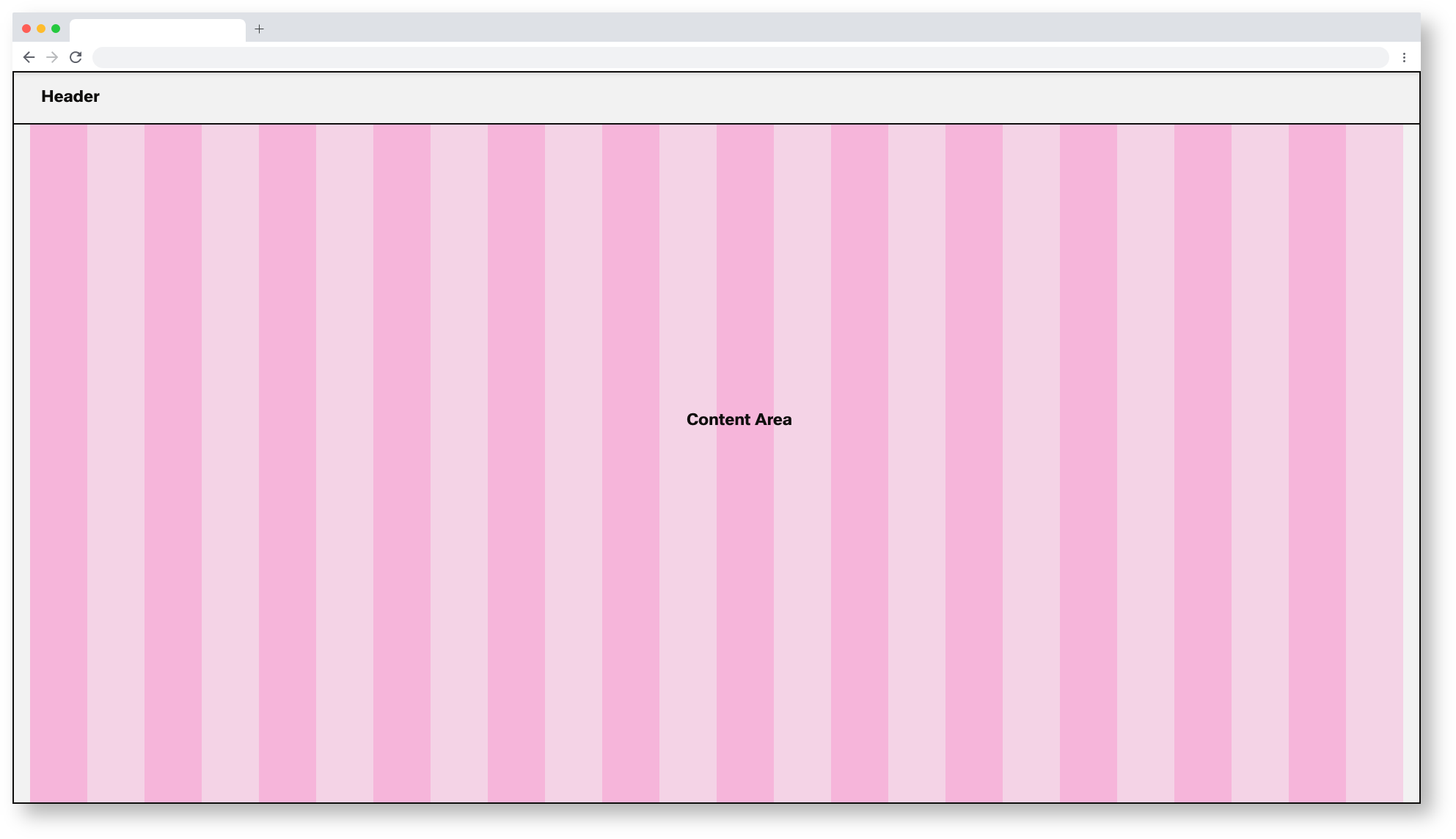
Basic Components of the Dashboard
All different breakpoints have a 24 column-grid.
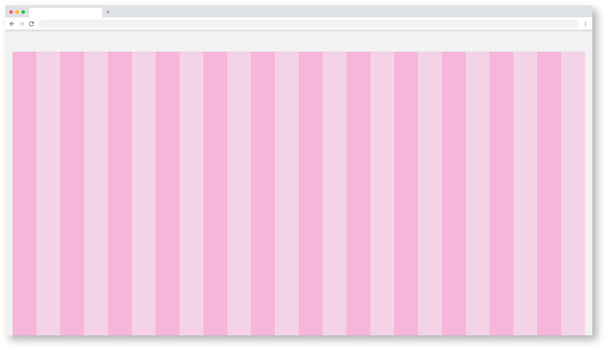
24 Column-grid of the Dashboard
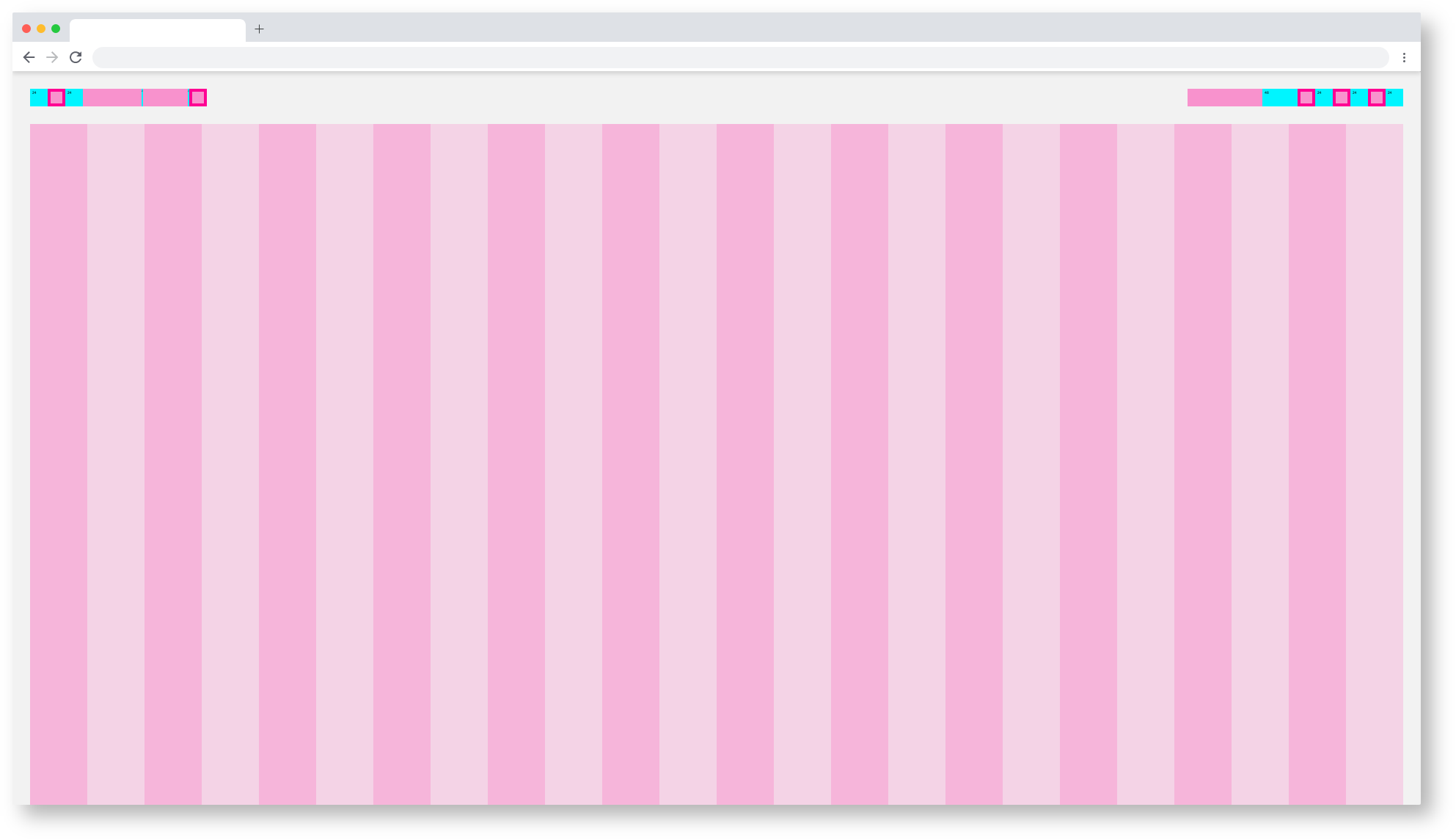
The dashboard spacing

Basic Components of the Dashboard
| Base | web_max | web_max (rem) | web_min | web_min (rem) | tablet_landscape | tablet_landscape | tablet_portrait | tablet_portrait | mobile_portrait (px) | mobile_portrait | kiosk (px) | kiosk (rem) |
|---|---|---|---|---|---|---|---|---|---|---|---|---|
| Breakpoint | ≥1800px | - | ≥1200px | - | ≥960px | - | ≥576px | - | <576px | - | WiP | WiP |
| Width | 1920 | 120 | 1280 | 80 | 1024 | 64 | 768 | 48 | 375* | 23,438* | WiP | WiP |
| Height | - | - | - | - | - | - | 1024 | 64 | - | - | WiP | WiP |
| Content Area | ||||||||||||
| Column Width | 78 | 4.875 | 52 | 3.25 | 42 | 2.625 | 31 | 1.938 | 15* | 0,938* | WiP | WiP |
| Gutter | 26 | 1.625 | 16 | 1 | 8 | 0,5 | 8 | 0.5 | - | - | WiP | WiP |
| Content-Area Margin | 24 | 1,5 | 16 | 1 | 8 | 0,5 | 8 | 0.5 | 6 | 0,375 | WiP | WiP |
| Header Area | ||||||||||||
| Header-Area | 24 | 1,5 | 24 | 1,500 | 48 | 3 | 48 | 3 | 48 | 3 | WiP | WiP |
| Icon max | 24 | 1,5 | 24 | 1,500 | 48 | 3 | 48 | 3 | 48 | 3 | WiP | WiP |
| Icon min | 18 | 1,125 | 18 | 1,125 | 48 | 3 | 48 | 3 | 48 | 3 | WiP | WiP |
| Scrollable | yes | yes | yes | yes | yes | WiP | WiP | |||||
| Navi and Toolbar | ||||||||||||
| Height | - | - | - | - | 64 | 4 | 64 | 4 | 64 | 4 | WiP | WiP |
*Iphone 6 / WiP = Work in Progress
default, all other breakpoints are located in the category subcategories.


| Info | ||||
|---|---|---|---|---|
| ||||
coming soon | ||||
Astronaut | ||||
| Info | ||||
| ||||
here you will find the handover and the Styleguide of this componente: |

Web_Min/Dashboard
Tablet_Landscape/Dashboard
Tablet_Portrait/Dashboard
Mobile_Portrait/Dashboard
Kiosk/Dashboard