Page History
...
A form is a group of related input controls that allows users to provide data or configure options. Forms can be simple or complex, and may be presented as dedicated pages, side panels, or dialogs depending on the use case and the situation.
Anatomy
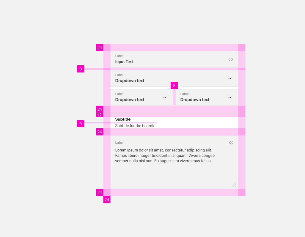
In general, forms have a padding of 24px arround the content. Elements inside the form like lables or input options have a distance of 8px eather vertically or horizontally between each other. This distance redces to 4px between text elements like titles and labels.
If the form has lot of content, it can be usefull to group certain elements. THis can be done with white space, wich should be 24px. This space expands by an additional 12px to a total of 36px bevor a title within the form.
Labels
Labels help users understand what the corresponding inputs mean. They are the user’s first point of orientation in a form and make it clear what information is being requested. Lables are directly connected to the input and usually configured in Visual Properties.
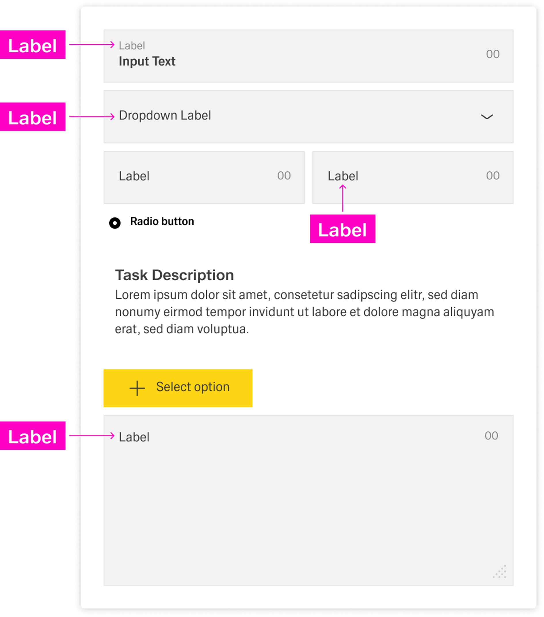
Labels are part of the form’s structure, not decoration. Even if input controls look different, they still need labels so the form stays scannable and predictable. A label should state the required input clearly and stay short so users can move quickly from field to field.
[Image placeholder: Close-up example showing label placement and how labels align across multiple fields.]
Input options
Forms capture information through different input options. Some inputs are free-form, where users type a value, and others are controlled, where users select, pick, upload, or scan. In general, use free-form inputs when the value cannot be predefined, and use controlled inputs when you want to restrict entry to valid values or make entry faster and more consistent.
...
Help provides in-context guidance like tooltips, placeholder text, or helper text, to assist the user in providing the right information. Help should reduce uncertainty and prevent avoidable errors.
[Image placeholder: Form example showing tooltip + placeholder text + helpertext in context.]
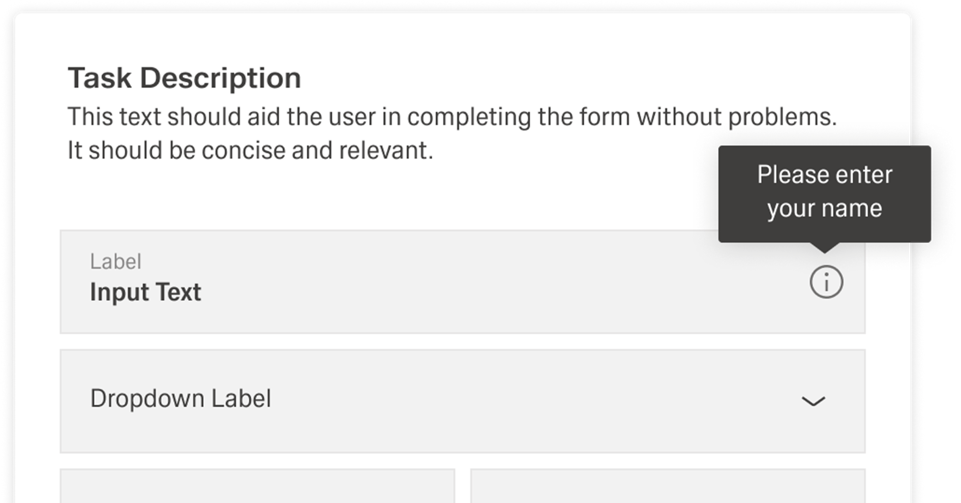
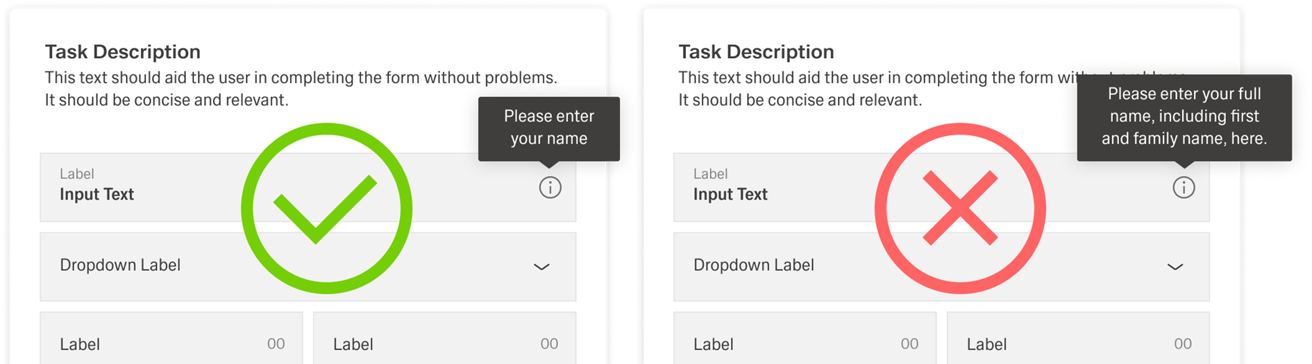
Tooltips
Tooltips can provide additional explanation for users that may be unfamiliar with a particular form field. They can also offer rationale for what may seem like an unusual request.
[Image placeholder: Tooltip icon next to a label with an example tooltip message.]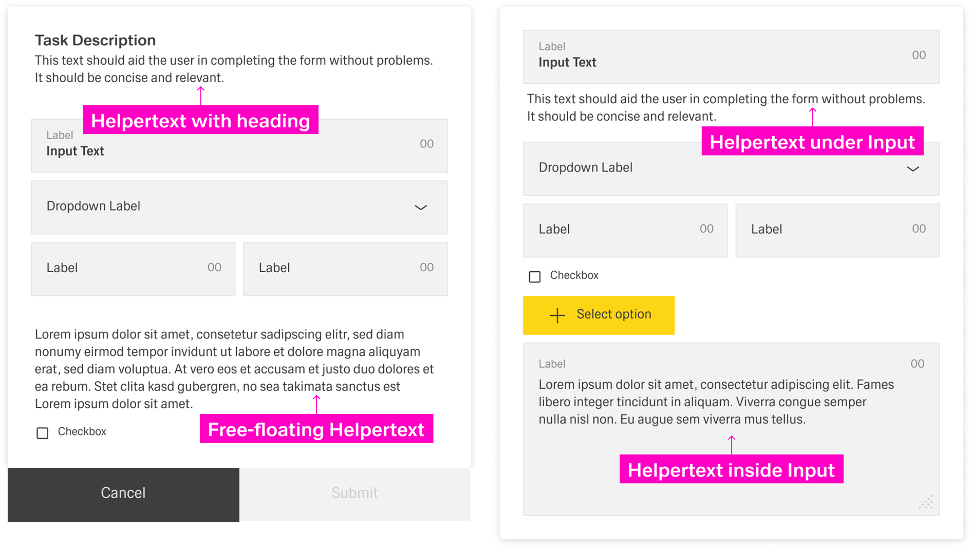
Placeholder text
...
Placeholder text is a lightweight hint inside the input. It can show an example value or expected format. It should not replace the label.
[Placeholder: Add specific placeholder text rules and examples.]
[Image placeholder: Placeholder text example in a text input.]
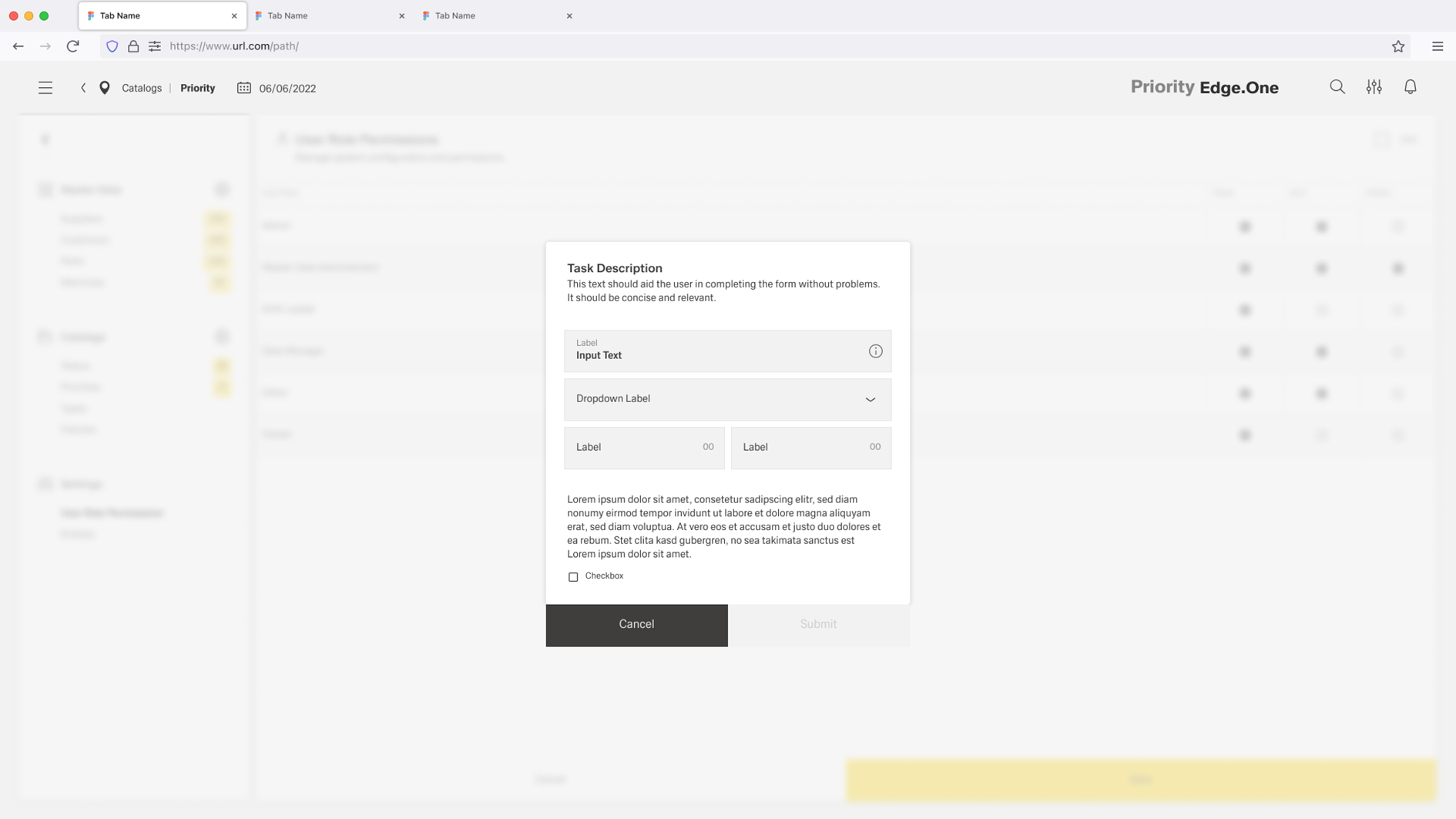
Helpertext
Help text always appears below the form title and assists the user in entering the correct information. The help text can refer to the entire form or only to individual parts of the form.
Help text is always available, even if the field is focused. Therefore, it is the right choice for information users need to know. For context or background information that is "nice to have", use placeholder text or a tooltip.
Tooltips
Tooltips can provide additional explanation for users that may be unfamiliar with a particular form field. They can also offer rationale for what may seem like an unusual request.
 [Image placeholder: Help text below the form title + helpertext for a specific form section.]
Best Practices
Forms are meant to gather information and guide people with as little fuss as possible. To help users scan and complete a form quickly, ask only for information that is absolutely necessary.
Group related tasks under clear section titles so the interface is easier to understand at a glance. Arrange fields in a logical, predictable order—for example, first name first and last name second—so users can move through the form without surprises.
[Image placeholder: Well-structured form with clear section titles and a predictable field order.]
Labels
Use sentence-style capitalization for all text elements, except for product names and proper nouns. Every input component needs a label, even if it is styled differently from other fields. Labels should clearly state what is required and stay focused on the essential meaning of the input. Do not use colons after label names. A label is not helper text, so it should be short and scannable—ideally one to two words.
[Image placeholder: Good label examples (short, clear, no colons).]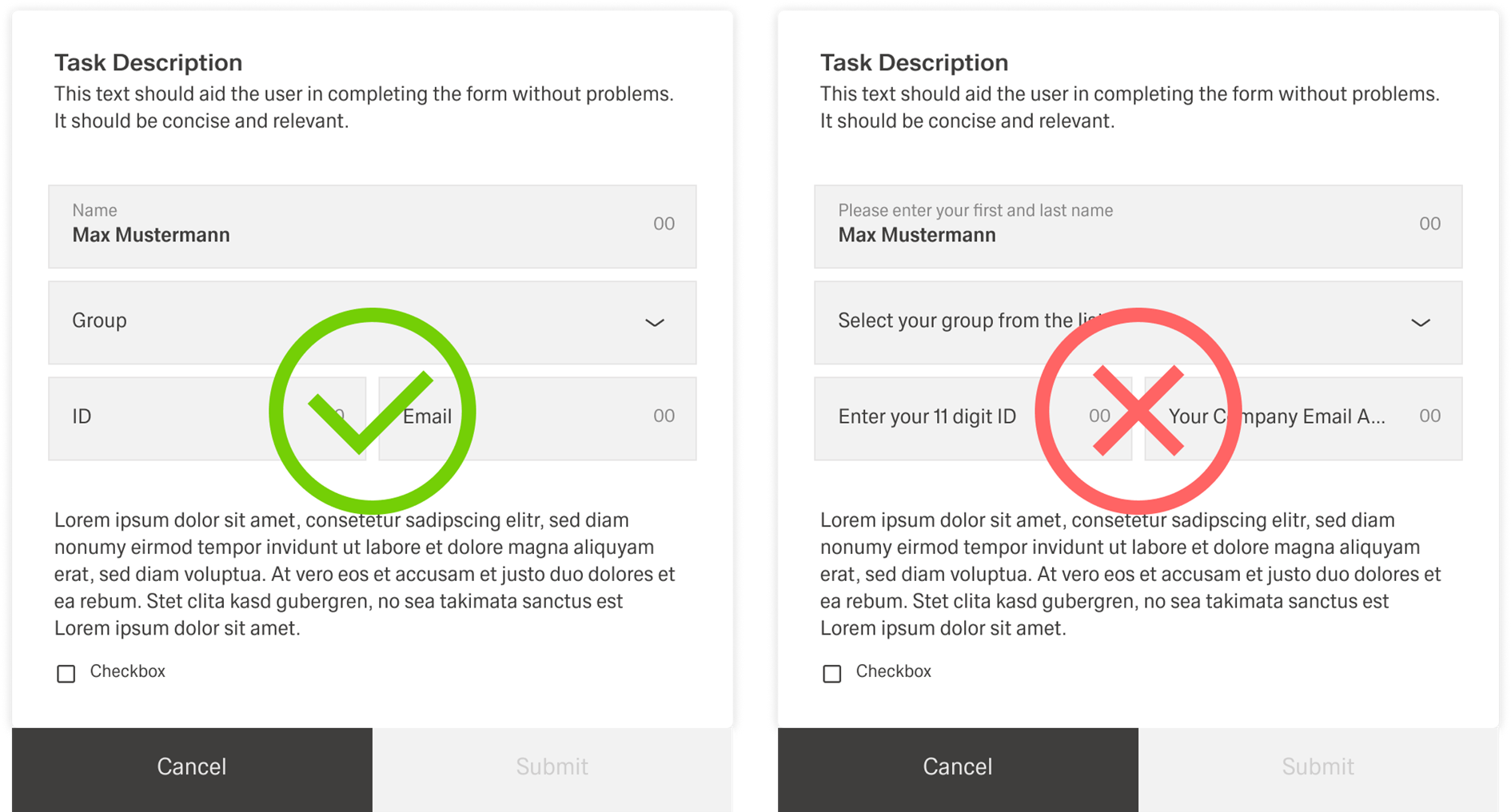
Spacing and grouping
Forms use consistent spacing to stay readable and predictable. The form should have a circumferential spacing of 24px. When inputs, datafields, and similar elements are arranged directly next to each other, the spacing between them should be 8px.
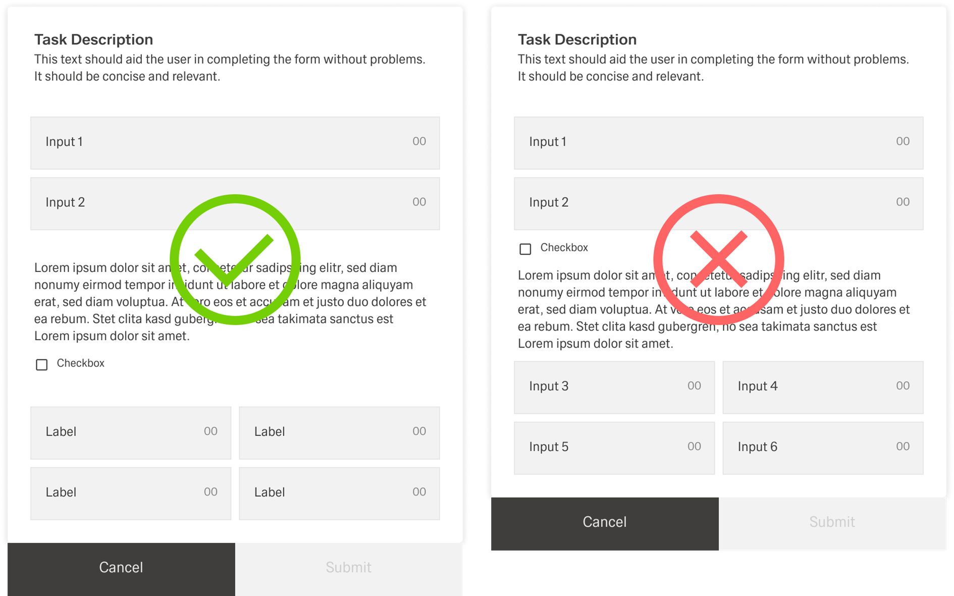
If input groups are separated, they should be separated with sublines. An introductory text below the subline is optional and can be used when users need extra context for the next group.
[Image placeholder: Spacing example showing 24px outer spacing, 8px between fields, and sublines separating groups.]
Tooltips
Tooltips should be used intentionally and sparingly. Use the outlined “i” (info) icon and reserve tooltips for explanatory or added information that helps users understand a field without cluttering the form. Because tooltips are microcontent, keep them concise and focused.
Tooltips are not a catchall for content that does not fit elsewhere. Do not place essential information in a tooltip, because users may miss it.
[Image placeholder: Side-by-side examples of good tooltip usage vs bad tooltip usage.]
Helpertext
Help
Use help text below the form title when it applies to the whole form. Use helpertext for information users need to know while completing the form, especially when it prevents mistakes or clarifies requirements. If the information is “nice to have” rather than required, prefer placeholder text or a tooltip instead.
[Image placeholder: Helpertext examples for whole-form help and section-level help.]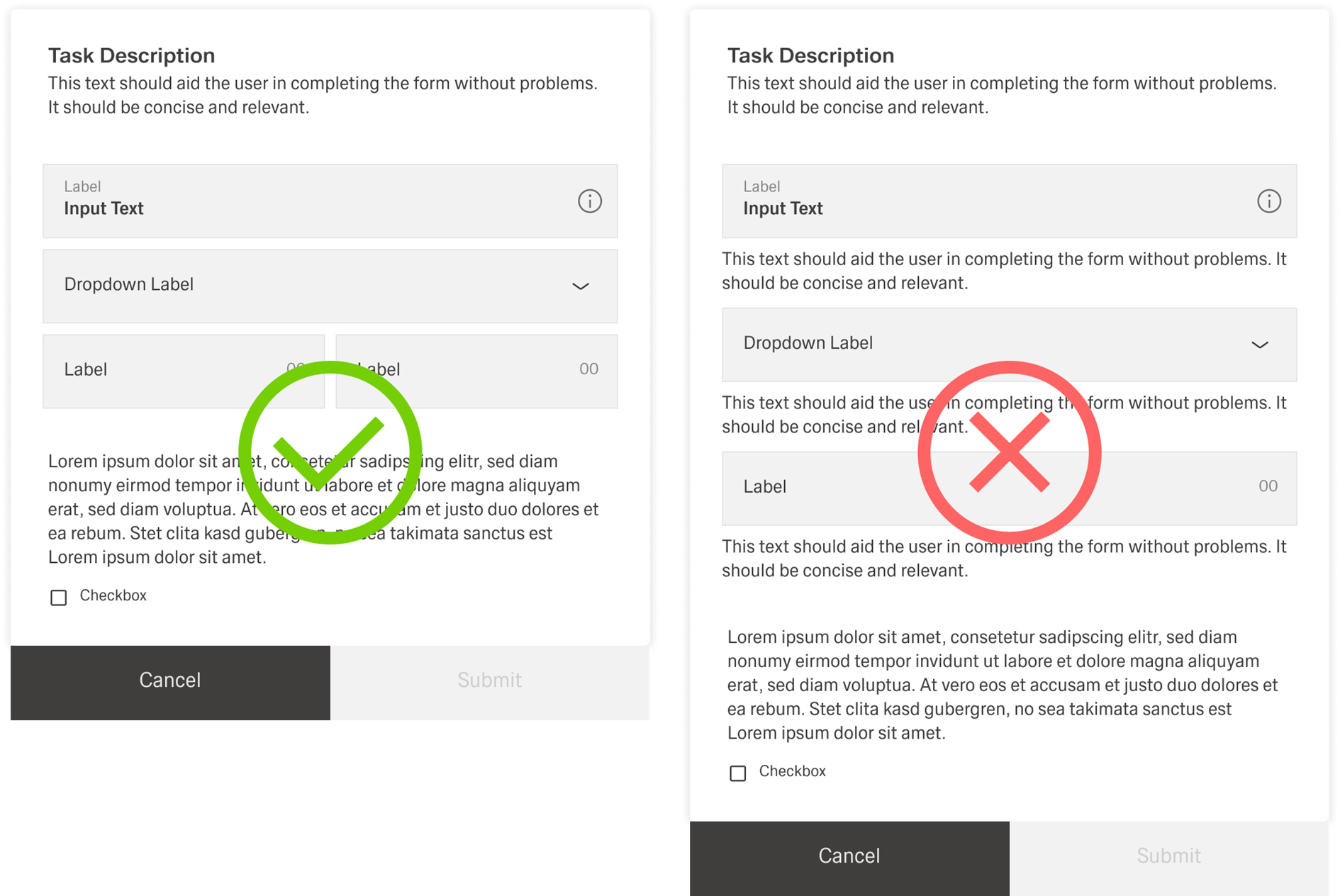
Error and Validation
...
If an error blocks completion, keep the form open and disable the primary button until the error is fixed. When needed, support the inline error with an additional inline notification to make the problem and required action even clearer.[Image placeholder:
Inline error message + disabled primary button + inline notification.]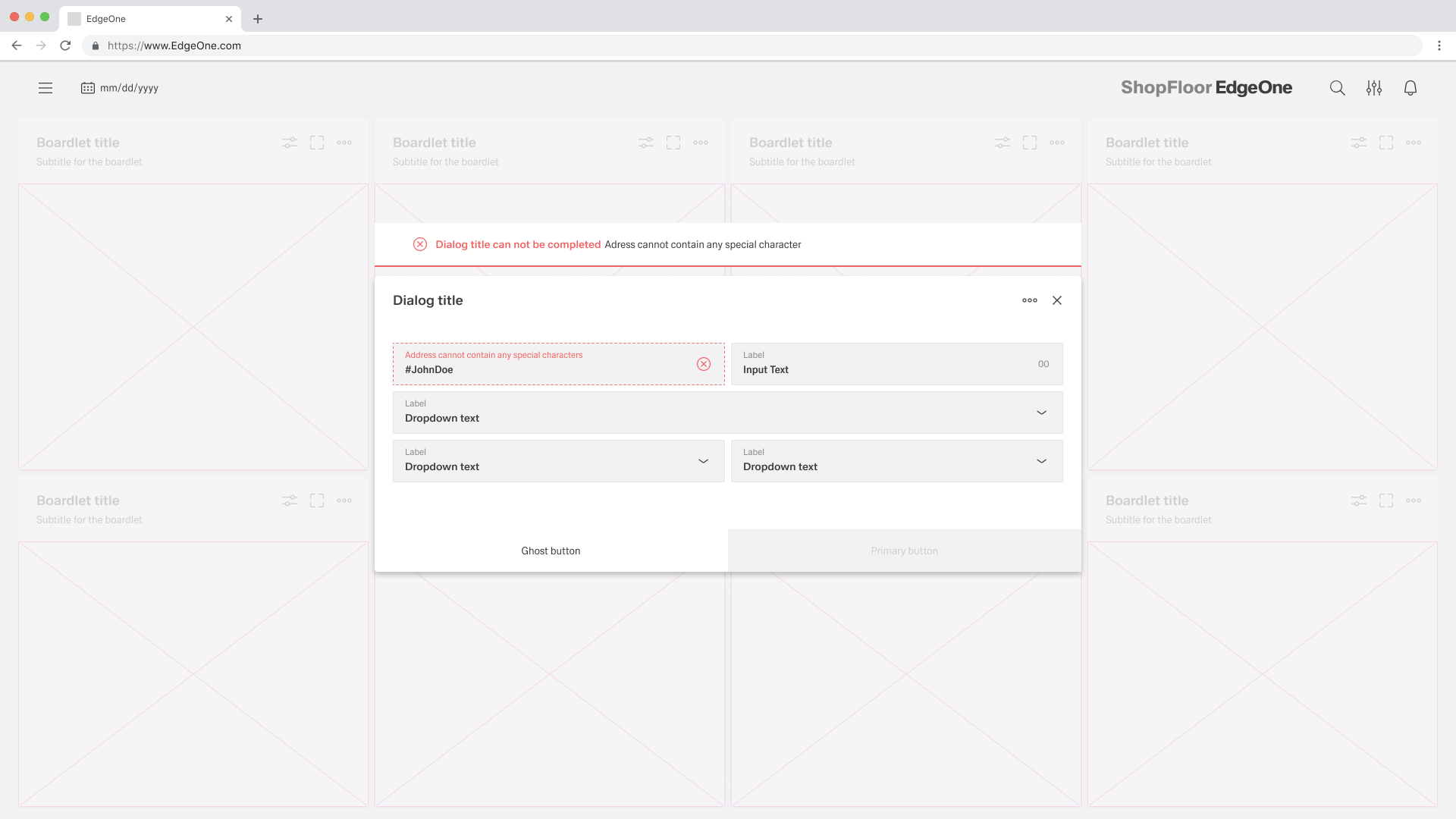
With or Without Tabs
Use a standard Form when the content can be understood and completed in one continuous flow. This layout works well for most create and update tasks because users can scan the fields from top to bottom, enter data, and submit without navigating between sections. A Form supports structured data entry, editing, submission, data binding, validation, and automatic form generation based on data schemas.
Use a Tabs Form when the form becomes complex and dividing it into clearly separated sections improves the user experience. Tabs Form uses a vertical tab-based layout where each tab contains its own form or content. This approach helps users focus on one topic at a time, prevents long scrolling, and makes large forms easier to understand. Tabs Form should be used when the content naturally breaks into logical groups that users can navigate between, while still keeping validation and saving consistent across the whole experience.
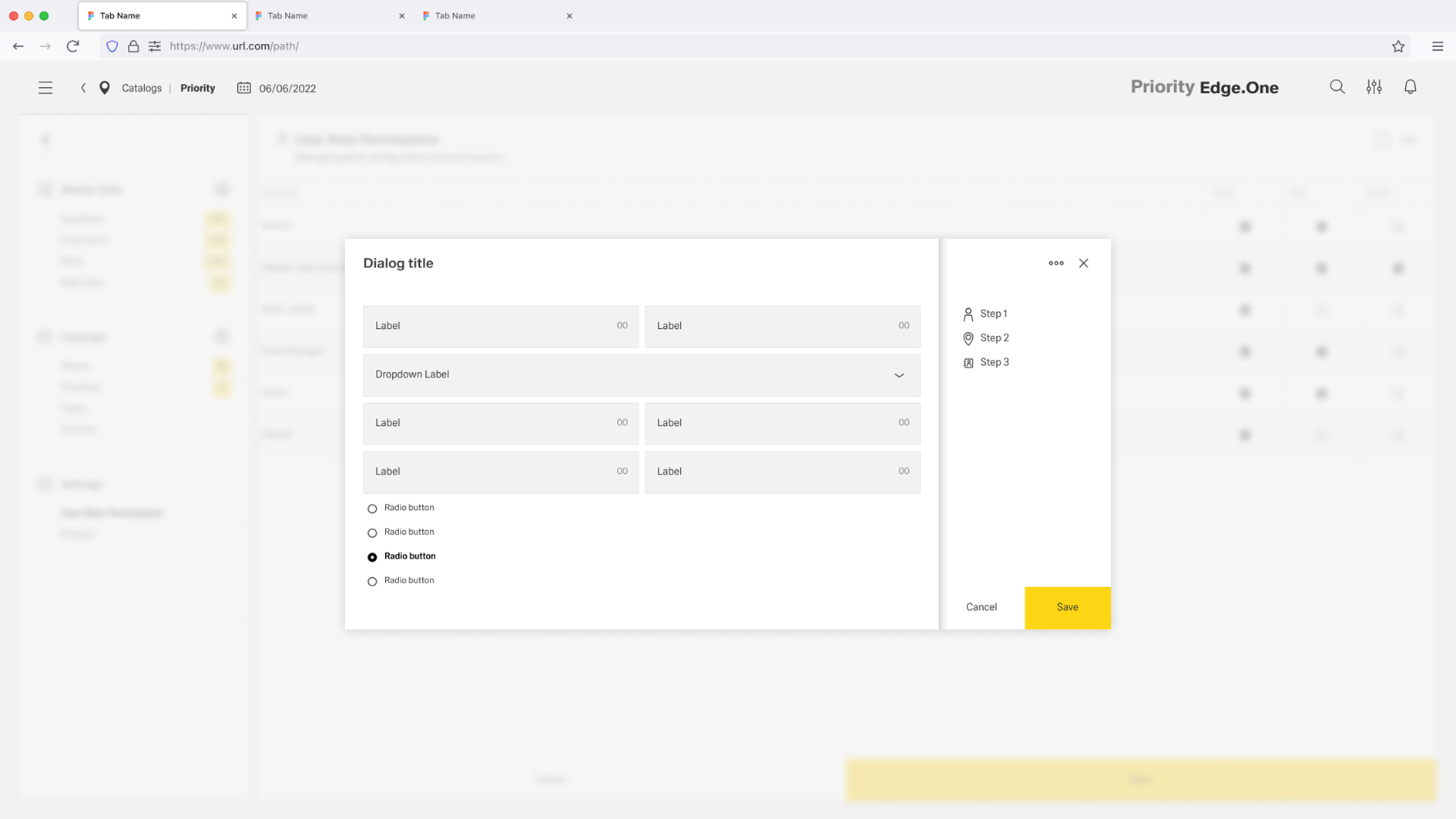
Vertical Tabs only occure inside Dialogs.
Selecting the right input
...