(this page was created automatically. In case of formatting issues, please visit the official Wiki Page)
Forms
Overview
A form is a group of related input controls that allows users to provide data or configure options. Forms can be simple or complex, and may be presented as dedicated pages, side panels, or dialogs depending on the use case and the situation.
Anatomy
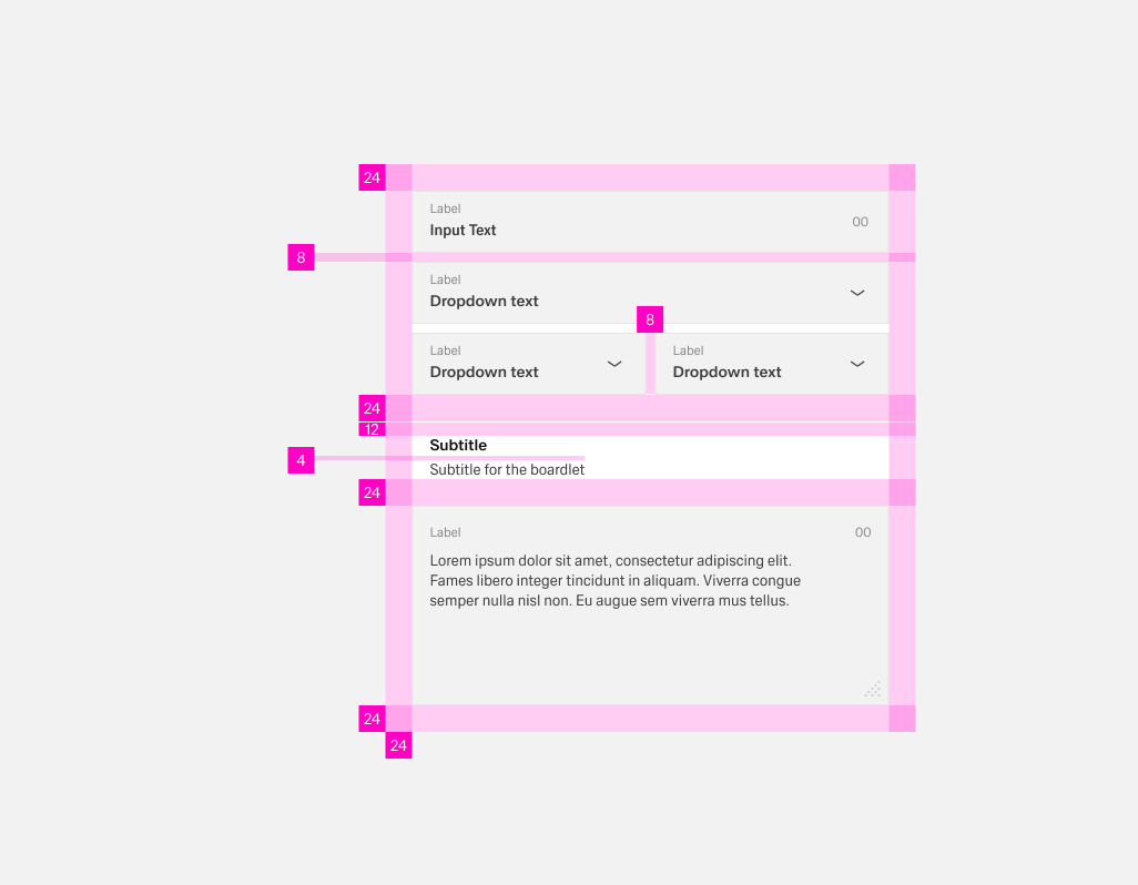
In general, forms have a padding of 24px arround the content. Elements inside the form like lables or input options have a distance of 8px eather vertically or horizontally between each other. This distance redces to 4px between text elements like titles and labels.
If the form has lot of content, it can be usefull to group certain elements. THis can be done with white space, wich should be 24px. This space expands by an additional 12px to a total of 36px bevor a title within the form.
Labels
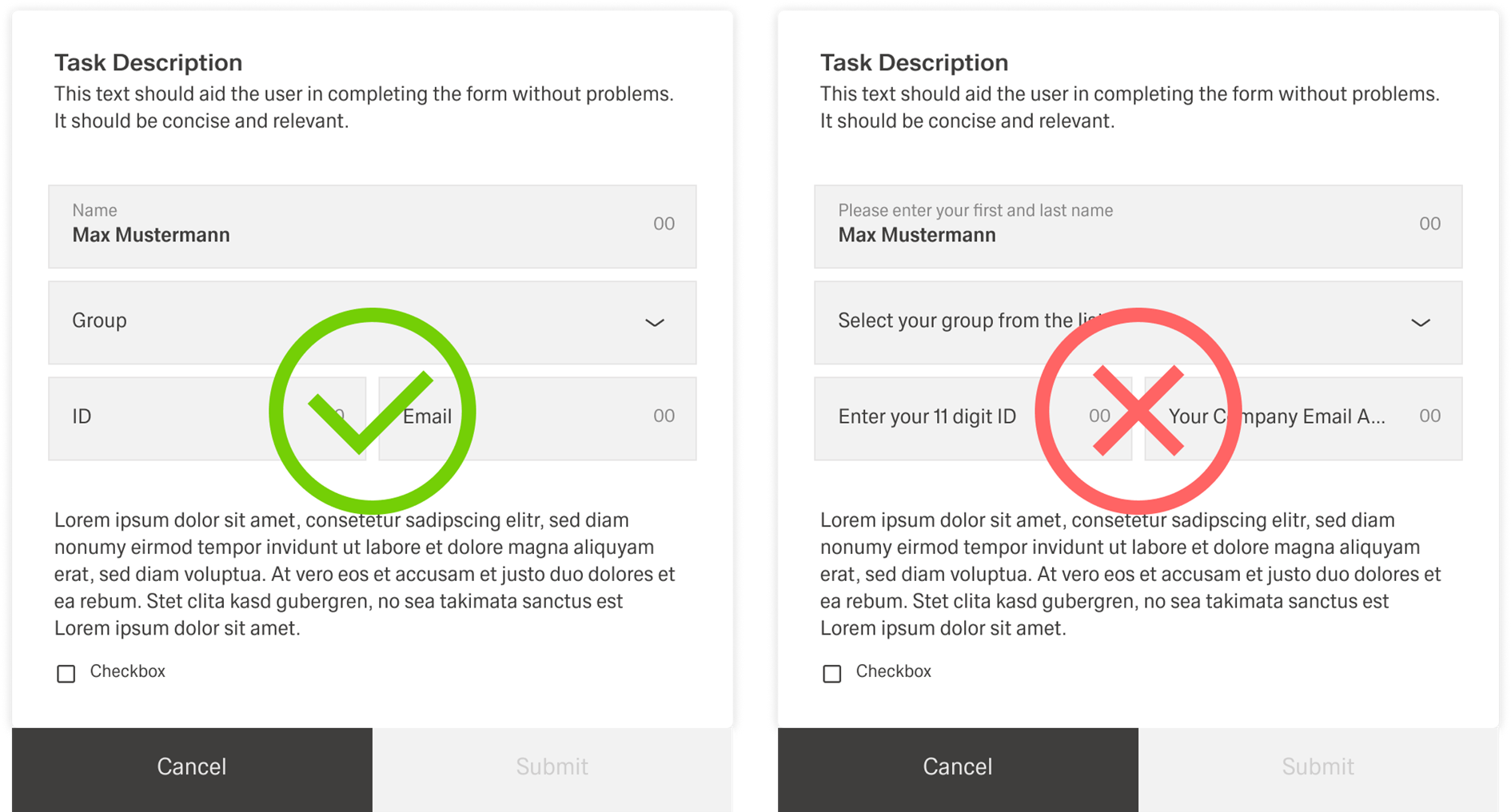
Labels help users understand what the corresponding inputs mean. They are the user’s first point of orientation in a form and make it clear what information is being requested. Lables are directly connected to the input and usually configured in Visual Properties.
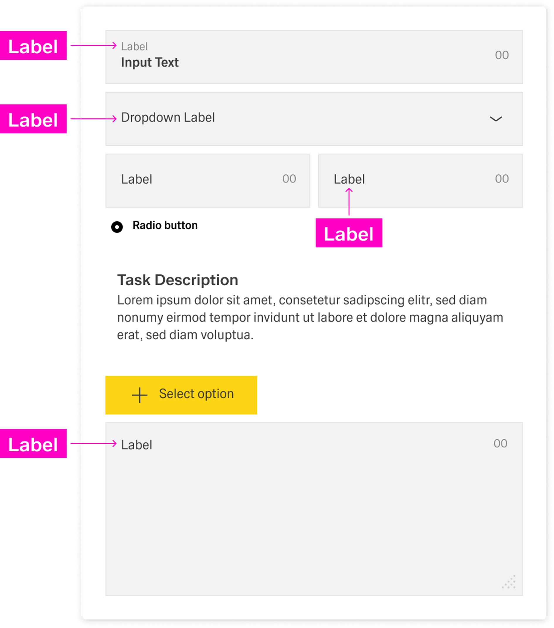
Labels are part of the form’s structure, not decoration. Even if input controls look different, they still need labels so the form stays scannable and predictable.
Input options
Forms capture information through different input options. Some inputs are free-form, where users type a value, and others are controlled, where users select, pick, upload, or scan. In general, use free-form inputs when the value cannot be predefined, and use controlled inputs when you want to restrict entry to valid values or make entry faster and more consistent.
For a detailed breakdown of specific input components and when to use them, see Selecting the right input.
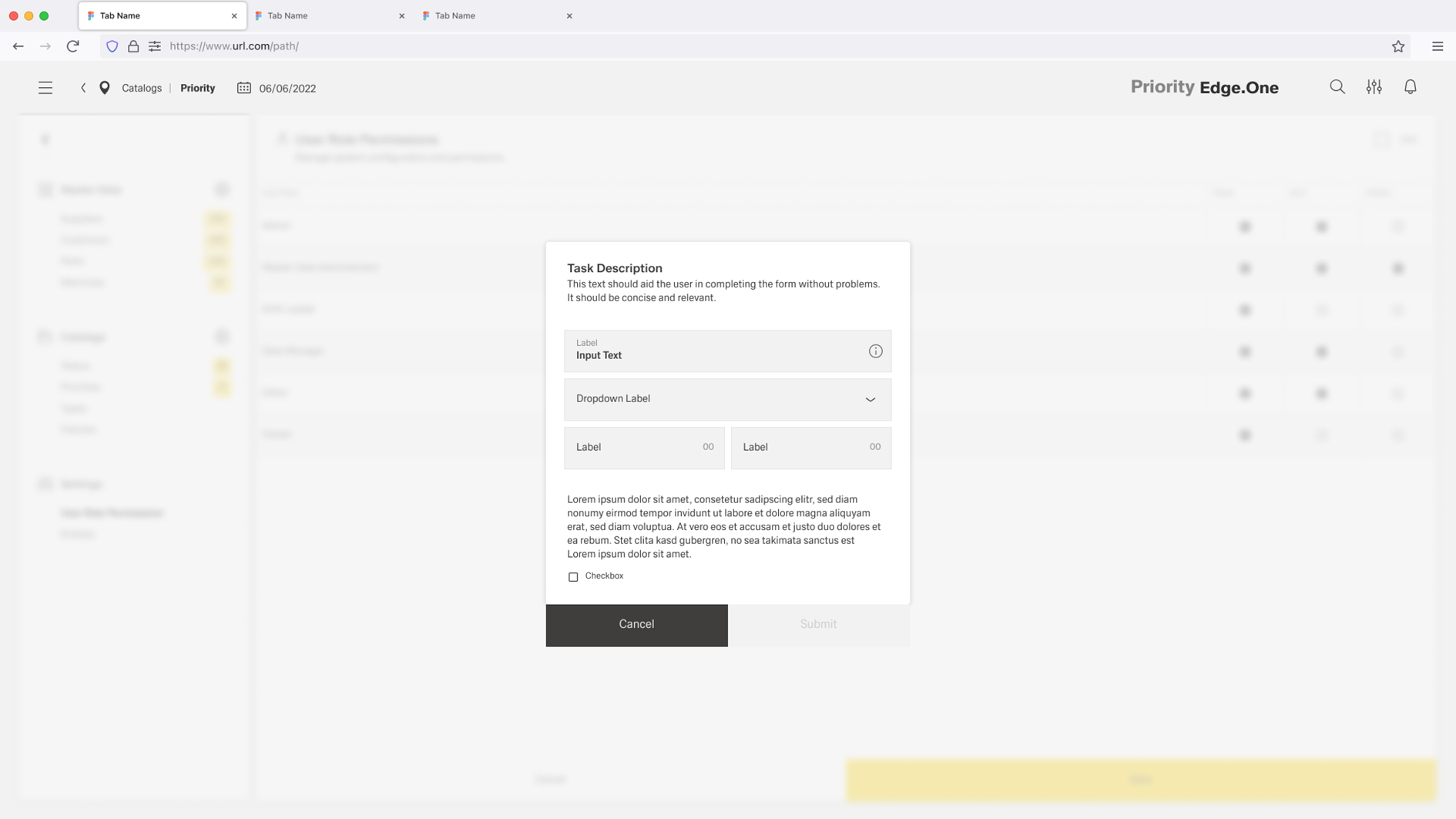
Help
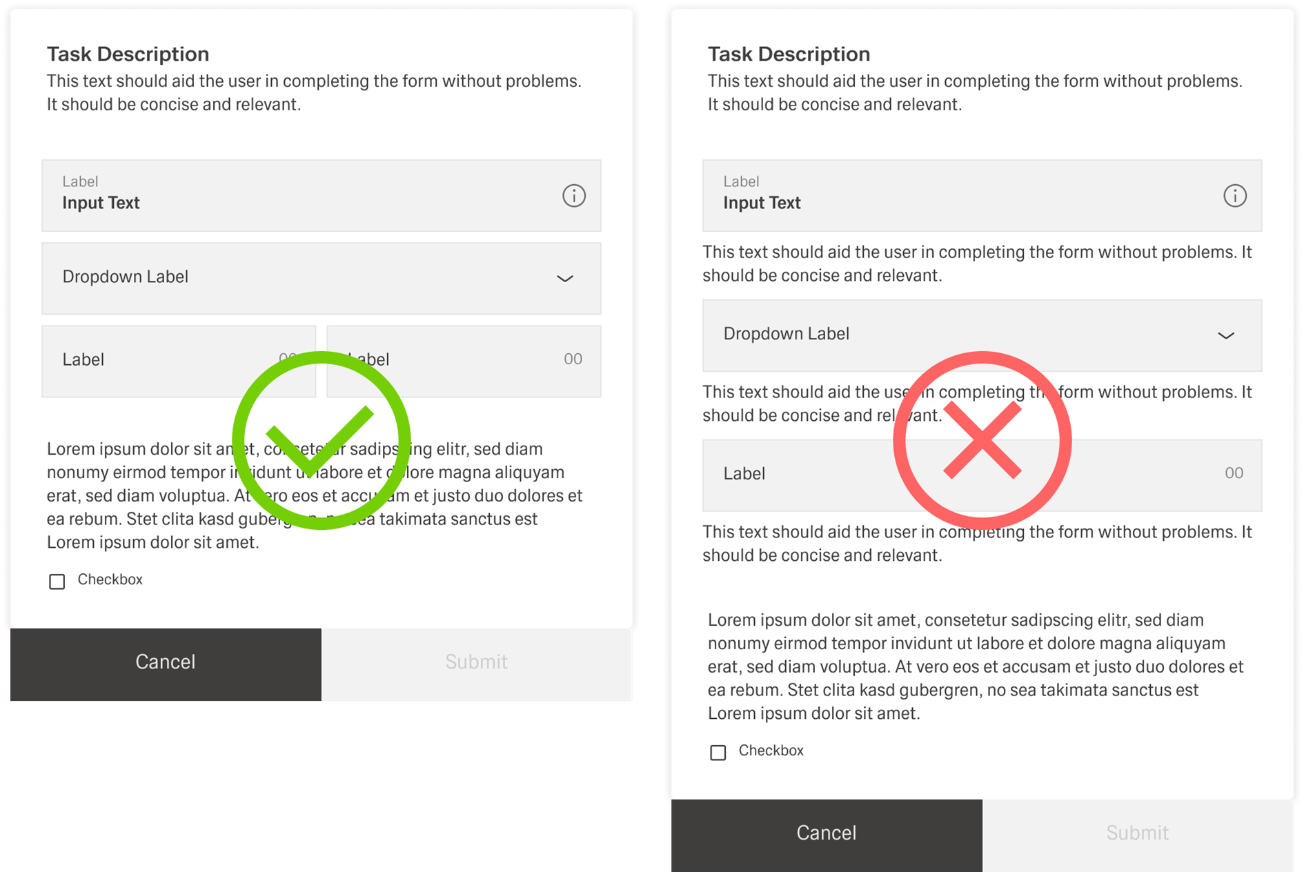
Help provides in-context guidance like tooltips, placeholder text, or helper text, to assist the user in providing the right information. Help should reduce uncertainty and prevent avoidable errors.
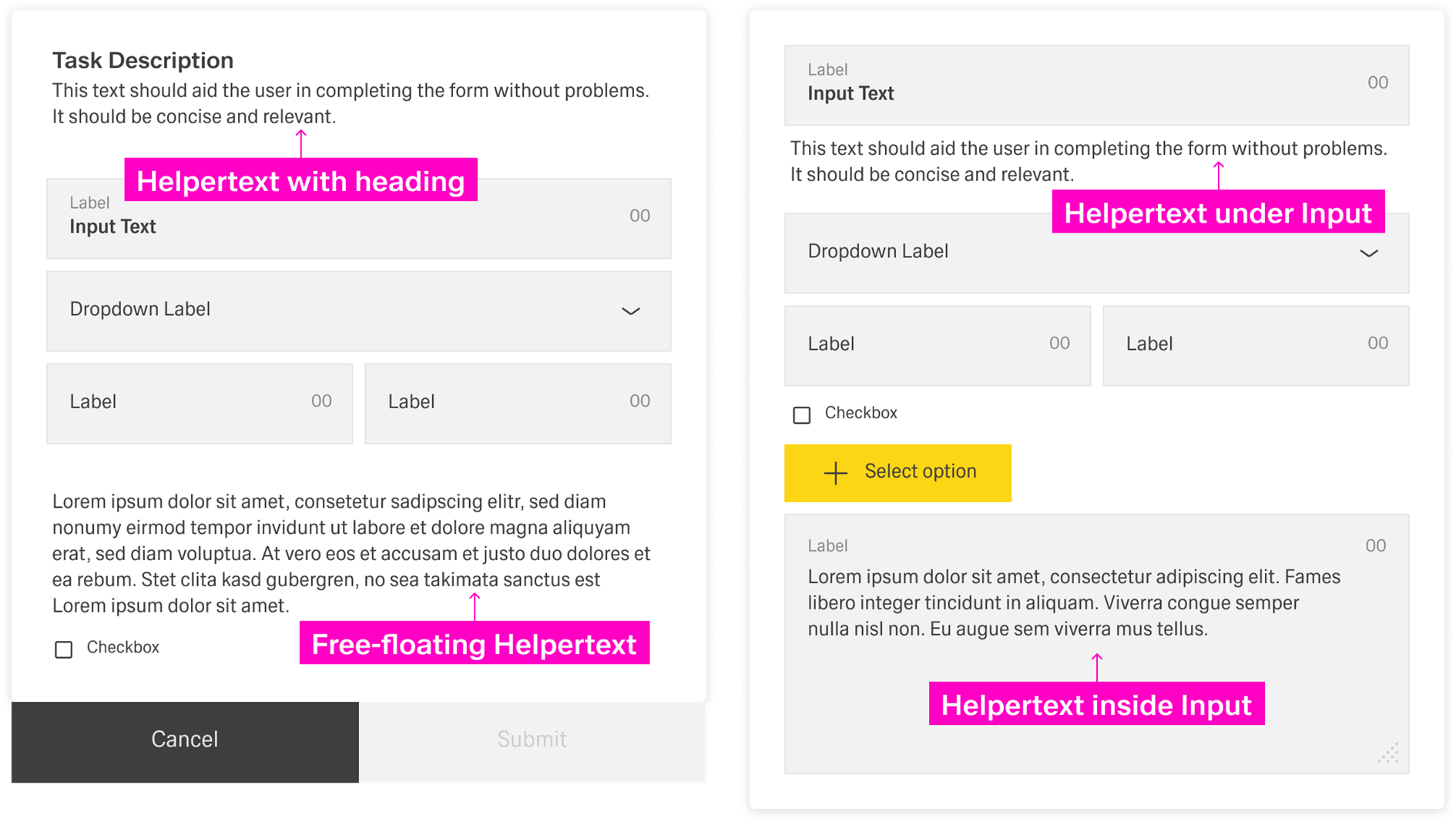
Placeholder text is a lightweight hint inside the input. It can show an example value or expected format. It should not replace the label.
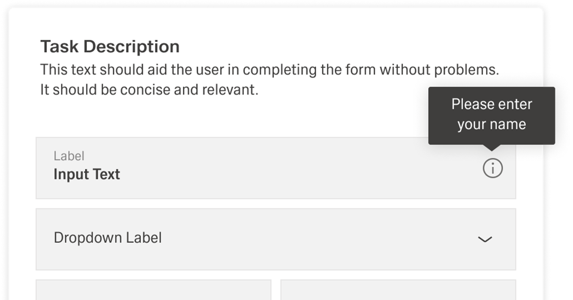
Tooltips
Tooltips can provide additional explanation for users that may be unfamiliar with a particular form field. They can also offer rationale for what may seem like an unusual request.
Best Practices
Forms are meant to gather information and guide people with as little fuss as possible. To help users scan and complete a form quickly, ask only for information that is absolutely necessary.
Labels
Use sentence-style capitalization for all text elements, except for product names and proper nouns. Every input component needs a label, even if it is styled differently from other fields. Labels should clearly state what is required and stay focused on the essential meaning of the input. Do not use colons after label names. A label is not helper text, so it should be short and scannable—ideally one to two words.
Spacing and grouping
Forms use consistent spacing to stay readable and predictable. The form should have a circumferential spacing of 24px. When inputs, datafields, and similar elements are arranged directly next to each other, the spacing between them should be 8px.
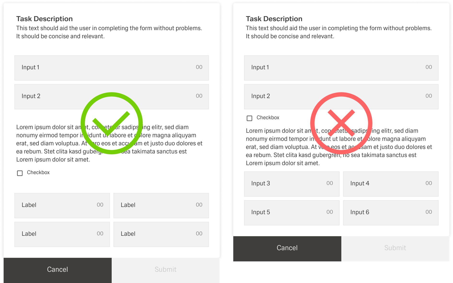
If input groups are separated, they should be separated with sublines. An introductory text below the subline is optional and can be used when users need extra context for the next group.
Tooltips
Tooltips should be used intentionally and sparingly. Use the outlined “i” (info) icon and reserve tooltips for explanatory or added information that helps users understand a field without cluttering the form. Because tooltips are microcontent, keep them concise and focused.
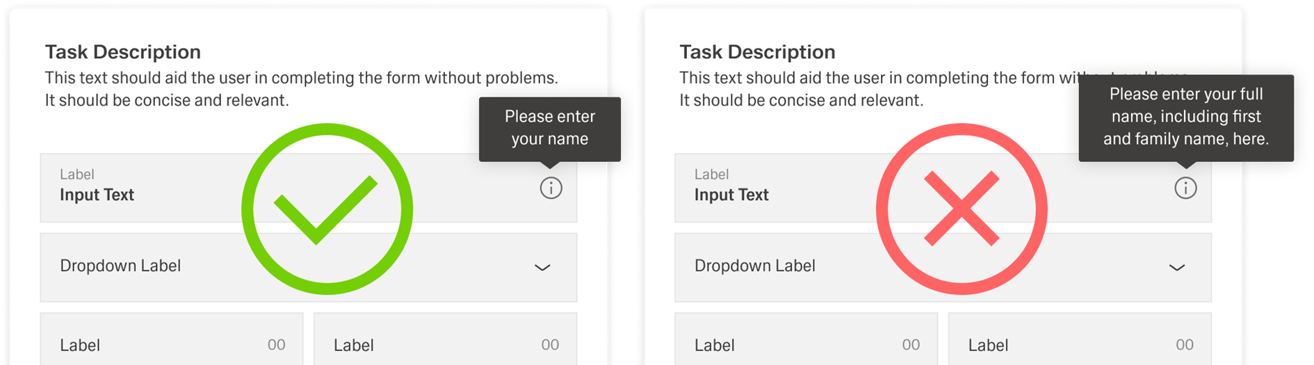
Tooltips are not a catchall for content that does not fit elsewhere. Do not place essential information in a tooltip, because users may miss it.
Help
Use help text below the form title when it applies to the whole form. Use helpertext for information users need to know while completing the form, especially when it prevents mistakes or clarifies requirements. If the information is “nice to have” rather than required, prefer placeholder text or a tooltip instead.
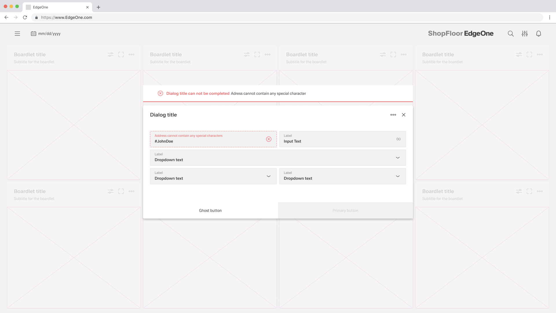
Error and Validation
Effective and immediate error messaging helps the user understand the problem and how to fix it. Start by explaining what happened, then guide the user toward the next step or the resolution. Error states should always be shown on the form, and inline errors should be used whenever possible so users can fix issues without searching.
If an error blocks completion, keep the form open and disable the primary button until the error is fixed. When needed, support the inline error with an additional inline notification to make the problem and required action even clearer.
With or Without Tabs
Use a standard Form when the content can be understood and completed in one continuous flow. This layout works well for most create and update tasks because users can scan the fields from top to bottom, enter data, and submit without navigating between sections. A Form supports structured data entry, editing, submission, data binding, validation, and automatic form generation based on data schemas.
Use a Tabs Form when the form becomes complex and dividing it into clearly separated sections improves the user experience. Tabs Form uses a vertical tab-based layout where each tab contains its own form or content. This approach helps users focus on one topic at a time, prevents long scrolling, and makes large forms easier to understand. Tabs Form should be used when the content naturally breaks into logical groups that users can navigate between, while still keeping validation and saving consistent across the whole experience.
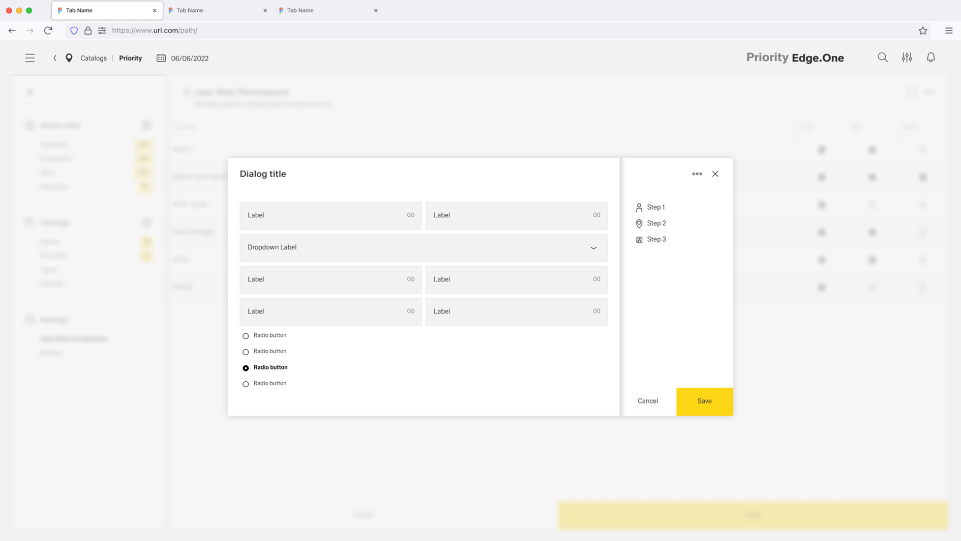
Vertical Tabs only occure inside Dialogs.
Selecting the right input
Choosing the right input type reduces effort, prevents errors, and keeps the form easy to scan. Use the sections below to match what the user needs to enter with the input option that supports it best.
Free-form input
Use free-form inputs when users need to type information that cannot be reliably selected from a predefined list. Pick the option that matches how much text is needed, whether it must be localized, and whether the value should be restricted to numeric entry.
| Component | Requirement | Why this is the better fit | Typical examples |
|---|---|---|---|
| Input | Short, single-line text | Keeps the layout compact and scannable for quick entries. | Name, email address, reference ID |
| Textarea | Longer text with line breaks | Gives users space to write and edit comfortably without feeling constrained. | Comment, description, feedback |
| Translation Input | Short text in multiple languages | Adds language selection so the same value can be maintained per locale. | UI label, short user-facing string, error message title |
| Translation Textarea | Longer text in multiple languages | Supports multi-line localized content with language selection for each locale. | Instructions, long descriptions, terms text |
| Number Input | Numeric values (with constraints/formatting) | Prevents invalid characters and supports numeric formatting/validation. | Price, quantity, measurement |
Selection
Use selection controls when users should choose from predefined options instead of typing. The right control depends on whether the choice is binary, single, or multiple, and on how large or complex the option set is.
| Component | Requirement | Why this is the better fit | Typical examples |
|---|---|---|---|
| Checkbox | A single binary choice (yes/no) where a checkbox fits the context | Clear for confirmations and acknowledgements; supports default, read-only, and disabled states. | “I agree”, “I have read…”, “Include archived items” |
| Toggle Switch | A simple on/off setting | Strong visual feedback for enabled/disabled states; feels like a setting control. | Enable notifications, Activate feature, Turn on auto-sync |
| Radio Group | Exactly one choice from a small set where options should stay visible | Makes mutually exclusive choices easy to compare without opening a menu. | Shipping method, Payment type, Priority level |
| Single Select | Exactly one choice from a list (options can be hidden in a dropdown) | Saves space while still allowing a clear single selection; can be static or API-backed. | Category, Status, Role |
| Multi Select | Multiple choices from a list | Supports selecting several values in one field; can be static or API-backed. | Tags, Categories, Related items |
| Combobox | Exactly one choice from a large or dynamic list where search helps | Adds search and pagination so users can find options quickly in long lists. | Assign user from directory, Select asset from inventory, Pick customer |
| Lookup Input | Selecting from a very large dataset where a dropdown is impractical | Opens a searchable dialog with a data grid, making big datasets manageable. | Select equipment, Choose part number, Pick location from thousands |
| Table Selection | Selecting from large/complex records where a table view is clearer | Combines a field with a data grid; better when users need to compare columns before selecting. | Choose an order, Select an incident record, Pick a person with metadata |
Date and Time
Use date and time inputs whenever users enter time-based values, because pickers prevent formatting errors and reduce cognitive load. Choose between a single point in time and a full period depending on whether one date or a start–end range is required.
| Component | Requirement | Why this is the better fit | Typical examples |
|---|---|---|---|
| Date Picker | One date (optionally with a time) | Keeps the interaction simple and fast for single-point-in-time values. | Due date, Appointment date/time, Start date |
| Date Range Picker | A start and end date (optionally with time) | Captures a complete period in one control and prevents inconsistent ranges. | Reporting period, Booking range, Filter “from–to” timeframe |
Files
Use file inputs when attachments are part of the submission. Choose a simple uploader for small numbers of files, and a table-based approach when users need an overview, actions, or management of multiple attachments.
| Component | Requirement | Why this is the better fit | Typical examples |
|---|---|---|---|
| File Upload | Uploading one or a few files as part of a form | Simple upload flow with configurable restrictions and behavior. | Attach document, Upload image, Add single attachment |
| Files Table | Managing multiple files with overview and actions | Table view improves scanning and control; supports upload, deletion, custom actions, and pagination. | Evidence set, Multiple attachments, Document bundle management |
Scanning
Use scanning inputs when data is best captured through RFID or visual codes rather than manual entry. Scanning is ideal for workflows where speed and accuracy matter and a scan-first experience reduces mistakes.
| Component | Requirement | Why this is the better fit | Typical examples |
|---|---|---|---|
| RFID Scanner | Capturing RFID tag values (scan-first, with manual fallback) | Fast and reliable for RFID workflows; supports validation, events, defaults, and manual entry. | Asset tagging, Equipment identification, Warehouse tracking |
| Visual Codes Scanner | Capturing QR codes, barcodes, or other visual codes (scan-first, with manual fallback) | Uses the device camera for quick capture; ideal for common barcode/QR scenarios. | Inventory scanning, Event check-in, Product verification |