The Unit
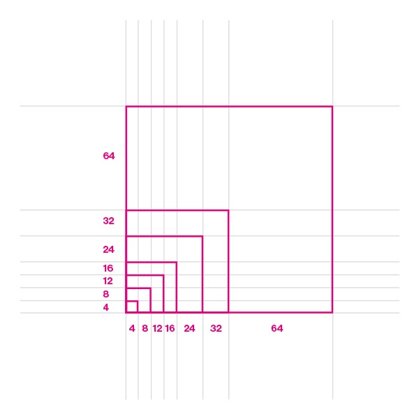
The basic unit for the grid is the 4-pixel square mini unit. Variants of mini units form the dimensions of columns, rows and boxes as well as their edges and fillings. The mini-unit adapts to your content while maintaining a constant visual rhythm.
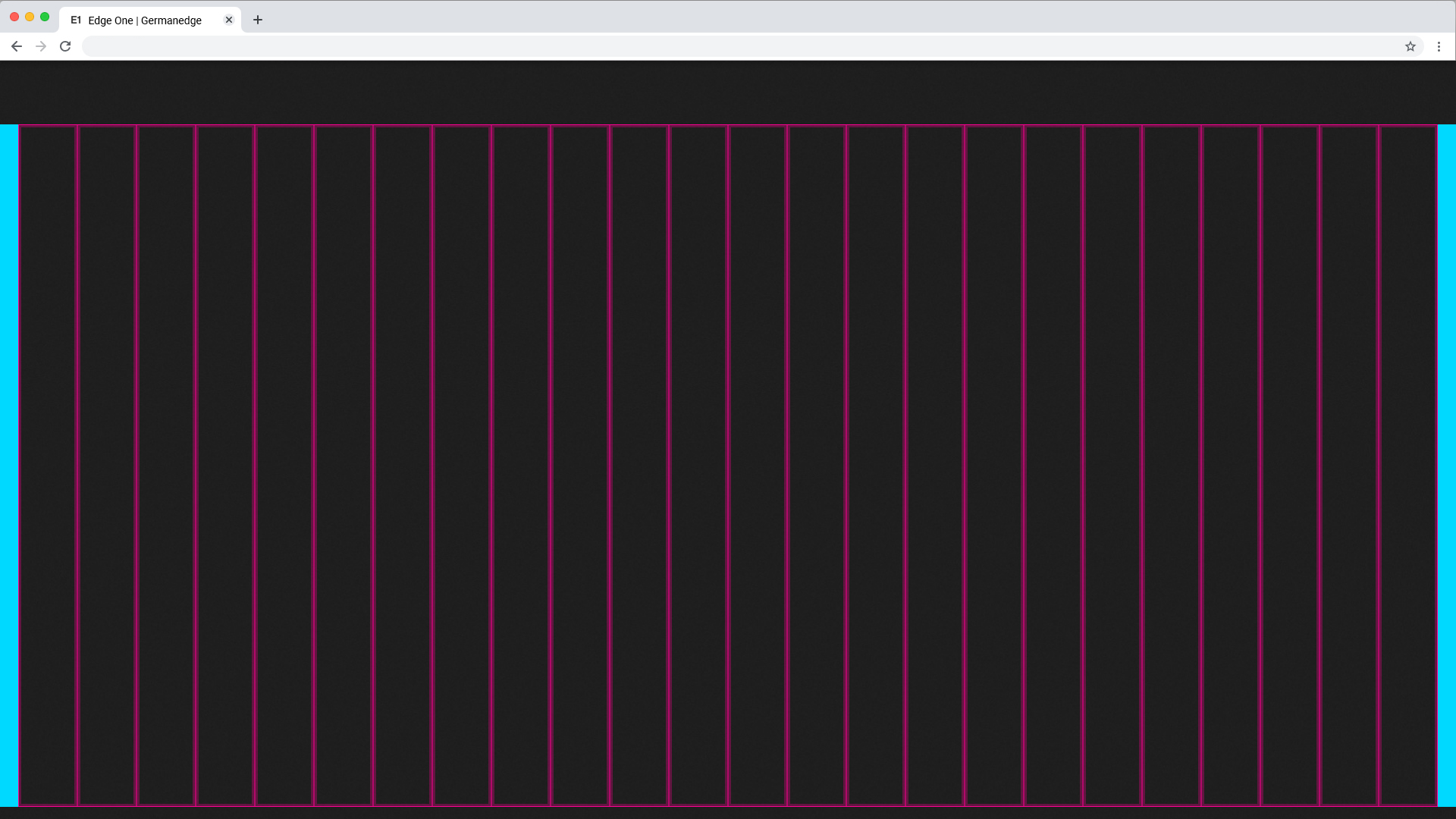
24 Columns Grid
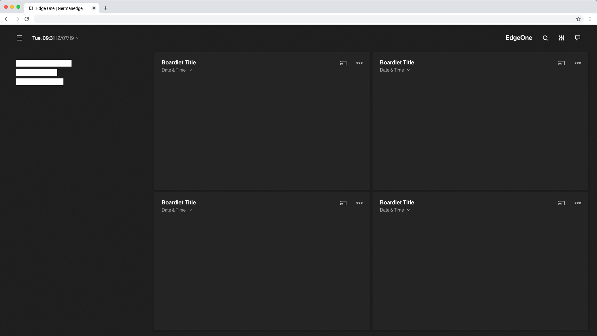
The 24 Columns Grid ist the Base of all. Columns result in key lines. Within the lines all components find their place. all columns have a padding.

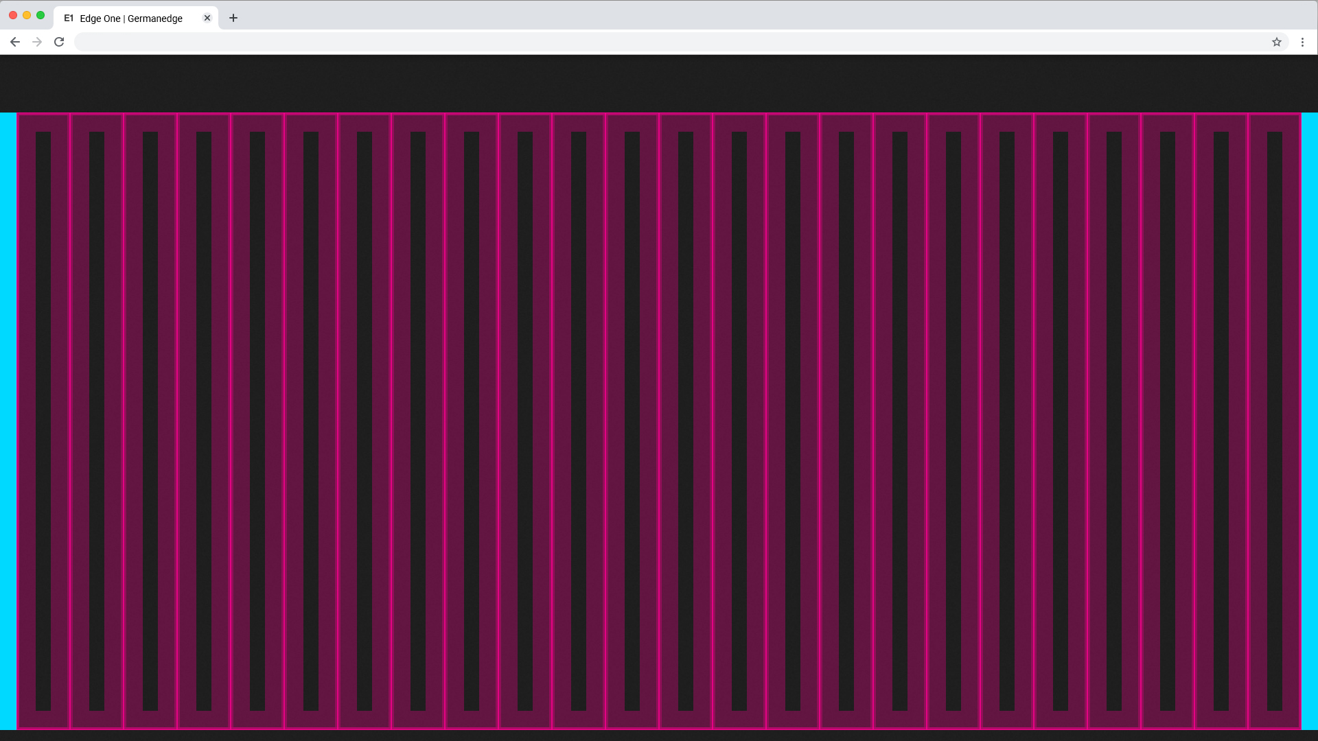
Columns and Gutter Padding
The padding within the columns is one Mini Unit (4x4px) or one Middle Unit (24x24px). This can be determined by the designer depending on the content.
It is recommended to use 1 mini unit for boardlets and 1 middle unit for content that is free standing.
Columns Patting with Mini Units
Gutter Patting with Middle Units
Use this set of standard breakpoints to maintain layout integrity across screen sizes. For best results, test designs and code at each of these standard breakpoints.
| Breakpoints | size (px) | columns | size (%) | padding | margin | gutter |
|---|---|---|---|---|---|---|
| Small | 328 | 4 | 25% | 4 px | 24 px | 24 px |
| Tablet upright | 720 | 8 | 12.5% | 4 px | 24 px | 24 px |
| Tablet landscape | 984 | 12 | 8.33% | 4 px | 20 px | 24 px |
| Web 1280 | 1224 | 12 | 8.33% | 4 px | 28 px | 24 px |
| Web 1920 | 1873 | 24 | 4,16% | 4 px | 24 px | 24 px |
