The header is the heart of the software. All buttons with global functions can be found here.
The appearance and the contents vary within the different devices. This is necessary because for example
mobile less details are necessary or the details have to be displayed in multiple levels. This also applies to the header.
The basis for all components of the "UI Flow" is the 1/1 Unit.
More details about the the base Unit you will find here
Header Box
(Desktop Max-Small)
The header box is oriented to the left and right of the content cutter (13/1 booth sides).
It has a fixed distance from the top (8/1). The padding of the header box is fixed (2/1).
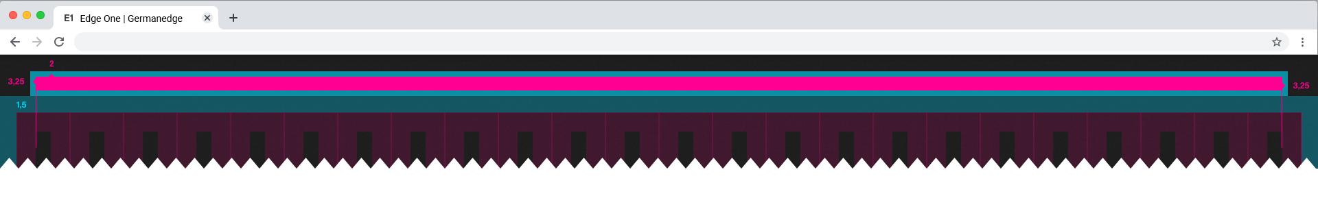
Header Content
(Desktop Max-Small)
The header content consists of icons, dropdowns with menu and logo.
All elements have a fixed distance of 8/1 to each other.

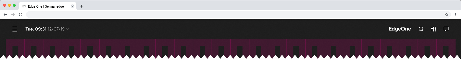
Best Practice
(Desktop Max-Small)
Here you can see the best practice of the MVP Header design.
Tablet and Mobile
Coming Soon