Links are used as navigational elements. They may appear on their own, within a sentence or paragraph, or directly following the content. You can place icons on a link to make them more specific.
Overview
Links are used as navigational elements and can be used on their own or inline with text. They provide a lightweight option for navigation but like other interactive elements, too many links will clutter a page and make it difficult for users to identify their next steps. This is especially true for inline links, which should be used sparingly.
Usage
Use
- Navigate to a different page within the application
- Navigate to an entirely different site
- Jump to an element on the same page
- Link to emails or phone numbers
Do not use
- You could use a button to trigger the action instead.
- Buttons should never be used for navigational actions.
There is no target or reference to be linked to.
Types
There are four different link types:
- Default
- Emphasized
- Subtle
- Link with icon
Guidelines
Use a meaningful link text that indicates what will happen when the user interacts with the link (for example, Open Sales Order). Avoid texts such as Click Here or Link, as these do not meet accessibility standards.
Default
Use a default link if you want to display a simple link.
Emphasized
Use an emphasized link for extraordinarily important links that need to attract the user’s attention quickly.
Subtle
Use subtle links to distinguish between important (default) and less important (subtle) links when the app page is full of various links (10+). Subtle links allow you to improve the visual hierarchy in large data lists and tables.
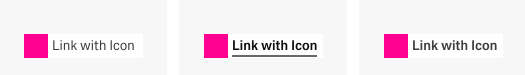
Link with Icon
Use the link with icon when the user expects and profits from the icon in the UI context.
Formatting
Anatomy
Basic Link
| ||
| default | hover/active | active |
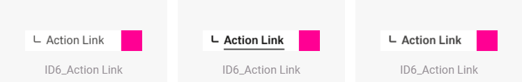
Action Link
| ||
| default | hover/active | active |
Link with Icon
| ||
| default | hover/active | active |
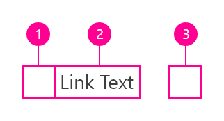
- Icon Button/ Icon
- Link Text
- Icon
Content
We recommend links be three words or fewer. Because links take users to a new location, it is important that their labels accurately reflect the content users will find at the link destination. Use meaningful labels for links and avoid terms like “click here” or the web address itself.
Links need to be clear enough to be understood by the user, but should not be so long that the text wraps unless used inline.
Behaviors
Interactions
Mouse
Users can open a link by clicking anywhere along the link text or on the associated icon.
Keyboard
Users can open a link by pressing Enter while the link has focus. For additional keyboard interactions, see the Accessibility tab.
Screen readers
VoiceOver: Users can open a link by pressing Control-Option-Space or Enter.
JAWS: Users can open a link by pressing Enter.
NVDA: Users can open a link by pressing Enter.
Link types
Standalone link
Standalone links are used on their own directly following content. They should not be used within sentences or paragraphs. Standalone links are the default link style for Carbon and only have an underline in the hover state.
The standalone link component can be paired with an icon. Use 16px icons and place them to the right of the link. Icons should always be the same color as the link text.
!!!insert picture here
Inline link
Inline links are used in sentences or paragraphs of text. The inline link behaves the same as the standalone link but it is styled with an underline. This helps differentiate them from the text they are placed next to and makes it clear users can interact with them.
Inline links should not be used on their own and should not be paired with icons.
Modifiers
Visited style
By default, the link component does not use a visited style. Visited links indicate that a user has already opened the link so they can be a helpful indicator during task completion. Visited styles should be used sparingly because they often clutter the the page and add further visual noise as users are trying to navigate a product. They can be used if it is important that a user knows they have already clicked on a link.
Links that trigger actions
Some links trigger actions to aid task completion in addition to navigation. These links should still serve a navigation purpose. A common example is linking phone numbers so clicking the website automatically opens and calls the phone number when clicked. The label and any accompanying icons should make it clear what action will be triggered and where the user will be directed.
Related
Color
!!! define color here
pawel tomkowski makes it sense to put the style information from live style guide here?
| Class | Property | Color token |
|---|---|---|
.bx--link | color | $link-01 |
Interactive States
| Class | Property | Color token |
|---|---|---|
:hover | text color | $hover-primary-text |
:active | text color | $text-01 |
:focus | border | $focus |
:visited | text color | $visited-link |
:disabled | text color | $disabled-02 |
!!! add picture here
Typography
Links should not exceed three words.
| Property | Font-size (px/rem) | Font-weight | Text style |
|---|---|---|---|
.bx--link | 14 / 0.875 | Regular / 400 | $body-short-01 |
Structure
Recommended
Links can be grouped horizontally or vertically and must be underlined. The following specs are not built into the Link component but are recommended by design as the proper distance between grouped Links.
| Class | Property | px / rem | Spacing token |
|---|---|---|---|
.bx--link | padding-right | 16 / 1 | $spacing-05 |
Preview the link component with the React live demo. For detailed code usage documentation, see the Storybooks for each framework below.
!!! create live demo here.
pawel tomkowski makes it sense to put the code from live style guide here as an iframe?
Test
!!!this section needs to rework
How it works
The link Carbon component is primarily a native HTML hyperlink navigational element. The Enter key activates the link and causes the user agent to move focus to the link destination. When you use the disabled link component the ARIA state is set to aria-disabled="true", which changes the appearance and the tabindex="-1" which removes the link for the tab order. When the link becomes active the ARIA state changes to aria-disabled="false" and the link is present in the tab order.
Accessibility considerations
This component has been validated to meet the WCAG 2.0 AA and Section 508 accessibility guidelines, however changes made by the content owner can affect accessibility compliance. Be sure to review and follow the guidance in this section when updating or adding new content to this component.
- Link text is the visible label for the native HTML link and is used to provide the purpose of the link which is clear and easy to understand for all users.
- The alt attribute for the img element is used to describe the purpose of a graphical link with an image inside the link.
- The title attribute can be used to supplement the link text with any additional useful description.