(this page was created automatically. In case of formatting issues, please visit the official Wiki Page)
Navigation Boardlet
Overview
The Navigation boardlet is a special type of boardlet. It has two states: collapsed and expanded. It is part of the grander patterns of Navigation.
Anatomy
Expanded
In its expanded stage, the navigation boardlet shows the entirety of its content. It consists of any number of Navigation Items grouped under a Navigation Overline. In addition, the boardlet can have a Footer that can include a brand logo, action buttons and a system information text.
Possible navigation items include but are not limited to:
- Tree view /node list of navigation links
- Link list
- Card collection
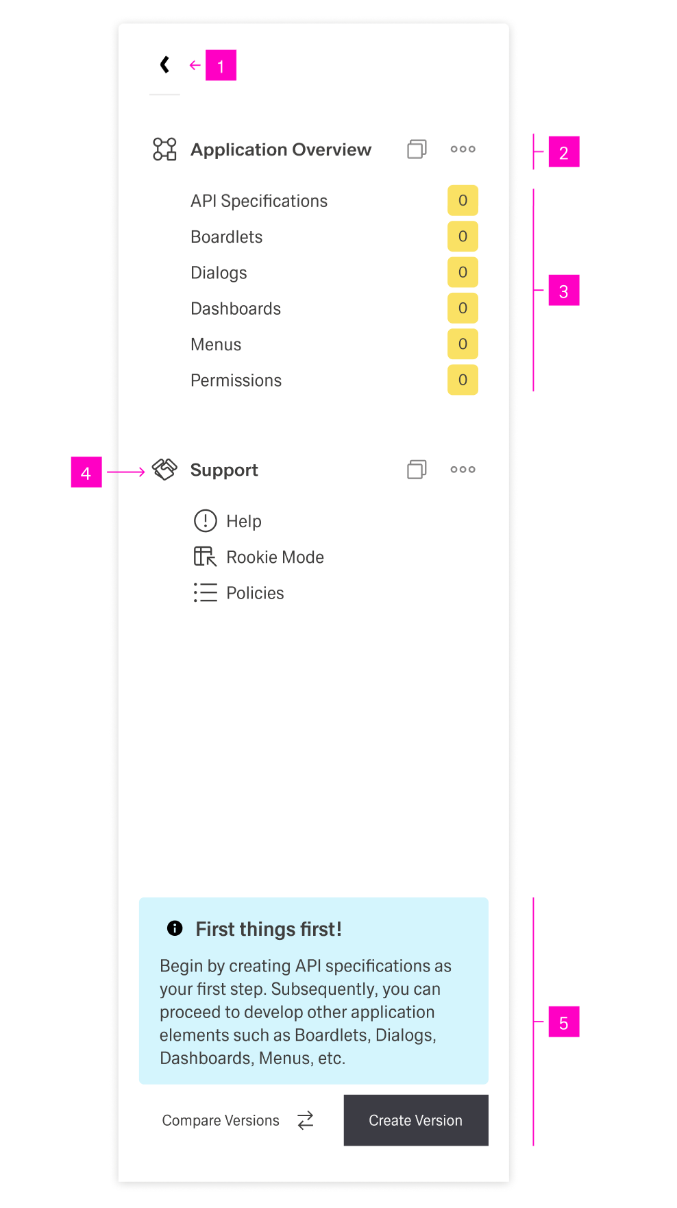
- 1 - "Collapse" action - This button allows the user to collapse the navigation.
- 2 - Navigation Overline - The header for a section of navigation items with an icon and possible action icons.
- 3 - Navigation Items - Navigational links with a multitude of forms.
- 4 - Navigation Overline Icon - A recognizable icon representing the navigation overline.
- 5 - Footer - With an action button and a system information text.
Collapsed
This is the default state of the Navigation boardlet when encountering it on a dashboard. In this state, the menu is only 1 column wide.
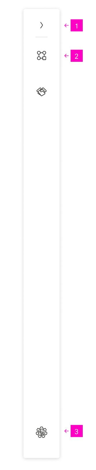
- 1 - "Expand" action - This button allows the user to expand the navigation.
- 2 - Navigation Overline Icon - In the collapsed state, only the icon of menu overlines is visible.
- 3 - Brand Logo - An optional brand logo can be placed at the bottom.
Best Practices
tba