(this page was created automatically. In case of formatting issues, please visit the official Wiki Page)
Table
Overview
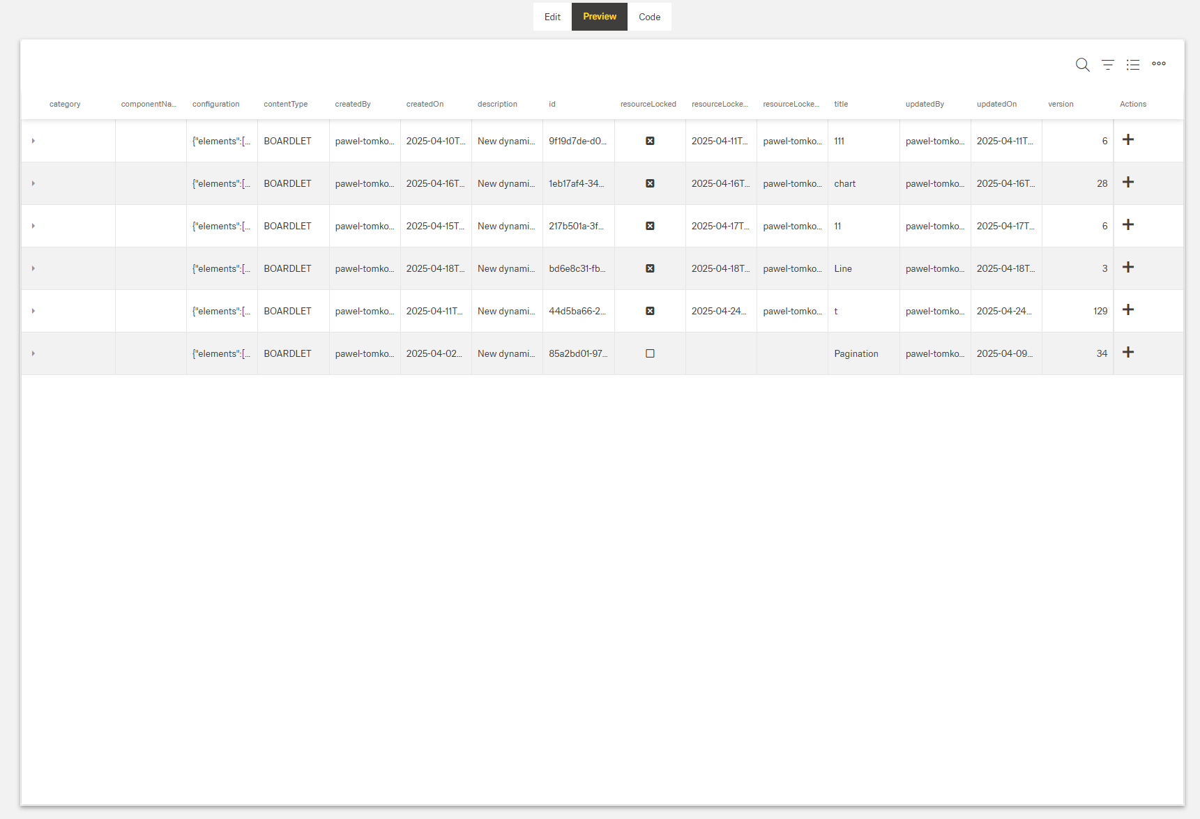
- The Dynamic Table displays data in rows and columns.
- It can show a header with title, subtitle, and controls.
- Rows support selection and optional expandable details.
- Data loading supports pagination and mapped request/response fields.
- Optional features include search, grouping, filtering, column chooser, CRUD actions, and Excel export.
Specs
Tokens
| Token | Description |
|---|---|
| displayName | Display name shown in structure panel. |
| id | Unique identifier for programmatic access. |
| keyExpr | Field(s) that uniquely identify rows. |
| height | Table height in px or %. |
| detailsRowEnabled | Enables expandable detail rows. |
| rowDetailsCustomTemplate | Template for expanded row details. |
| detailsRowHeightInPx | Height of detail rows in pixels. |
| allowSearching | Enables table search box. |
| paddingClass | Spacing via CSS classes. |
| scrollingMode | Row scrolling strategy. |
| columnRenderingMode | Column rendering strategy. |
| autoExpandAll | Expands all grouped rows on load. |
| enterKeyAction | Behavior on Enter key press. |
| enterKeyDirection | Direction after Enter key press. |
| editOnkeyPress | Start editing when typing in cell. |
| selectedRowsAccessKey | Context key to read selected rows. |
| selectionMode | Row selection mode. |
| showHeader | Show or hide the header area. |
| titleTranslations | Localized table title. |
| subtitleTranslations | Localized subtitle. |
| enableMaximize | Toggle full screen mode. |
| enableColumnChooser | Show/hide columns chooser. |
| allowGrouping | Enable drag-to-group by column. |
| allowFiltering | Enable column filtering. |
| highlightSearchText | Highlight matched search text. |
| elements | Array of DynamicTableColumnComponent. |
| columnMinWidth | Minimum column width in px. |
| columnAutoWidth | Auto-fit column width to content. |
| columnResizingMode | How resizing affects columns. |
| saveColumnSettings | Persist user column settings. |
| fieldsUsedInSearch | Fields included in search. |
| enablePagination | Enable paged data loading. |
| pageSize | Rows per page. |
| paginationRequestParamsMap | Map client paging params to server. |
| paginationResponseFieldsMap | Map server paging fields to client. |
| paginationFilterFieldsMap | Map filter names for pagination. |
| useFiltersInRequestBody | Send filters in request body. |
| getEntityCollectionHttpRequestParametersMap | Extra HTTP params for fetch. |
| getElementsDataSourceId | Data source ID for rows. |
| visibilityPolicySetId | Controls component visibility by policy. |
| allowAdding | Allow creating new rows. |
| addingType | How rows are added. |
| addingDialog | Dialog content ID for add. |
| createElementDataSourceId | Data source for create. |
| createEntityHttpRequestParametersMap | Params mapping for create. |
| allowUpdating | Allow editing existing rows. |
| updatingType | How rows are updated. |
| updatingDialog | Dialog content ID for update. |
| updateElementDataSourceId | Data source for update. |
| updateEntityHttpRequestParametersMap | Params mapping for update. |
| allowDeleting | Allow deleting rows. |
| deleteConfirmation | Require confirmation before delete. |
| removeElementDataSourceId | Data source for delete. |
| removeEntityHttpRequestParametersMap | Params mapping for delete. |
| exportToExcelFileName | Default Excel export filename. |
| exportToExcelAllRows | Export all rows. |
| exportToExcelSelectedRows | Export selected rows only. |
| exportToExcelVisibleRows | Export only visible rows. |
| showInSubmenu | Place export options in submenu. |
| columnCustomProps | Define custom row action icons. |
| columnOverflowMenus | Configure row overflow menu options. |
| events | Configurable component events. |
| ON_INIT (Events) | Event on component initialization. |
| ON_DESTROY (Events) | Event on component removal. |
| ON_TABLE_ROW_CLICK (Events) | Event on row click. |
| ON_TABLE_ROW_EDIT_START (Events) | Event when row edit starts. |
| ON_TABLE_ROW_EDIT_CANCEL (Events) | Event when row edit is cancelled. |
| ON_TABLE_ROW_SAVED (Events) | Event when row changes are saved. |
| dataTestId | Testing hook ID for automation. |
Structure
- elements — Defines all columns in the table with their individual configurations. This array contains DynamicTableColumnComponent objects with properties like dataField, caption, and visibility.
(Configured in General Properties)
- id — Specifies a unique identifier for the component used for programmatic access. For example, "customerOrdersTable" enables targeted manipulation of this specific table.
- keyExpr — Defines the field(s) used to uniquely identify rows in the table. For example, setting keyExpr to ["orderId"] ensures each row can be uniquely identified by its order ID.
- displayName — Sets the display name of the component shown in the structure panel. For example, "Orders Table" allows for easy identification of the table's purpose in the component structure.
(Configured in Datasource)
- getElementsDataSourceId — Specifies the data source ID for retrieving table data. For example, "api/orders" connects the table to the orders API endpoint.
- getEntityCollectionHttpRequestParametersMap — Configures HTTP parameters for data fetching. This object maps additional parameters needed for the data request.
Rows
(Configured in Visual Properties)
- scrollingMode — Determines how the table handles scrolling with options: "virtual" (only renders visible rows), "infinite" (loads more as user scrolls), or "standard". For large datasets, "virtual" significantly improves performance.
- autoExpandAll — Automatically expands all grouped rows when enabled. When set to true, all grouped data will be expanded by default when the table loads.
- selectionMode — Sets row selection behavior: "single" (one row), "multiple" (many rows), or "none" (no selection). For example, "multiple" allows selecting several orders for batch processing.
- selectedRowsAccessKey — Defines the key for accessing selected rows in the context. For example, "selectedOrders" allows accessing selected rows through this context key.
- detailsRowEnabled — Activates expandable detail rows for showing additional information. When enabled, rows can be expanded to show more detailed content.
- rowDetailsCustomTemplate — Specifies the template content for expanded row details. For example, an order details boardlet could show line items when a row is expanded.
(Configured in Visibility)
- visibilityPolicySetId — Determines the visibility of the component based on specified policy sets. For example, setting to "adminOnlyPolicy" restricts the table to users with admin privileges.
Pagination
(Configured in Datasource)
- enablePagination — Activates server-side pagination for large datasets. When enabled, data is loaded in pages rather than all at once, improving performance.
- pageSize — Sets the number of rows displayed per page. For example, setting to 25 will display 25 records per page when pagination is enabled.
- paginationRequestParamsMap — Maps client-side pagination parameters to server-expected parameters. For example, {"page": "pageNumber", "size": "pageLimit"} adapts to server naming conventions.
- paginationResponseFieldsMap — Maps server pagination fields to client expectations. For example, {"content": "data", "totalElements": "count"} handles different response structures.
- paginationFilterFieldsMap — Maps filter field names for pagination requests. For example, {"value": "filterValue", "key": "filterField"} adapts to server filter naming conventions.
- useFiltersInRequestBody — Places filters in the request body instead of URL parameters. When enabled, filter data is sent in the request body, which is better for complex filters.
Styling
Header
(Configured in Header)
- showHeader — Controls visibility of the table header section. When enabled, displays title, subtitle, and optional toolbar controls.
- titleTranslations — Sets the title text displayed above the table, with support for multiple languages. For example, {"en-US": "Customer Orders", "de-DE": "Kundenbestellungen"}.
- subtitleTranslations — Sets a secondary text displayed below the title, with language support. For example, {"en-US": "Last 30 days", "de-DE": "Letzten 30 Tage"}.
Sizing & Spacing
(Configured in Visual Properties)
- height — Sets the height of the table using pixels or percentages. For example, "400px" creates a fixed height table, while "100%" makes it fill its container.
- detailsRowHeightInPx — Sets the height of expanded detail rows in pixels. For example, setting to "200" ensures detail rows have adequate space for their content.
- paddingClass — Configures spacing around the table using CSS classes. For example, "p-4" adds medium padding on all sides of the table.
Columns
(Configured in Column)
- columnMinWidth — Sets the minimum width in pixels for all columns. For example, setting it to "100" ensures columns never become too narrow to read properly.
- columnAutoWidth — Automatically adjusts column widths to fit their content. When enabled, column widths dynamically adapt to their contents.
- columnResizingMode — Determines how column resizing affects other columns: "nextColumn" (only adjusts adjacent column) or "widget" (redistributes all columns). For precise control, "nextColumn" is preferred.
- saveColumnSettings — Preserves user customizations to column width, order, and visibility between sessions. When enabled, user preferences persist across page refreshes.

(Configured in Visual Properties)
- columnRenderingMode — Controls how columns are rendered: "virtual" (only renders visible columns) or "standard". For tables with many columns, "virtual" mode improves performance.
Actions & Variants
(Subsections grouped and sourced as approved.)
Header Controls
(Configured in Header)
- enableMaximize — Allows the table to be expanded to full screen mode. When enabled, a maximize button appears in the header for better data viewing.
- enableColumnChooser — Displays a tool for users to show/hide columns. When enabled, users can customize which columns are visible through a dropdown menu.
- allowGrouping — Enables users to group data by columns. When enabled, users can drag column headers to the grouping area to organize data hierarchically.
- allowFiltering — Enables column filtering capabilities. When enabled, users can apply filters like "Status equals 'Completed'" to narrow down visible data.
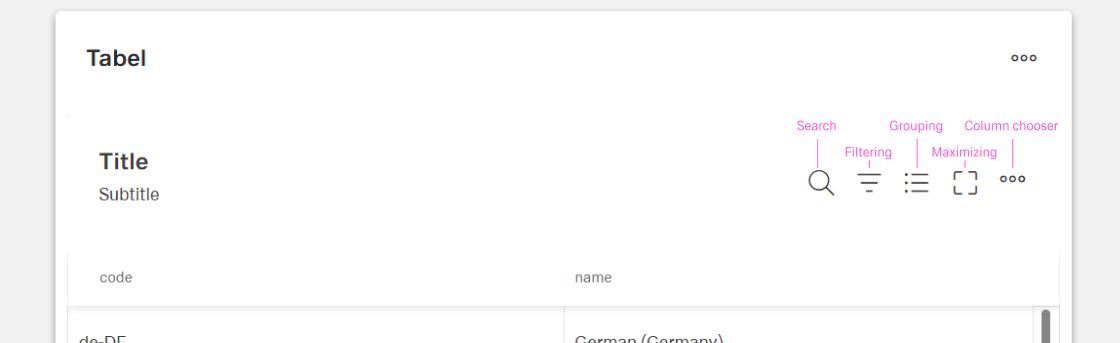
Search
(Configured in Visual Properties)
- allowSearching — Enables the search functionality for the table. When enabled, a search box appears, allowing users to search across all designated searchable columns.
(Configured in Column)
- fieldsUsedInSearch — Specifies which data fields are included when searching. For example, ["customerName", "orderReference"] limits searches to just these fields.
(Configured in Header)
- highlightSearchText — Emphasizes search terms within table content. When enabled, any text matching search queries will be visually highlighted for easier identification.
Adding
(Configured in Datasource)
- allowAdding — Enables row creation functionality. When enabled, users can add new records to the table through a UI control.
- addingType — Determines how new rows are added: "inline" (directly in the table) or "dialog" (in a popup). For complex forms, "dialog" provides more space for data entry.
- addingDialog — Configures the dialog used for adding rows. This specifies the content ID for the dialog component to show when adding new records.
- createElementDataSourceId — Specifies the data source ID for creating new records. For example, "api/orders/create" would be the endpoint for adding new orders.
- createEntityHttpRequestParametersMap — Configures parameters for create requests. This maps table data to the expected format for the creation endpoint.

Update
(Configured in Datasource)
- allowUpdating — Enables row editing functionality. When enabled, users can modify existing row data through inline editing or dialogs.
- updatingType — Sets how rows are updated: "inline" (directly in table) or "dialog" (in a popup). For complex forms, "dialog" provides a better editing experience.
- updatingDialog — Configures the dialog used for updating rows. This specifies the content ID for the dialog component to show when editing records.
- updateElementDataSourceId — Specifies the data source ID for updating records. For example, "api/orders/{id}/update" would be the endpoint for modifying orders.
- updateEntityHttpRequestParametersMap — Configures parameters for update requests. This maps table data to the expected format for the update endpoint.

Export
(Configured in Datasource)
- exportToExcelFileName — Sets the default filename for Excel exports. For example, "CustomerOrders_Export" will be the base name when exporting to Excel.
- exportToExcelAllRows — Enables exporting all data rows to Excel, even if paginated. When enabled, all data will be exported regardless of current view.
- exportToExcelSelectedRows — Enables exporting only selected rows to Excel. When enabled and rows are selected, only those rows will be exported.
- exportToExcelVisibleRows — Enables exporting only currently visible rows to Excel. When enabled, only the current view is exported, ideal for filtered data.
- showInSubmenu — Shows export options in a dropdown submenu. When enabled, export options appear in a separate dropdown for cleaner interface.
Delete
(Configured in Datasource)
- allowDeleting — Enables row deletion functionality. When enabled, users can remove rows from the table through delete buttons or commands.
- deleteConfirmation — Requires confirmation before row deletion. When enabled, prompts users with a dialog to confirm before removing data.
- removeElementDataSourceId — Specifies the data source ID for deleting records. For example, "api/orders/{id}" would be the endpoint for removing orders.
- removeEntityHttpRequestParametersMap — Configures parameters for delete requests. This maps table data to the expected format for the deletion endpoint.
Row Actions
(Configured in Visual Properties)
- enterKeyAction — Determines the behavior when the Enter key is pressed: "startEdit" (begins editing the cell) or "moveFocus" (moves to the next cell). For data entry tables, "startEdit" is more efficient.
- enterKeyDirection — Sets the direction to move after Enter key press: "none", "column" (move down), or "row" (move right). For form-like data entry, "row" provides a natural flow.
- editOnkeyPress — Enables cell editing when typing directly on a cell. When enabled, users can begin typing to replace cell content without clicking first.
(Configured in Custom Actions)
- columnCustomProps — Defines custom action icons displayed for each row. For example, an "email" icon that triggers a contact action for the customer in that row. (if proper flow will be set)
- columnOverflowMenus — Configures dropdown menu options for rows. For example, options like "Archive", "Export", or "Flag" that perform specific actions on the row.
Events
(Configured in Events)
- events — Configures the events that the component can trigger and respond to:
- ON_INIT: Triggered when the component is initialized. Can be used to perform setup operations.
- ON_DESTROY: Triggered when the component is removed from the DOM. Useful for cleanup operations.
- ON_TABLE_ROW_CLICK: Triggered when a row is clicked. Can be used to navigate to detail pages or show additional information.
- ON_TABLE_ROW_EDIT_START: Triggered when row editing begins. Can be used for validation or prefilling related data.
- ON_TABLE_ROW_EDIT_CANCEL: Triggered when row editing is cancelled. Can undo temporary changes or refresh data from server.
- ON_TABLE_ROW_SAVED: Triggered when row changes are successfully saved. Can be used for notifications or follow-up actions.
Tests
(Configured in Testing Hooks)
- dataTestId — Sets the testing hook ID for automated testing. For example, setting it to "orders-table" allows test scripts to reliably locate this component.
Links
- Figma: https://www.figma.com/design/yck1tcUXgdQ5aYX6iUAwrO/GE---Astronaut-Design-System?node-id=11525-23378&t=ftfrOGkPzlG2GaTo-1
- Live style guide: https://e1-dev.k8s.myapp.de/live-style-guide/id6/1-data-grid/table/overview
Guidelines
Usage
- Configure per-row actions directly on the table: place high-frequency actions as inline icons via
columnCustomProps, and move secondary actions into the overflow menu withcolumnOverflowMenus. - Expose a stable selector for testing and monitoring by setting
dataTestId. - Control whether typing immediately edits a cell with
editOnkeyPress(enable for data entry; disable for read-first review).
Sizing & Layout
- Keep action density readable: limit inline icons defined in
columnCustomProps; route additional/low-priority actions tocolumnOverflowMenus.
Interactions & Events
- Use
ON_TABLE_ROW_CLICKfor primary navigation or to reveal details.
Content & Localization
- Keep action labels concise in the configurations where they are defined (inline icons in
columnCustomProps, menu items incolumnOverflowMenus). Tooltips are supplemental and not required by this component.
Dos & Don’ts
| Do | Don’t |
|---|---|
For fast data entry, set enterKeyAction: "startEdit" (optionally with editOnkeyPress: true) so users can type immediately. |
Force extra clicks before typing in entry workflows. |
Match focus traversal to reading order using enterKeyDirection (e.g., "row" for left→right tables). |
Move focus in a direction that conflicts with the layout. |
Keep only primary actions as inline icons and place the rest in columnOverflowMenus. |
Pack rows with many small icons that compete for attention. |
Configure deletes with removeElementDataSourceId and removeEntityHttpRequestParametersMap. |
Fire ad-hoc delete calls that ignore row context. |
| React to edit start/cancel/save with the table’s events to keep UI and data in sync. | Ignore the edit lifecycle and risk data/UI drift. |
Use ON_TABLE_ROW_CLICK for navigation or detail reveal. |
Hide navigation behind a tiny icon only. |
Provide a stable selector via dataTestId. |
Depend on brittle DOM/text selectors. |
Accessibility
- Keyboard control can be tailored by configuring
enterKeyActionandenterKeyDirectionto align with reading order. - Reduce accidental edits by setting
editOnkeyPressbased on context (on for dedicated entry, off for review). - Maintain clear targets by limiting inline icons (
columnCustomProps) and moving secondary actions tocolumnOverflowMenus.
Datasource Requirements
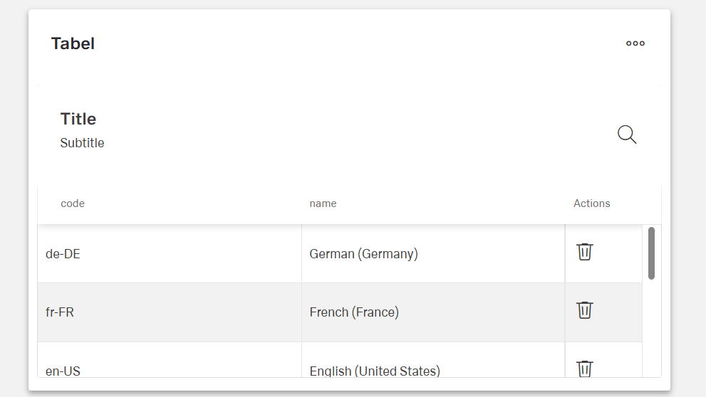
The table component expects an array of objects. Value keys inside the objects provide a title to the column while any single object inside the array represents one row of the table.
Example:
[
  {
    "name": "German (Germany)",
    "code": "de-DE"
  },
  {
    "name": "French (France)",
    "code": "fr-FR"
  },
  {
    "name": "English (United States)",
    "code": "en-US"
  },
  {
    "name": "Dutch (Netherlands)",
    "code": "nl-NL"
  },
  {
    "name": "Spanish (Spain)",
    "code": "es-ES"
  },
  {
    "name": "Chinese (China)",
    "code": "zh-CN"
  },
  {
    "name": "Polish (Poland)",
    "code": "pl-PL"
  }
]
Column Creation
After initially selecting a data source, the column chooser will open automatically with the keys added from the data source. If an existing and desired key is not among them, create an additional column and add the key under data field in the column. The columns can be edited individually as table columns.
Adding a Row
The table uses a POST method to send the user input to the backend. The request parameters of the data source have to match the columns of the table, and the response parameters have to match the initial data source of the table.
Updating Table
Using a post method, the Table is sending back whole data record to the backend. Even if for instance the code column is not visible, table will send whole object with modification.
Example:
[
  {
    "name": "Swiss (Switzerland)",
    "code": "de-CH"
  }
]
The request has to match the columns of the table, and the response parameters must match the initial data source of the table.
Deleting Data
A DELETE method is needed for this action which uses the key expression to remove a data object from the end point.