(this page was created automatically. In case of formatting issues, please visit the official Wiki Page)
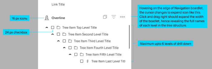
Tree View
Overview
- The Dynamic Tree View component displays data in a collapsible hierarchical tree structure.
- It allows users to explore nested information through parent-child relationships.
- The component supports navigation and selection of nodes within the hierarchy.
- It is useful for representing structures such as organizations, file systems, and categories.
Specs
Tokens
| Token | Description |
|---|---|
| displayName | Display name of the component in the structure panel |
| displayExpression | Field from data shown as text in tree nodes |
| keyExpression | Field used as unique identifier for each node |
| childrenExpression | Field containing child items for each node |
| selectionMode | Determines how users can select nodes |
| showCheckBoxesMode | Controls how checkboxes are displayed |
| selectNodesRecursive | Selects child nodes when parent is selected |
| selectByClick | Enables or disables selection on click |
| paddingClass | Configures padding around the component |
| dataSourceId | ID of the data source for retrieving tree data |
| getEntityCollectionHttpRequestParametersMap | Configures HTTP parameters for fetching data |
| events | Configurable events for the component |
| ON_TREE_ITEM_CLICK (Events) | Triggered when a node is clicked |
| ON_INIT (Events) | Triggered when the component initializes |
| ON_DESTROY (Events) | Triggered when the component is destroyed |
| visibilityPolicySetId | Determines visibility based on policy sets |
| displayConditions | Conditions for dynamically showing the component |
| id | Unique identifier for programmatic access |
| dataTestId | Testing hook ID for automated tests |
| enableAsHotspot | Enables the component as a guided tour hotspot |
| guidedTourHotSpotTitle | Title for guided tour hotspot (multi-language) |
| guidedTourHotSpotDescription | Description for guided tour hotspot (multi-language) |
Structure
- The data structure should have a clear parent-child relationship, with each node containing a unique identifier and a field that references its children.
- The component automatically handles the expansion and collapse of tree nodes.
- When a node is selected, the ON_TREE_ITEM_CLICK event is triggered, passing the selected node's data to any configured actions.
- The component supports both flat and hierarchical data structures, as long as the appropriate expressions are set to map the relationships.
- For large datasets, consider implementing server-side filtering or pagination through the request parameters.
(Configured in General Properties)
- displayName – Sets the display name of the component shown in the structure panel. For example, "Category Tree" allows for easy identification of the component's purpose in the component structure. This name is used to reference the component in the editor and does not affect the front-end display.
(Configured in Visibility)
- displayConditions – Defines conditions for displaying the component based on context values. For example, { key: "showCategoryTree", operator: "equals", value: "true" } would only show the tree view when the context contains a "showCategoryTree" property set to "true". This allows the tree view to be shown or hidden dynamically depending on the state of the application.
Data Allocation
(Configured in Visual Properties)
- displayExpression – Defines the field from your data that will be displayed as text for each tree node. For example, setting it to "name" will display the value of the "name" field for each item in your data.
- keyExpression – Specifies the field from your data that uniquely identifies each node. For example, setting it to "id" means the component will use the "id" field as the unique identifier for each tree node.
- childrenExpression – Defines the field that contains child items for each node. For example, setting it to "children" means the component will look for child nodes in a field called "children" in your data objects.
Datasource
(Configured in Datasource)
- dataSourceId – Specifies the data source ID for retrieving tree data. For example, "api/categories" connects the tree view to a categories API endpoint.
- getEntityCollectionHttpRequestParametersMap – Configures HTTP parameters for data fetching. This object maps additional parameters needed for the data request, such as filters or sorting options. For example, {"headers": {"Content-Type": "application/json"}, "pathParams": {"tenantId": "{{tenantId}}"}} allows you to pass dynamic path parameters to the API.
Styling
(Configured in Visual Properties)
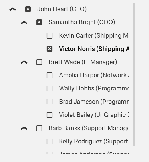
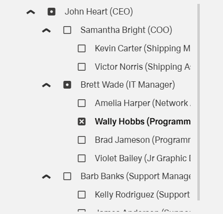
- showCheckBoxesMode – Controls how checkboxes are displayed in the tree view. Options include "none" (no checkboxes), "normal" (checkboxes shown for all nodes), or "selectAll" (includes a select all checkbox). For example, using "selectAll" is helpful when users need to select multiple items in a permissions tree.
- paddingClass – Configures the padding around the component using CSS classes. For example, "p-4" adds medium padding on all sides of the tree view, while "px-3 py-2" adds different horizontal and vertical padding. Proper padding ensures the tree view has adequate spacing within its container.

Actions & Variants
(Configured in Events)
- events — Configures the events that the component can trigger and respond to.
- ON_TREE_ITEM_CLICK — Triggered when a tree node is clicked. Can be used to navigate to detail pages or load related content based on the selected node.
- ON_INIT — Triggered when the component is initialized. Can be used to perform setup operations like setting initial states or loading additional data.
- ON_DESTROY — Triggered when the component is removed from the DOM. Useful for cleanup operations and releasing resources.
Variants
(Configured in Visual Properties)
selectionMode — Determines how users can select nodes in the tree. Options include "single" (only one node can be selected at a time), "multiple" (multiple nodes can be selected simultaneously), or null (no selection allowed). For example, setting to "multiple" allows users to select several categories in a product catalog tree.
selectByClick — Enables or disables node selection when clicking on a node. When set to true, users can select a node by clicking anywhere on it; when false, they must use checkboxes (if enabled) to select nodes. This provides flexibility in how users interact with the tree.
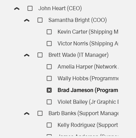
selectNodesRecursive — Determines if selecting a parent node automatically selects all its child nodes. When set to true, clicking a parent node selects all its children recursively, which is useful for operations that apply to entire branches of the tree.
Tests
(Configured in Testing Hooks)
- id — Specifies a unique identifier for the component used for programmatic access. For example, "productCategoryTree" enables targeted manipulation of this specific component in scripts or for automated testing.
- dataTestId — Sets the testing hook ID for automated testing. For example, setting it to "product-category-tree" allows test scripts to reliably locate this component during test execution.
- enableAsHotspot — Enables the component as a guided tour hotspot. When set to true, this component can be highlighted in guided tours to help users understand its navigation functionality.
- guidedTourHotSpotTitle — Sets the title for the guided tour hotspot with support for multiple languages. For example, {"en-US": "Category Navigation", "fr-FR": "Navigation par Catégorie"} ensures proper localization of the hotspot title.
- guidedTourHotSpotDescription — Sets the description for the guided tour hotspot with language support. For example, {"en-US": "Use this tree to navigate between different product categories", "fr-FR": "Utilisez cet arborescence pour naviguer entre différentes catégories de produits"} provides localized guidance about how to use the component.
Authorization
(Configured in Authorization)
- visibilityPolicySetId — Determines the visibility of the component based on specified policy sets. For example, setting to "categoryAdminPolicy" restricts the tree view to users with category management privileges. This enables role-based access control for the component, ensuring only authorized users can see and interact with certain hierarchical data.
Links
- Link to Figma: https://www.figma.com/design/yck1tcUXgdQ5aYX6iUAwrO/GE---Astronaut-Design-System?node-id=11600-87979&t=ExcQFUXKvr1QdxTm-1
- Live style guide: https://e1-dev.k8s.myapp.de/live-style-guide/id2/9-tree
Guidelines
Usage
- Present hierarchical data with expand/collapse by mapping
displayExpression,keyExpression, andchildrenExpression; connect data viadataSourceId. - Choose selection semantics per task:
- Single choice (navigation):
selectionMode: "single"; optionally hide checkboxes withshowCheckBoxesMode: "none". - Multi-select (bulk actions):
selectionMode: "multiple"withshowCheckBoxesMode: "normal"or"selectAll". - Enable branch-level actions with
selectNodesRecursive: trueto select descendants with a parent. - Control precision of selection: set
selectByClick: falseto require checkbox-only selection; setselectByClick: trueto allow row click selection.
Sizing & Layout
- Apply spacing around the control using
paddingClass. - Keep labels concise and readable by pointing
displayExpressionat a short, human-facing field. - Name the instance for authors/editors using
displayName(editor-only, not user-facing).
Visibility & Authorization
- Restrict visibility by role or policy using
visibilityPolicySetId.
Content & Localization
- Localize node labels by pointing
displayExpressionat the locale-appropriate field in your dataset.
Dos & Don’ts
| Do | Don’t | Article setting(s) |
|---|---|---|
| Use stable unique keys for nodes. | Use labels or array indices as identifiers. | keyExpression |
| Map human-readable text to nodes. | Surface internal IDs or verbose blobs as labels. | displayExpression |
Set selectionMode: "single" for navigation trees. |
Allow multi-select when only one target makes sense. | selectionMode |
| Show checkboxes for multi-select tasks. | Force multi-select without visible affordances. | showCheckBoxesMode, selectionMode |
Enable selectNodesRecursive for branch actions. |
Make users select every child manually. | selectNodesRecursive |
| Require checkbox-only selection when precision matters. | Allow row-click selection that causes accidental picks. | selectByClick: false, showCheckBoxesMode |
| Hide the Tree View when not applicable. | Leave an empty/irrelevant tree visible. | displayConditions |
| Restrict sensitive trees by policy. | Show structure and rely on downstream errors. | visibilityPolicySetId |
Accessibility
- Programmatic names for nodes: Ensure meaningful labels by mapping
displayExpressionto human-readable text. - Explicit selection affordance for multi-select: Show checkboxes to convey state non-visually using
showCheckBoxesModewithselectionMode: "multiple". - Accidental-selection prevention: When precision is needed, disable row-click with
selectByClick: false. - Localized helper text for guided flows: If tours are used, provide localized titles/descriptions via
enableAsHotspot,guidedTourHotSpotTitle,guidedTourHotSpotDescription. - Avoid color-only meaning: Convey selection and hierarchy via labels and checkbox presence using
displayExpressionandshowCheckBoxesMode. - Stable relationships: Use persistent identifiers so assistive tech can track nodes; configure
keyExpressionand hierarchical relations viachildrenExpression.
Datasource Requirements
The tree view component expects a hierarchical data structure or a flat structure that can be converted to a hierarchy.
Multiple level of the tree use a recursive structure.
Example format:
[
  {
    "id": "1",
    "name": "Electronics",
    "children": [
      {
        "id": "1-1",
        "name": "Smartphones",
        "children": []
      },
      {
        "id": "1-2",
        "name": "Laptops",
        "children": []
      }
    ]
  },
  {
    "id": "2",
    "name": "Clothing",
    "children": [
      {
        "id": "2-1",
        "name": "Men's",
        "children": []
      },
      {
        "id": "2-2",
        "name": "Women's",
        "children": []
      }
    ]
  }
]
With this data structure, you would set:
- keyExpression:
"id" - displayExpression:
"name" - childrenExpression:
"children"