(this page was created automatically. In case of formatting issues, please visit the official Wiki Page)
Navigation Boardlet
Overview
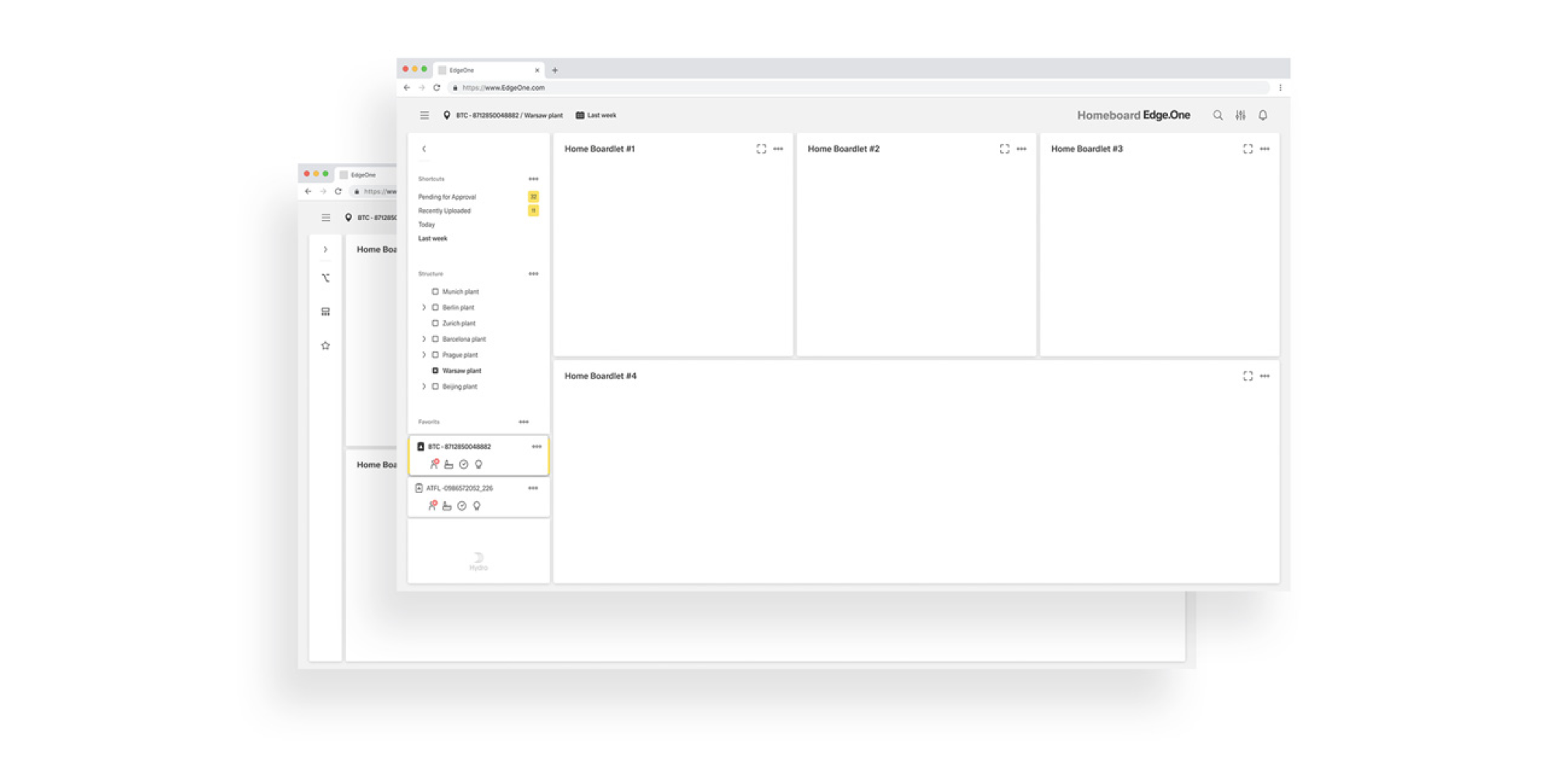
The navigation boardlet is a special type of boardlet. It houses several links to other dashboards and is part of the grander patterns of [Local Navigation]().
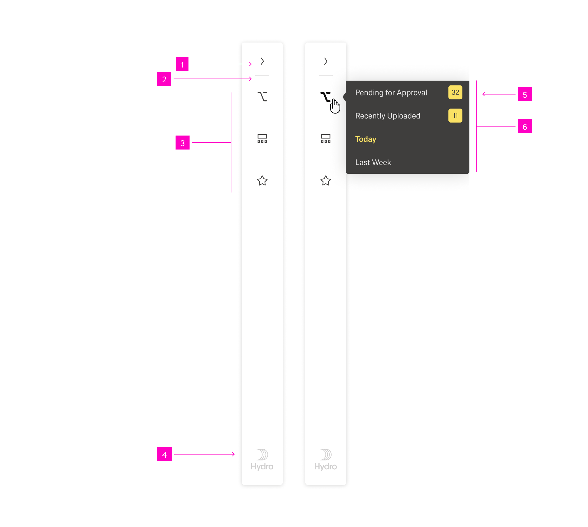
The boardlet has two states: collapsed and expanded. It can toggle between the two through a "Collapse/Expand" action icon.
Anatomy
The dashboard navigation boardlet has two display options, Collapsed and Extended. This is necessary to keep the focus on the content of the dashboard. Shape and presentation within a breakpoint are always the same and must not be changed.
Expanded
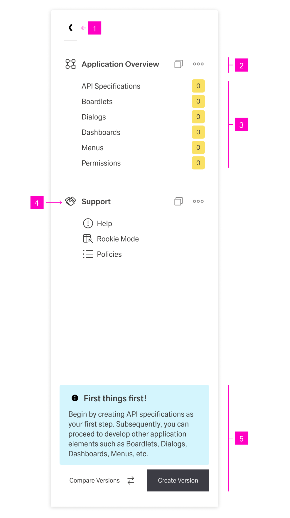
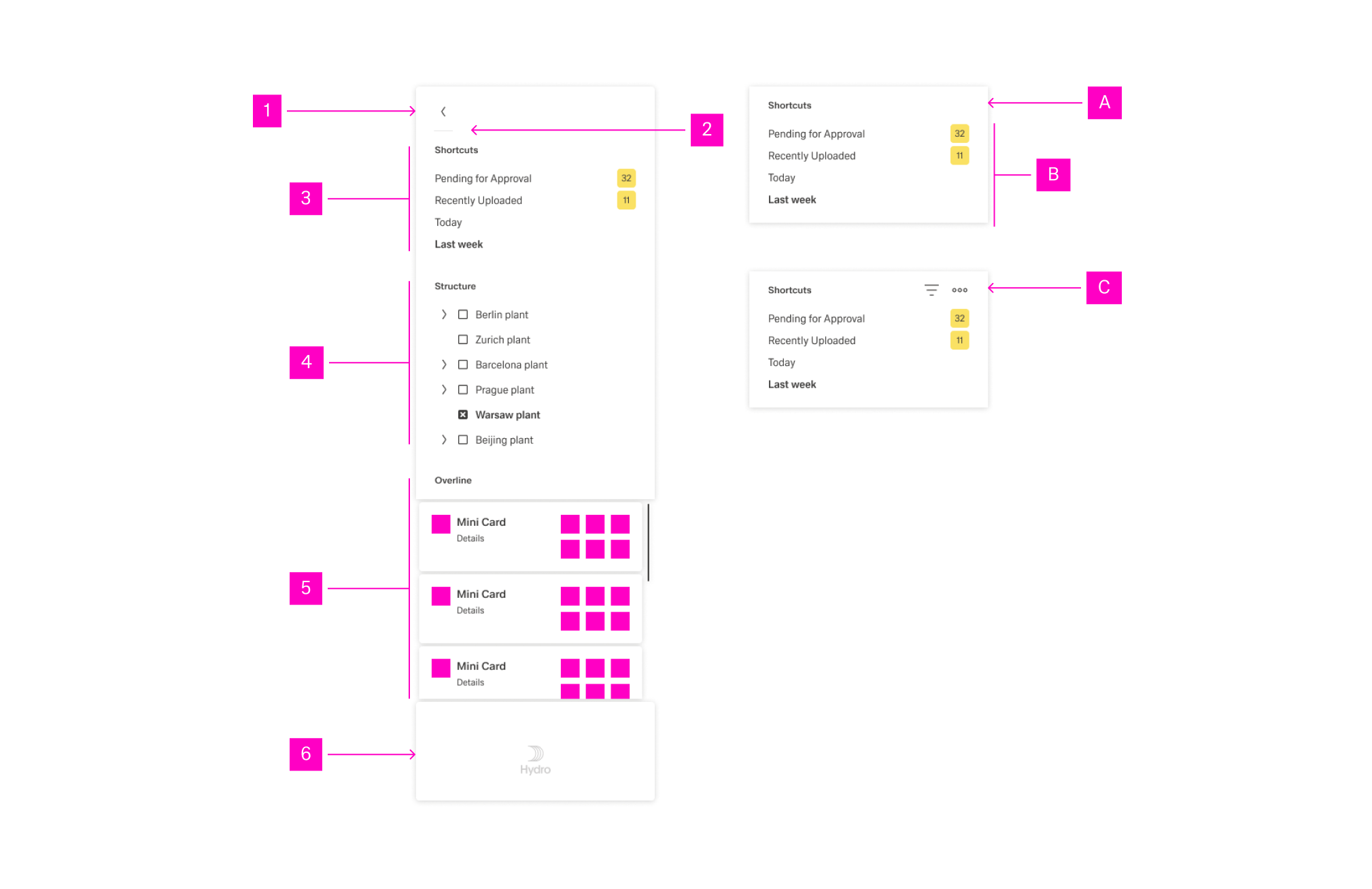
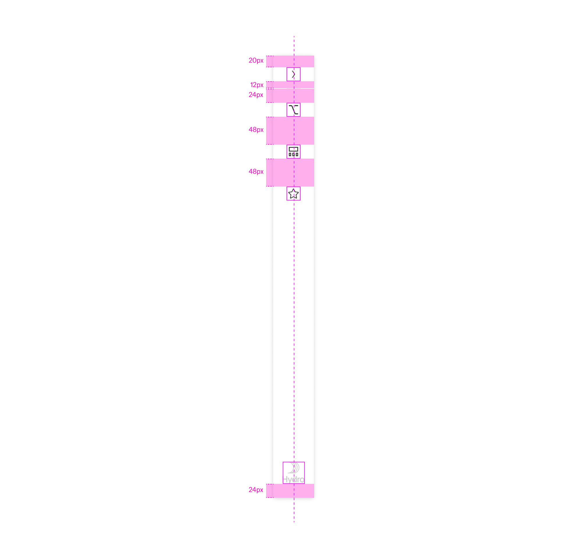
In its expanded stage, the navigation boardlet shows the entirety of its content. It consists of any number of Navigation Items grouped under a Navigation Overline. In addition, the boardlet can have a Footer that can include a brand logo, action buttons and a system information text.
Any combination and ordering is supported. However, using more than three assets simultaneously is not recommended due to space constraints.
- 01 "Collapse" action - This button allows the user to collapse the navigation.
- 02 Navigation Overline - The header for a section of navigation items with an icon and possible action icons.
- 03 Navigation Items - Navigational links with a multitude of forms.
- 04 Navigation Overline Icon - A recognizable icon representing the navigation overline.
- 05 Footer - With an action button and a system information text.
Possible navigation items include but are not limited to:
| Asset | Purpose & Behavior |
|---|---|
| Link List | Scrollable collection of links. Use for quick movement in content and to surface favorites. |
| Node List | Scrollable collection of nodes. Enables fast navigation across node hierarchies. |
| Card List | Scrollable mini-cards providing additional detail. It supports navigation into related content. |
| Conflict List | Scrollable conflict cards showing current issues; supports filtering and prioritization. |
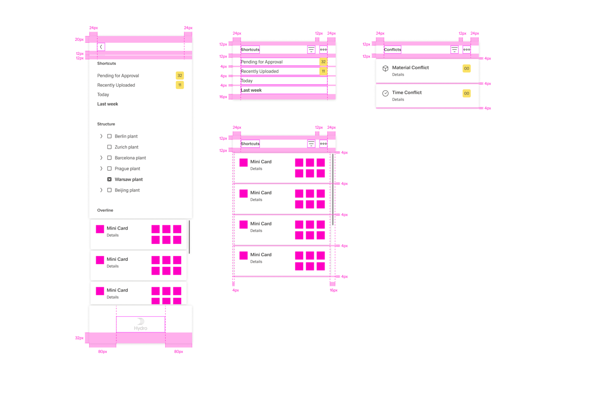
- 01 Extender - The Action Icon for extend and collapse the navigation boardlet.
- 02 Divider - A divider helps the user to differentiate between several action icons that have a different content and function.
- 03 Link-List Assets
- 04 Node-List Assets
- 05 Card-List
- 06 Client Logo - In case the customer wants his own logo, it will be placed only here. Only signets or rectangular logos are allowed
- A Navigation Asset
- B Content of a navigation asset - The content can vary, see overview navigation asset.
- C Overline of a navigation asset - Overlines can be used with or without an action bar.
The following image shows the alignment of navigation items.
Collapsed
In this state, the menu is only 1 column wide. A compact rail of action icons (with dividers) representing the available navigation content. Each icon opens an overflow menu listing thematic actions. If a customer logo is required inside Edge.One, it is placed only in the Navigation Boardlet.
- 01 Extender - This button allows the user to expand the navigation.
- 02 Divider - A divider helps the user to differentiate between several action icons that have a different content and function.
- 03 Content Actions/Navigation Overline Icons - These actions are variable and can be selected by the user/creator.
- 04 Brand Logo - In case the customer wants his own logo, it will be placed only here. Only signets or rectangular logos are allowed
- 05 Overflow Action Link - The number of links and the content of the link are variable.
- 06 Overflow Menu - The overflow menu contains all thematic actions. It opens only to the right.
The following image shows the alignment of elements.
Best Practices
Usage
Local navigation is optional in Edge.One. Simple applications do not require it. Use the Nnavigation boardlet only when a dashboard needs local navigation (e.g., nodes, dependencies, favorites, sub-dashboards). Keep it off simple dashboards to preserve focus.
Default to collapsed on content-dense dashboards; expand on demand when navigation is the user’s next likely step.
In extended, use at most three assets (Link, Node, Card, Conflict) at once to avoid vertical crowding and nested scroll traps.
Local navigation controls only the current dashboard; don’t mix cross-dashboard items here.
Content
Order assets and items by user intent: first what’s used most, then by task flow, then alphabetically.
Prefer fewer, clearer entries to exhaustive lists; encourage favorites/pinning in Link Lists.
Scrolling
Prefer no internal scrolling. If content overflows, switch to the extended state or split into multiple assets/tabs.
Accept scrolling when:
- The content must be visible simultaneously (e.g., long Node List in extended).
- The boardlet provides essential footer/actions tied to the list (e.g., batch selection).
- The overflow occurs only on rarely used small screens.
Use independent scrolling for each asset and never create horizontal scrolling.